
Table
 The guideline content on this page is synced with Figma and can be used as a source of truth.
Open in Figma
The guideline content on this page is synced with Figma and can be used as a source of truth.
Open in Figma
Tables are used to efficiently organise and display data. This component can be customised with extra features to meet the specific needs of your product’s users.
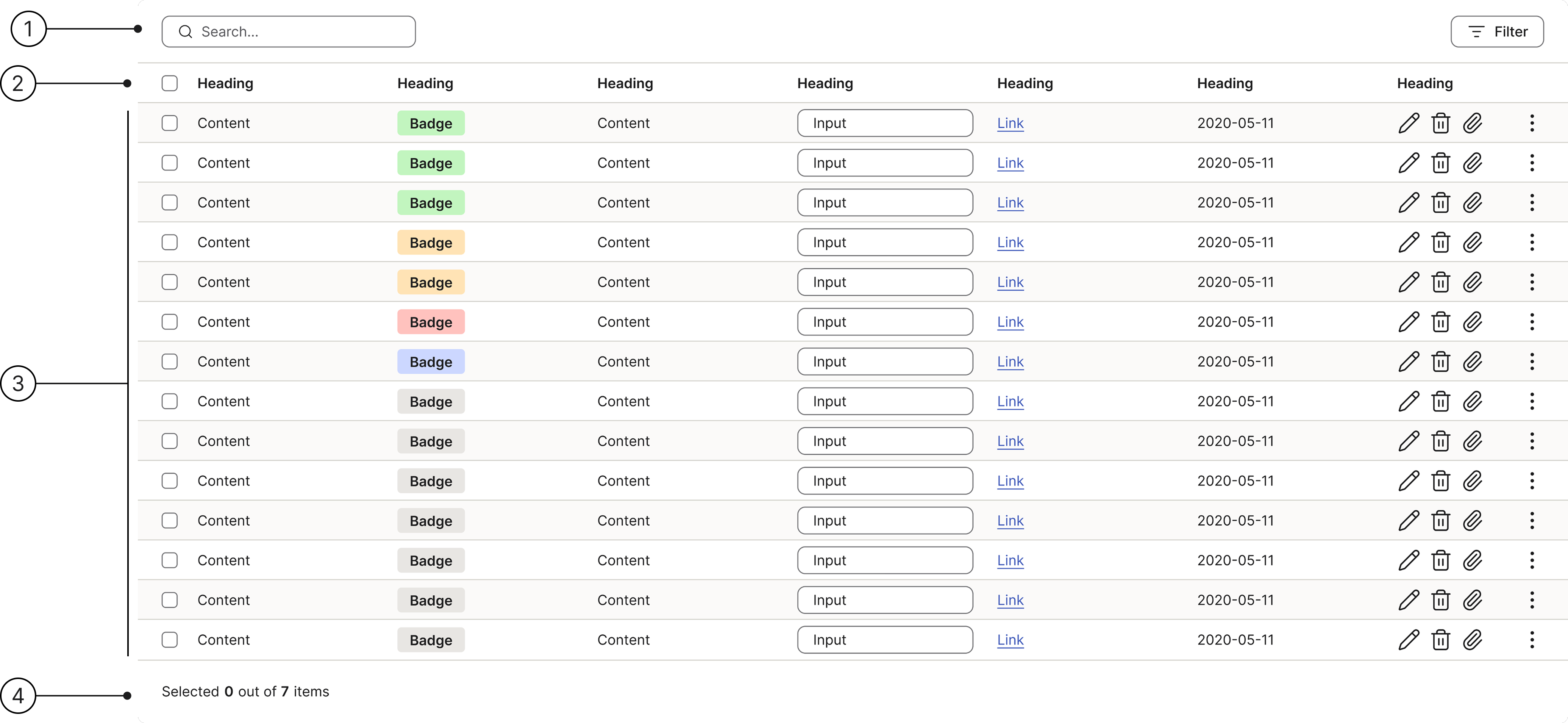
Anatomy
- Header
- Column header
- Table rows
- Table footer
Variants
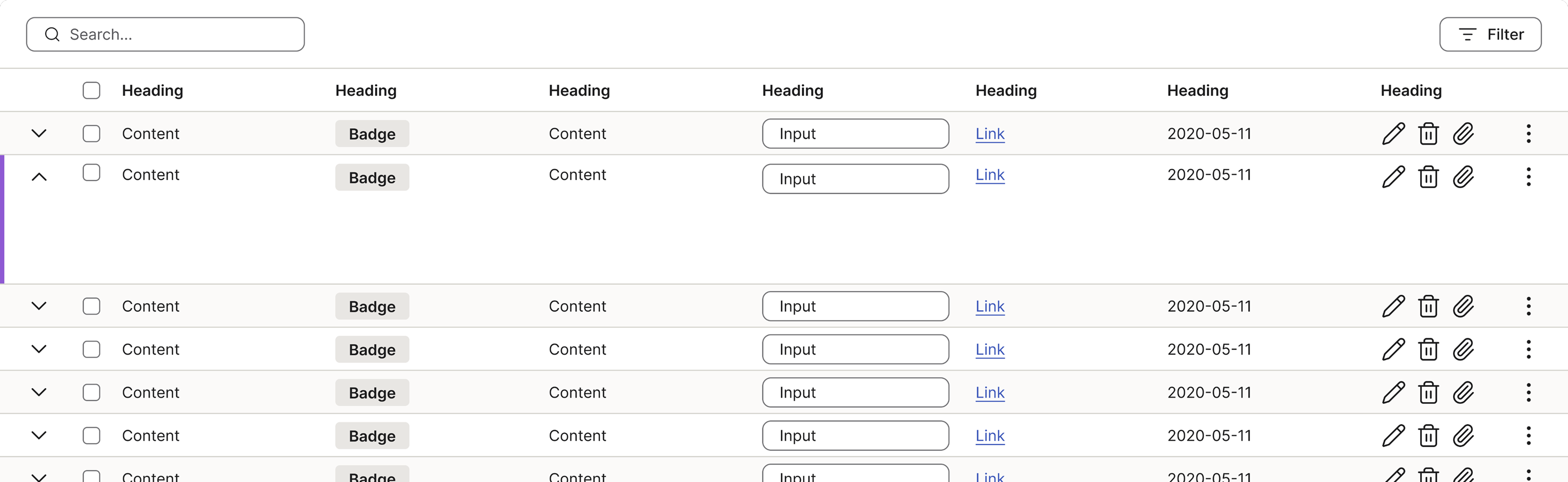
We have two primary table types in our design system: the standard table and the expandable row table. These variations ensure we can present data efficiently, regardless of its complexity or volume.
The expandable row is a specialised component used when a row contains details that are important but not critical for the initial overview.
An expandable row always contains a chevron to the left to indicate that it is expandable.
Truncated
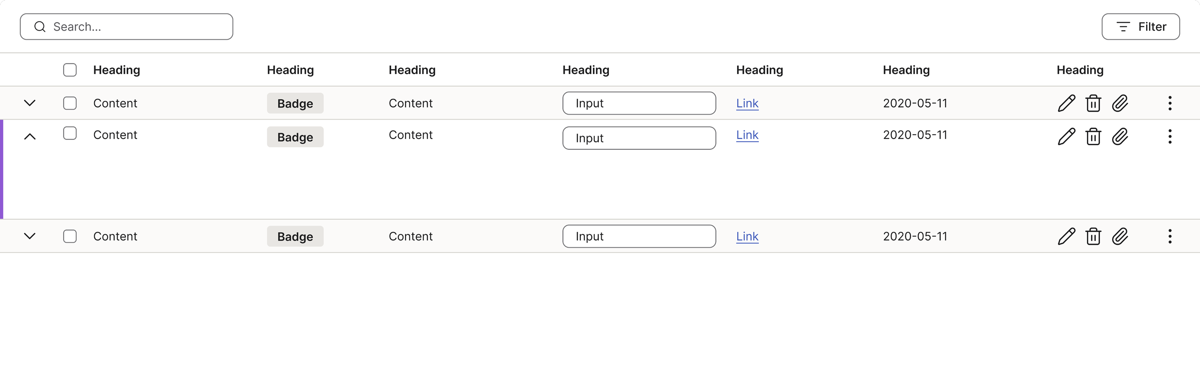
For instances where the full data set is too extensive or unnecessary, our design system includes a standardised truncated version of the standard table component.
Heading
A descriptive heading (the title of the entire table) is essential because it provides immediate context for the entire data set.
Column headings
Clear and concise column headings are fundamental for data interpretation.
Purpose:
- They define the specific type of data contained within that vertical column (for example, “Conversion rate” or “Last activity”).
Primary button
If the table is using a primary action it should follow the guidelines for buttons.
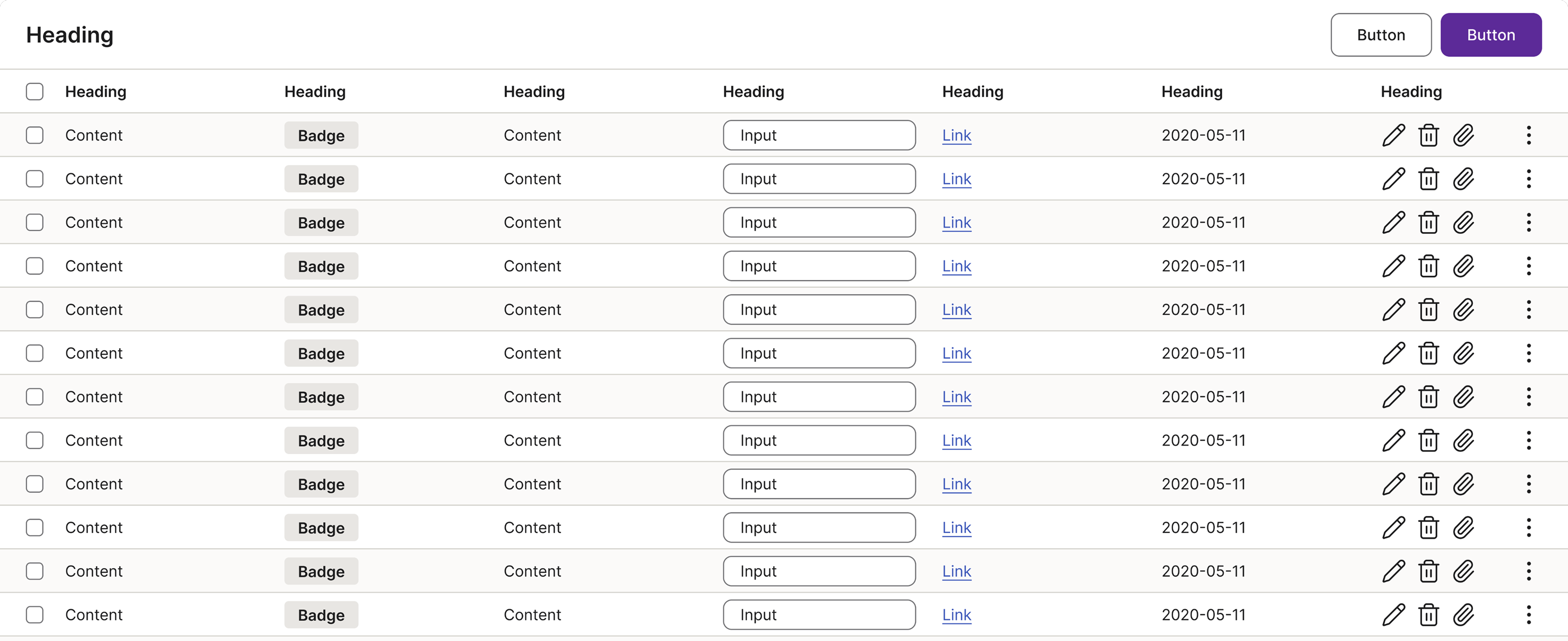
Table header variants
Sits at the top of the table. Pick the variant that fits the controls your view needs. Use only one primary action per header.
- Search: search field + filter button. Default for finding and filtering a list.
- Title: heading + action buttons. When the table needs a clear title and a primary action.
- Dropdown: search + dropdown + settings. For switching modes beyond search.
- Settings: search + settings. Minimal variant when the only extra need is table settings.
- Expanded filter: search + toggle (for example “Show inactive”) + primary action, with a separate “Filter by” row. For data-heavy views with multiple filters.
Numeric summary
Shows a summary row at the bottom of the table, like a total. A label on the left and the amount on the right, lined up with its column. Right-align the amount so it’s easy to read. A line above sets it apart from the rows. Use it only when the table has a value worth adding up.
| Totals | 155,000 SEK |
Clickable area
While a table displays data, certain parts are intentionally made clickable to allow users to interact with and manipulate the information. The following areas within a table are interactive:
- Sortable column headers
- Checkboxes
- Button icons
- Links
- Label actions

Hover
The row hover state must always be enabled in data tables. This feature helps users visually scan the columns across a row, improving readability even when the row itself is not interactive.

Selected
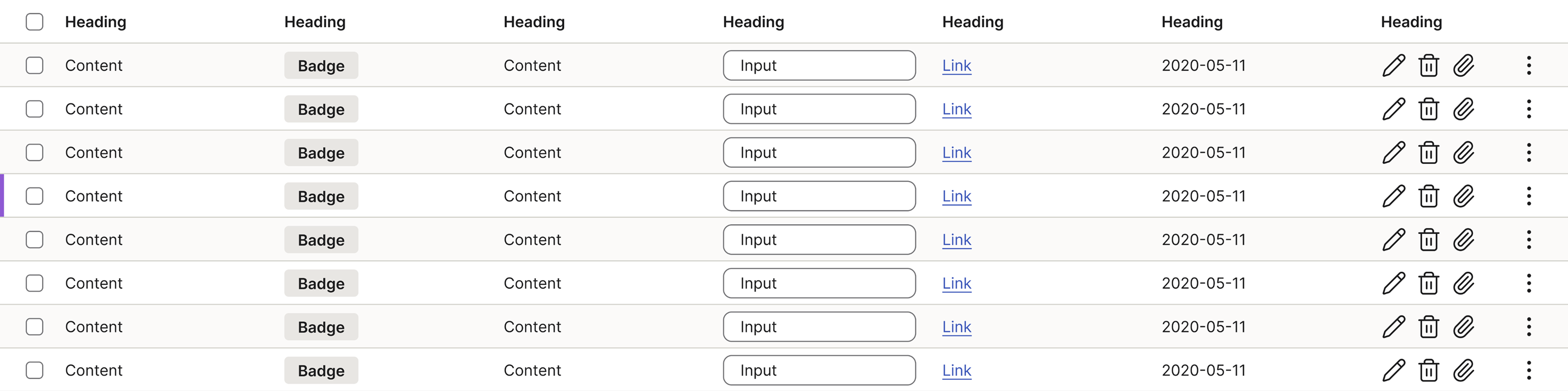
To clearly convey that a table row is selected, we use a visual indicator known as the selection marker.
The marker is a small, solid rectangle positioned along the left-hand edge of the row, specifically next to the content of the first column.
Inline action
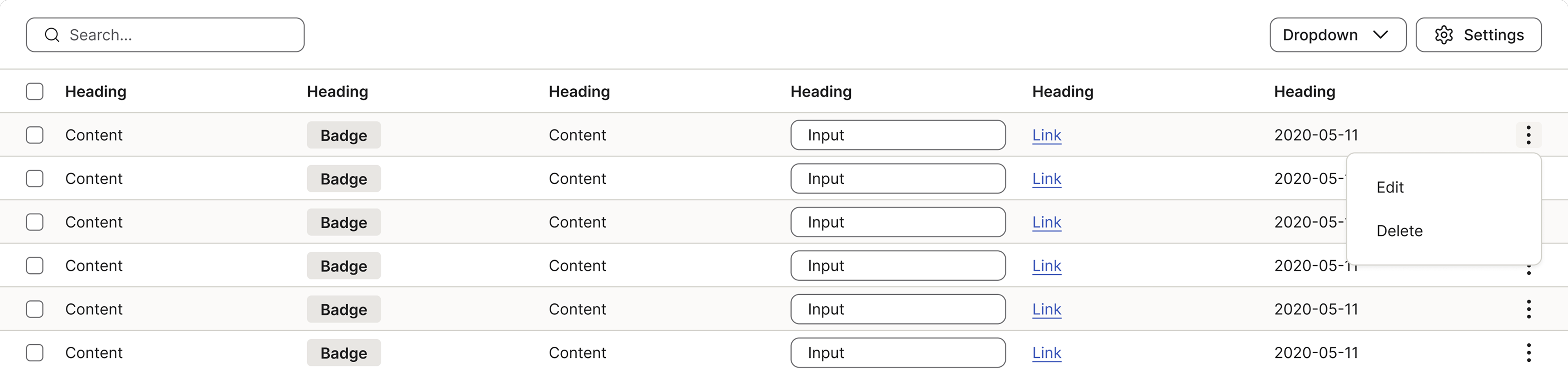
Inline actions are functions or operations that can be performed directly on a specific table row without requiring the user to select the row and navigate to a separate toolbar. They provide contextual, immediate access to the most common or critical actions associated with the data in that row.
Actions displayed inline must be directly related to the data in the specific row they accompany (for example, “Edit” a user, “View details” of an order, or “Delete” a file).
Expanded background
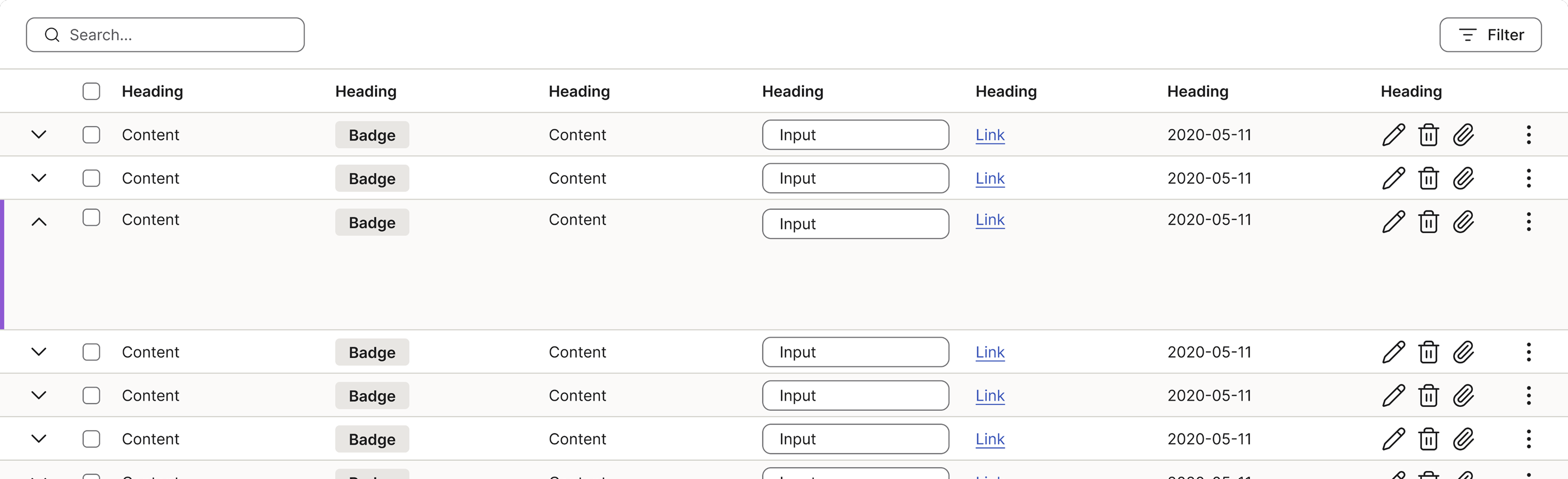
A row can have a white or neutral background colour when it is expanded, depending on the original background colour of the row.
Numeric data alignment
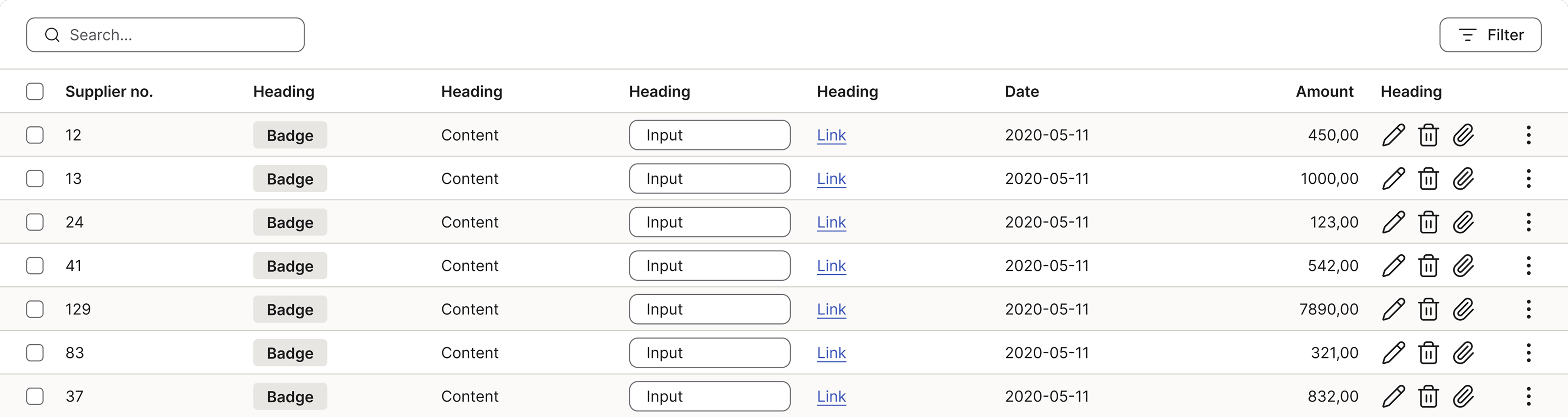
Right-align numbers that represent a quantitative value or an amount to make them easy to compare. Also make sure that the heading follows the alignment of the data.
Examples: amount, VAT, quantities, and percentages.
Left-align numbers used as labels or names to follow the natural reading path.
Examples: entry numbers, supplier numbers, verification numbers, dates.
Accessibility
Keyboard interaction
Tab only lands on elements that are actually interactive within the table - filters, checkboxes, buttons and links. Tab order follows the reading order: left to right, top to bottom. Plain data cells do not receive focus; screen reader users read the data with their own table-navigation commands, not Tab.
Managing focus when content changes
- Deleting a row: move focus to a sensible neighbour - the same control on the next row, or the previous row if it was the last one.
- Sorting/filtering: keep focus on the control that triggered it, so the user can continue right away.
Skip to pagination
When pagination sits at the bottom, provide a skip link so keyboard users can jump past all the rows straight to the pagination instead of tabbing through every row:
- Hidden until needed: it sits first in the table (after the filters) but only appears when a keyboard user tabs to it, then as a clearly focused element.
- Labelled “Skip to pagination”: activating it moves focus straight to the pagination, skipping the rows. To enter the rows instead, the user simply keeps tabbing.
Accessible table name & headers
Every table needs a descriptive accessible name, e.g. “Supplier invoices, 42 rows”. It tells a screen reader user which table they’re in and lets them jump to it. A proper header row is required. As a screen reader user moves through the data, each cell is announced together with its header - so they always know which column and row they’re in, just as a sighted user does at a glance.

Best practices
Numeric alignment
| Amount |
|---|
| 100,00 |
| 3000,00 |
| 40,50 |

Right-align numbers that represent quantities to make them easier to compare.
| Amount |
|---|
| 100,00 |
| 3000,00 |
| 40,50 |

Don’t left-align amounts - misaligned digits are hard to scan and compare.
| Entry no. |
|---|
| 13 |
| 15 |
| 9 |
Always left-align numbers used as labels or identifiers to follow the natural reading path.
| Entry no. |
|---|
| 13 |
| 15 |
| 9 |
Avoid right-aligning labels or identifiers, as it creates uneven gaps and makes the list harder to scan.
| Amount |
|---|
| 100,00 |
| 3000,00 |
| 40,50 |
Ensure the heading aligns with the content.
| Amount |
|---|
| 100,00 |
| 3000,00 |
| 40,50 |
Don’t left-align the heading if the content is right-aligned.
Specs
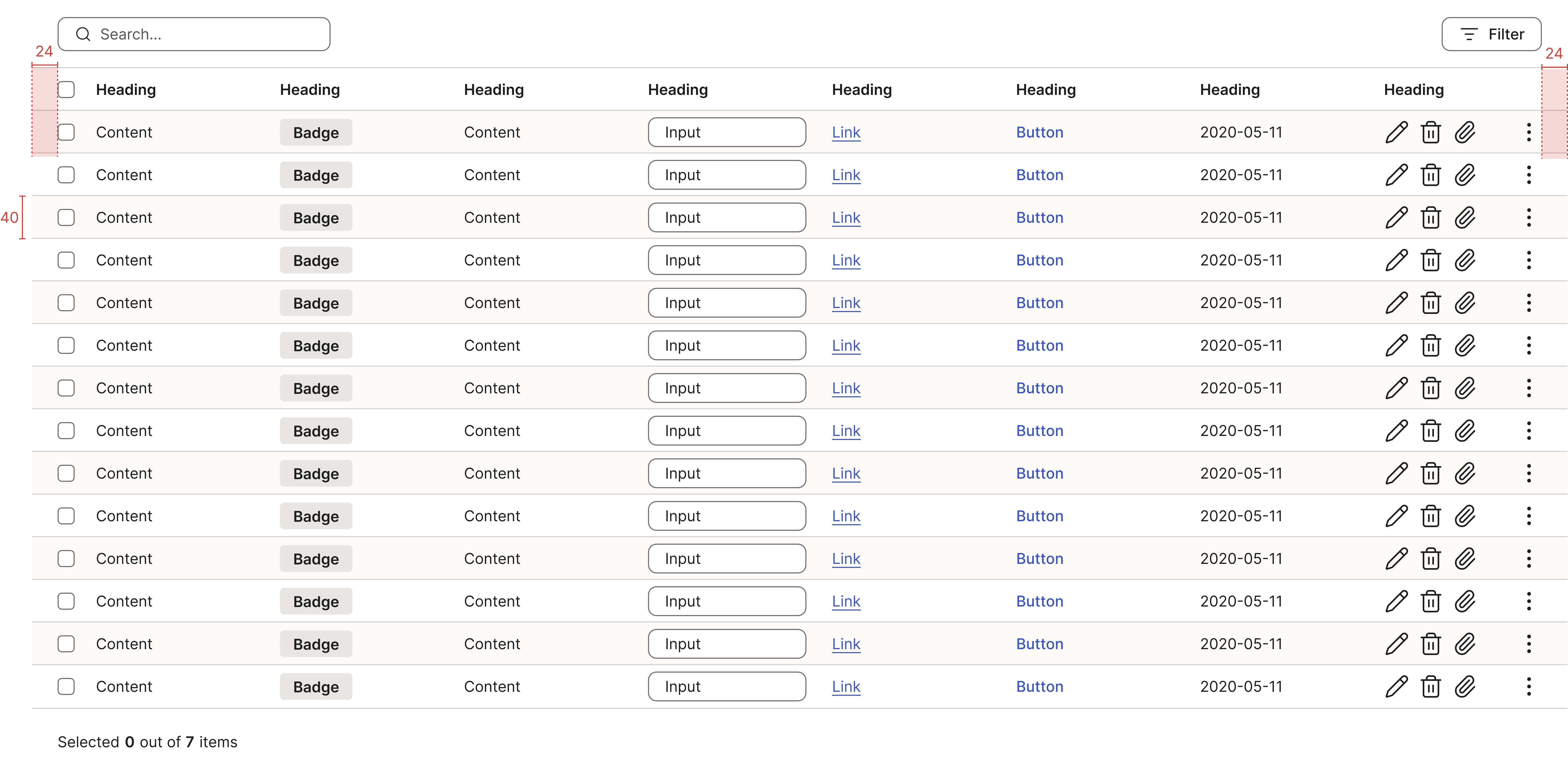
Developer reference
The following sections describe supported functionality and implementation details that are not part of the Figma design specification.
Design
For the default styling — light padding, zebra striping and horizontal dividers — add the base class .table to any <table>.
| # | First Name | Last Name | Username |
|---|---|---|---|
| 1 | Mark | Otto | @mdo |
| 2 | Jacob | Thornton | @fat |
| 3 | Larry | the Bird | |
| 4 | Stan | Lucas | @mdo |
| 5 | Ben | Johnas | @fat |
| 6 | John | Snow | @fb |
| Users listed in this table: 6 |
|
||
Plain tables
For plain styling — light padding and no striped rows or horizontal dividers — add the class .table-plain (together with the base class) to any <table>.
| # | First Name | Last Name | Username | |
|---|---|---|---|---|
| 1 | Mark | Otto | @mdo | |
| 2 | Jacob | Thornton | @fat | |
| 3 | Larry | the Bird | ||
| 4 | Stan | Lucas | @mdo | |
| 5 | Ben | Johnas | @fat | |
| 6 | John | Snow | @fb | |
Size
Table grid size variants:
- Condensed table: 32px row height
- Default table: 40px row height
- Regular table: 48px row height
- Relaxed table: 56px row height
Condensed table
Add .table-condensed to make tables more compact by cutting cell padding.
| # | First Name | Last Name | Username |
|---|---|---|---|
| 1 | Mark | Otto | @mdo |
| 2 | Jacob | Thornton | @fat |
| 3 | Larry | the Bird | |
| 4 | Stan | Lucas | @mdo |
| 5 | Ben | Johnas | @fat |
| 6 | John | Snow | @fb |
Regular size table
Add .table-regular for a 48px row height.
| # | First Name | Last Name | Username |
|---|---|---|---|
| 1 | Mark | Otto | @mdo |
| 2 | Jacob | Thornton | @fat |
| 3 | Larry | the Bird | |
| 4 | Stan | Lucas | @mdo |
| 5 | Ben | Johnas | @fat |
| 6 | John | Snow | @fb |
Relaxed size table
Add .table-relaxed for a 56px row height.
| # | First Name | Last Name | Username |
|---|---|---|---|
| 1 | Mark | Otto | @mdo |
| 2 | Jacob | Thornton | @fat |
| 3 | Larry | the Bird | |
| 4 | Stan | Lucas | @mdo |
| 5 | Ben | Johnas | @fat |
| 6 | John | Snow | @fb |
Table toolbar
Add .table-toolbar to a <div> placed immediately before the <table> (or before its .table-responsive wrapper) to add the controls bar — search, filters, a title and actions. It is deliberately a sibling of the table, not part of <thead>: keeping the controls outside the grid means assistive technologies do not announce them as table cells. The shared surface and soft shadow connect the toolbar to the table, while its bottom divider separates it from the column headers. Controls inside the toolbar render at the compact 32px height. Use only one primary action per toolbar.
Add .table-toolbar-stacked for the expanded-filter layout (a “Filter by” row beneath the primary controls). See Table header variants for the full set of layouts.
| First name | Last name | Username |
|---|---|---|
| Mark | Otto | @mdo |
| Jacob | Thornton | @fat |
| Larry | the Bird |
Table footer
Add a <tfoot> to show a summary row at the bottom of the table, such as a total. Put the label on the left and the value on the right, lined up with its column, and right-align amounts so they are easy to compare. A divider above the footer separates it from the rows. Only use it when the table has a value worth summing up.
Pagination
When a table holds more rows than fit comfortably on one view, split it across pages and put the pagination component in the table footer — a <tfoot> cell that spans the full width supplies the divider and spacing. See the pagination page for the full API and behaviour.
| # | First name | Last name | Username |
|---|---|---|---|
| 1 | Mark | Otto | @mdo |
| 2 | Jacob | Thornton | @fat |
| 3 | Larry | the Bird | |
Table row state
Hover, active/selected and error states for table rows.
Hover on rows
Add the class .table-hover to your table.
| # | First Name | Last Name | Username |
|---|---|---|---|
| 1 | Mark | Otto | @mdo |
| 2 | Jacob | Thornton | @fat |
| 3 | Larry | the Bird | |
| 4 | Stan | Lucas | @mdo |
| 5 | Ben | Johnas | @fat |
| 6 | John | Snow | @fb |
Selected rows
Add the class .table-active to your table and .active to the selected <tr>. The selected row shows the selection marker on its left edge; row hover applies too.
| # | First Name | Last Name | Username |
|---|---|---|---|
| 1 | Mark | Otto | @mdo |
| 2 | Jacob | Thornton | @fat |
| 3 | Larry | the Bird | |
| 4 | Stan | Lucas | @mdo |
| 5 | Ben | Johnas | @fat |
| 6 | John | Snow | @fb |
Error validation table row
Add the .has-error class to the table row (<tr>). To indent the error icon, wrap it in a container with the .indent-error class; the indent works only for the first table cell.
| # | First Name | Last Name | Username |
|---|---|---|---|
| 1 | Mark | Otto | @mdo |
| 2 - (with tr.has-error) | Jacob | Thornton | @fat |
| 3 | Stan | Lucas | @mdo |
| 4 - (without tr.has-error) | Ben | Johnas | @fat |
Add the .px-32 helper class to the table tag to include the indent inside the table borders but outside the cell.
| # | First Name | Last Name | Username |
|---|---|---|---|
| 1 | Mark | Otto | @mdo |
| 2 | Jacob | Thornton | @fat |
| 3 | Stan | Lucas | @mdo |
| 4 | Ben | Johnas | @fat |
Disabled table row
Add the .disabled class to a table row (<tr>) to give it a muted background and text colour. This only changes the row’s appearance — it does not disable the controls inside the row, so disable any interactive elements (links, buttons, inputs) yourself so the row is genuinely non-interactive.
The cursor follows the table’s interactivity: in an interactive table (.table-hover or .table-active) a disabled row shows a not-allowed cursor; in a plain, non-interactive table the disabled row keeps the default arrow cursor.
Interactive table
In an interactive table (.table-hover or .table-active) the disabled row shows a not-allowed cursor.
| # | First name | Last name | Username |
|---|---|---|---|
| 1 | Mark | Otto | @mdo |
| 2 | Jacob | Thornton | @fat |
| 3 | Larry | the Bird |
Non-interactive table
In a plain, non-interactive table the disabled row keeps the default arrow cursor.
| # | First name | Last name | Username |
|---|---|---|---|
| 1 | Mark | Otto | @mdo |
| 2 | Jacob | Thornton | @fat |
| 3 | Larry | the Bird |
Inline actions
Inline actions give immediate access to the most common operations on a row without selecting it first. Place a kebab (“more”) menu in the last column: a .btn-icon.dropdown-toggle with the spirisicon-vertical-menu icon that opens a .dropdown-menu of row-scoped actions. Keep the actions directly related to that row’s data (for example Edit or Delete).
| First name | Last name | Username | Actions |
|---|---|---|---|
| Mark | Otto | @mdo |
|
| Jacob | Thornton | @fat |
|
| Larry | the Bird |
|
Expanded background
An expandable row’s panel inherits the resting background of the row it belongs to: white when the row is white, neutral when the row is the alternate (zebra) row. Match the expandable content cell’s background to its parent row so the panel reads as part of that row.
| Expand | Name | Role |
|---|---|---|
| Mark Otto | Manager | |
|
The expanded panel keeps a white background because the row it belongs to is white. |
||
| Jacob Thornton | Developer | |
|
The expanded panel uses the neutral background because the row it belongs to is the alternate (zebra) row. |
||
Responsive tables
Wrap any .table in .table-responsive to make it scroll horizontally on small devices (under 992px).
| # | First Name | Last Name | Username |
|---|---|---|---|
| 1 | Mark | Otto | @mdo |
| 2 | Jacob | Thornton | @fat |
| 3 | Larry | the Bird | |
| 4 | Stan | Lucas | @mdo |
| 5 | Ben | Johnas | @fat |
| 6 | John | Snow | @fb |
Table without zebra striping
Tables use zebra striping (alternating row colour) by default for improved readability. If really needed, add the class .layout-table together with the other classes to disable zebra striping.
| # | First Name | Last Name | Username |
|---|---|---|---|
| 1 | Mark | Otto | @mdo |
| 2 | Jacob | Thornton | @fat |
| 3 | Larry | the Bird | |
| 4 | Stan | Lucas | @mdo |
| 5 | Ben | Johnas | @fat |
| 6 | John | Snow | @fb |
| Users listed in this table: 6 |
|
||
Demo table
An interactive table demonstrating selection, the “selected x out of y” footer and expandable rows. The behaviour is wired up with a custom demo script for documentation purposes only.
| Expand |
|
First Name | Last Name | Username |
|---|---|---|---|---|
|
|
Mark | Otto | @mdo | |
|
Click to see the error message
|
|
Jacob | Thornton | @fat |
|
|
Larry | the Bird | ||
Summary:Lorem ipsum dolor sit amet, consectetur adipiscing elit. Curabitur quis nisi eleifend, sagittis ligula tempor, facilisis ligula. Integer non nunc non tortor faucibus mattis porttitor ac massa vestibulum vel ipsum vitae. Sed fringilla consequat libero, blandit pulvinar metus lobortis sit amet.
Skills:
Designer
Level:
85%
|
||||
|
|
Stan | Lucas | @mdo | |
|
|
John | Snow | @fb | |
|
|
Ben | Johnas | @fat | |
| Selected: 0 out of 6 items |
|
|||
Additional examples
These examples are also used by our Playwright CSS property assertion tests.
Bordered table
Add .table-bordered to add a border around the entire table, useful when placing tables on a white background.
| # | First Name | Last Name | Username |
|---|---|---|---|
| 1 | Mark | Otto | @mdo |
| 2 | Jacob | Thornton | @fat |
| 3 | Larry | the Bird | |
| 4 | Stan | Lucas | @mdo |
Sticky header
Add .table-header-sticky to make the header row stick to the top of a scrollable container.
| # | First Name | Last Name | Username |
|---|---|---|---|
| 1 | Mark | Otto | @mdo |
| 2 | Jacob | Thornton | @fat |
| 3 | Larry | the Bird | |
| 4 | Stan | Lucas | @mdo |
| 5 | Ben | Johnas | @fat |
| 6 | John | Snow | @fb |
Sticky first column
Add .table-first-column-sticky to make the first column stick when scrolling horizontally.
| # | First Name | Last Name | Username | Phone | |
|---|---|---|---|---|---|
| 1 | Mark | Otto | @mdo | [email protected] | 555-0101 |
| 2 | Jacob | Thornton | @fat | [email protected] | 555-0102 |
| 3 | Larry | the Bird | [email protected] | 555-0103 | |
| 4 | Stan | Lucas | @mdo | [email protected] | 555-0104 |
Sticky last column
Add .table-last-column-sticky to make the last column stick when scrolling horizontally.
| # | First Name | Last Name | Username | Actions | |
|---|---|---|---|---|---|
| 1 | Mark | Otto | @mdo | [email protected] | Edit |
| 2 | Jacob | Thornton | @fat | [email protected] | Edit |
| 3 | Larry | the Bird | [email protected] | Edit | |
| 4 | Stan | Lucas | @mdo | [email protected] | Edit |