
Dropdown
 The guideline content on this page is synced with Figma and can be used as a source of truth.
Open in Figma
The guideline content on this page is synced with Figma and can be used as a source of truth.
Open in Figma
A dropdown presents a user with a predetermined list (dataset) from which they can select one value.
Anatomy
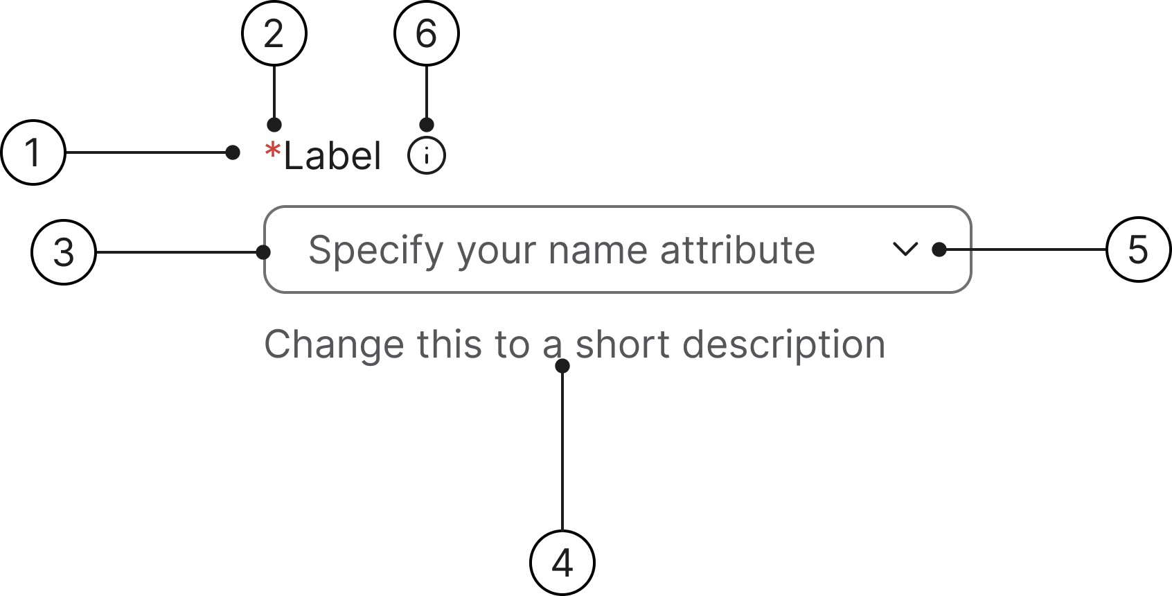
- Label
- Mandatory (optional)
- Container
- Helper text
- Dropdown icon
- Info icon (optional)
States
- Enabled
- Hover
- Selected
- Error
- Error focused
- Read only
- Disabled
- Focused
Change this to a short description
Change this to a short description
Change this to a short description
Change this to a short description
Change this to a short description
Change this to a short description
Change this to a short description
Change this to a short description
Label
A label is mandatory for all text fields and should describe the field's purpose. Labels are included by default. If another element (such as a section title) already serves as a clear description, the default label can be visually hidden.
Change this to a short description
Helper text
Helper text communicates requirements and disclaimers below the field. An error message will always replace the helper text when a field validation error is triggered.
Change this to a short description
Required/optional fields
We use an asterisk to indicate a field is required.
The convention of using a red asterisk (*) in a label to denote a required field is a long-standing and widely adopted practice in User Experience (UX) and form design.
Error message
Upon validation failure, the helper text is replaced by a concise error message. This message includes an error icon and provides direct instructions to help the user satisfy the requirements.
Select a value for this item
Max width
Dropdown buttons and menus have a max width of 520px.
Accessibility
Keyboard interaction
All buttons should be reachable via TAB and SHIFT+TAB keys.
Change this to a short description
Specs
Developer reference
The following sections describe supported functionality that is not part of the Figma design specification.
The open/close and Arrow Up/Arrow Down keyboard navigation behaviour is not provided. The documentation has a demo script that you can draw inspiration from in your work.
Basic design
The dropdown component uses a <button> element with the .dropdown-toggle and .dropdown-field classes inside a .dropdown container. The dropdown menu uses the standard .dropdown-menu with .dropdown-item list items.
Wrap the dropdown in a .form-group with a <label> for proper accessibility and form integration.
Helper text for this dropdown field
Selected value
When a value is selected, add the .has-value class to the trigger button. This changes the text colour from placeholder (secondary) to primary. Update the button text to show the selected value.
A value has been selected
Info icon
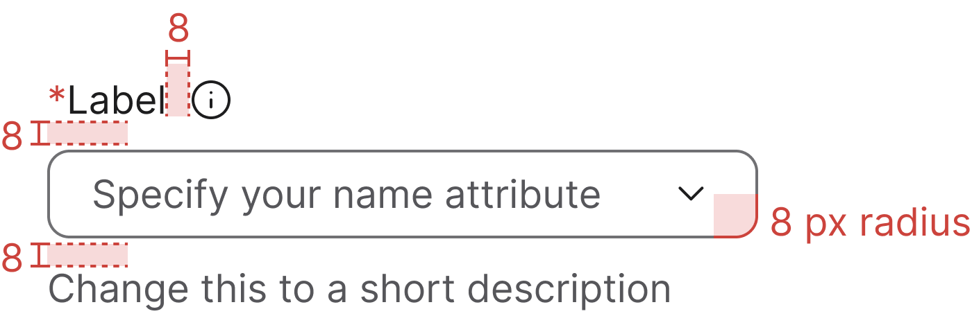
Wrap the <label> and an info icon in .label-with-info to place the icon beside the label with the 8 px gap from the Figma anatomy. On hover or keyboard focus, the tooltip opens upwards (data-bs-placement="top") to reveal the supporting text.
Keep the icon outside the <label for> so clicking the icon does not toggle the dropdown, and mirror the tooltip text into a visually-hidden element that the trigger references via aria-describedby — that way assistive tech users hear the same help text without depending on the tooltip.
Tooltip behaviour relies on Bootstrap's tooltip plugin (with Popper for positioning). See the Tooltip page for setup details.
Change this to a short description
Provide a clear, concise description so users understand what to select.