
Spinner
 The guideline content on this page is synced with Figma and can be used as a source of truth.
Open in Figma
The guideline content on this page is synced with Figma and can be used as a source of truth.
Open in Figma
A spinner is an animated icon that indicates that content is loading.
Anatomy
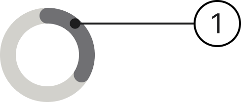
- Loading status: This indicates the state of the loading process.
Sizes
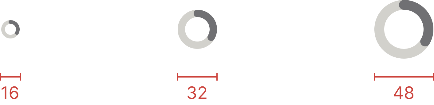
The spinner component comes in three sizes: small, medium and large.
Loading
Small
Loading
Medium
Loading
Large
Specs
Developer reference
The following sections describe supported functionality that is not part of the Figma design specification.
Use when
There are two types of work indicators, determinate and indeterminate.
- Use the determinate work indicator (progress bar) when there's either a clear endpoint for the process or some other way to track progress.
- Use an indeterminate work indicator (spinner, loading bar) when there's no clear endpoint or when it can't be known when the process will be finished. A typical case is waiting for a server response.
Helper classes for spinners
The default spinner is grey. You can include a spinner in your interface by adding a <span> with a .spinner class, which renders the large (48px × 48px) size. You can change the size by adding .spinner-sm for 32px × 32px or .spinner-xs for 16px × 16px.
Loading
Small
Loading
Medium
Loading
Large