
Icon button
 The guideline content on this page is synced with Figma and can be used as a source of truth.
Open in Figma
The guideline content on this page is synced with Figma and can be used as a source of truth.
Open in Figma
Used for when there is only an icon in a button — no visible text label.
Anatomy
- Icon
- Container

States
An icon button has the following states: enabled, hover, pressed, focused, and disabled. Three sizes are available; Medium (32 × 32) is the default. Use Large (40 × 40) for prominent placements and Small (24 × 24) in dense layouts.
Enabled
Hover
Pressed
Focused
Disabled
Icon
View available icons in the icon library. Avoid using icons that are not from the Spiris icon library — if you have any questions, contact the design system team.
Usage
Icon buttons are compact controls that direct and capture user action without needing a visible text label.
Use an icon button when the icon performs an action. The icon should be clickable and trigger something immediately, such as opening, closing, adding, deleting, or navigating.
Icon buttons are essential in dense layouts, such as tables and dashboards. Their small size allows for more actions to be visible before they need to be grouped into an overflow menu.
Recognisable icons
Icons used in icon buttons must be easily recognisable. Avoid using ambiguous icons that could have multiple meanings within the same context.
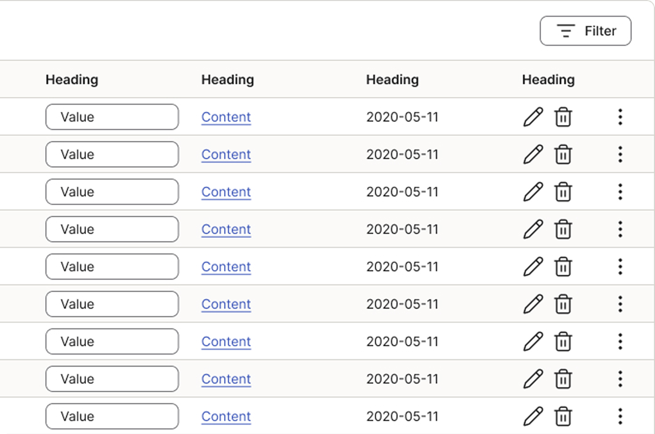
Behaviour
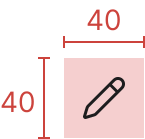
Touch area
The recommended minimum tap target is 40 × 40.
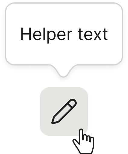
Tooltips
On hover or long-press, the label for an icon button can appear in a tooltip. Read more on the Tooltip documentation page.
Add new row
Use an icon button (typically with a Plus icon or similar add symbol) when users need to add a new row to an input field list, a table, or a form component. The icon button uses the minimal screen real estate required, which is essential in dense layouts where multiple rows may be present.
Change this to a short description.
The icon button to the right adds a new row to the list.Accessibility
Keyboard interaction
All buttons should be reachable via TAB and SHIFT+TAB keys.
Specs
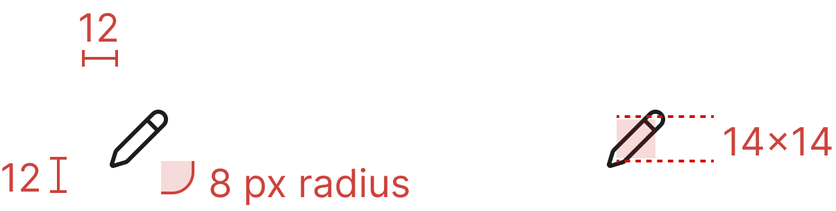
Developer reference
The following sections describe supported functionality that is not part of the Figma design specification.
Close and dismiss controls
Wherever a Spiris component dismisses with an icon, that control is an icon button with a spirisicon-close glyph and an aria-label="Close". (The one component that does not is the cookie banner on the login pages, which dismisses with a text button reading “OK”.) It replaces the .close helper class, which remains supported for standalone use but is not the dismiss control of any component.
Use Medium (.btn.btn-icon, 32×32) in a modal or drawer header, and Small (.btn.btn-icon.btn-sm with .spirisicon-sm, 24×24) inside an alert or a toast. Each of those components right-aligns and spaces the control from .btn-icon, so no positioning classes are needed.
Clearing a field's value (combobox, search fields) and removing a chip (multi-select combobox) reuse the same close glyph, but they are field-level controls owned by those components — follow each component's own page rather than treating them as dismiss controls.
Solid background
Add .btn-solid together with .btn-icon for a visually interactive icon button with a filled background. Useful when the icon button must read as a clearly distinct surface from its parent (for example over imagery or coloured backgrounds).
Icon button with solid background — .btn-icon.btn-solid
Shape variants
Solid icon buttons default to a rounded square (.btn-icon.btn-solid); add .btn-square to make this default explicit. It is the only shape modifier the icon button ships — there is no separate circle or squircle variant.
Square — .btn-icon.btn-solid.btn-square
Size variants
Three sizes are available: Large (40 × 40, add .btn-lg), Medium (32 × 32, default — no modifier), and Small (24 × 24, add .btn-sm). The Small size uses a 4 px border radius and a 16 × 16 icon — pair the .spirisicon span with .spirisicon-sm.
.btn-icon.btn-lg now renders Figma's Large size (40 × 40) — the legacy 48 × 48 path was dropped. .btn-icon with no modifier renders Medium (32 × 32) (was 40 × 40 previously).
Large — .btn-lg
Medium (default)
Small — .btn-sm
All sizes × all states
Combined showcase of all five states across the three transparent icon-button sizes (Large, Medium, Small). The Figma States section above only ships the Large reference; this matrix is for developer convenience when verifying parity.
Large
Enabled
Hover
Pressed
Focused
Disabled
Medium
Enabled
Hover
Pressed
Focused
Disabled
Small
Enabled
Hover
Pressed
Focused
Disabled
All states (solid)
Combined showcase of all states for solid icon buttons in Large, Medium and Small sizes.
Normal
:hover
:focus
:active / Pressed
:disabled