
Card
 The guideline content on this page is synced with Figma and can be used as a source of truth.
Open in Figma
The guideline content on this page is synced with Figma and can be used as a source of truth.
Open in Figma
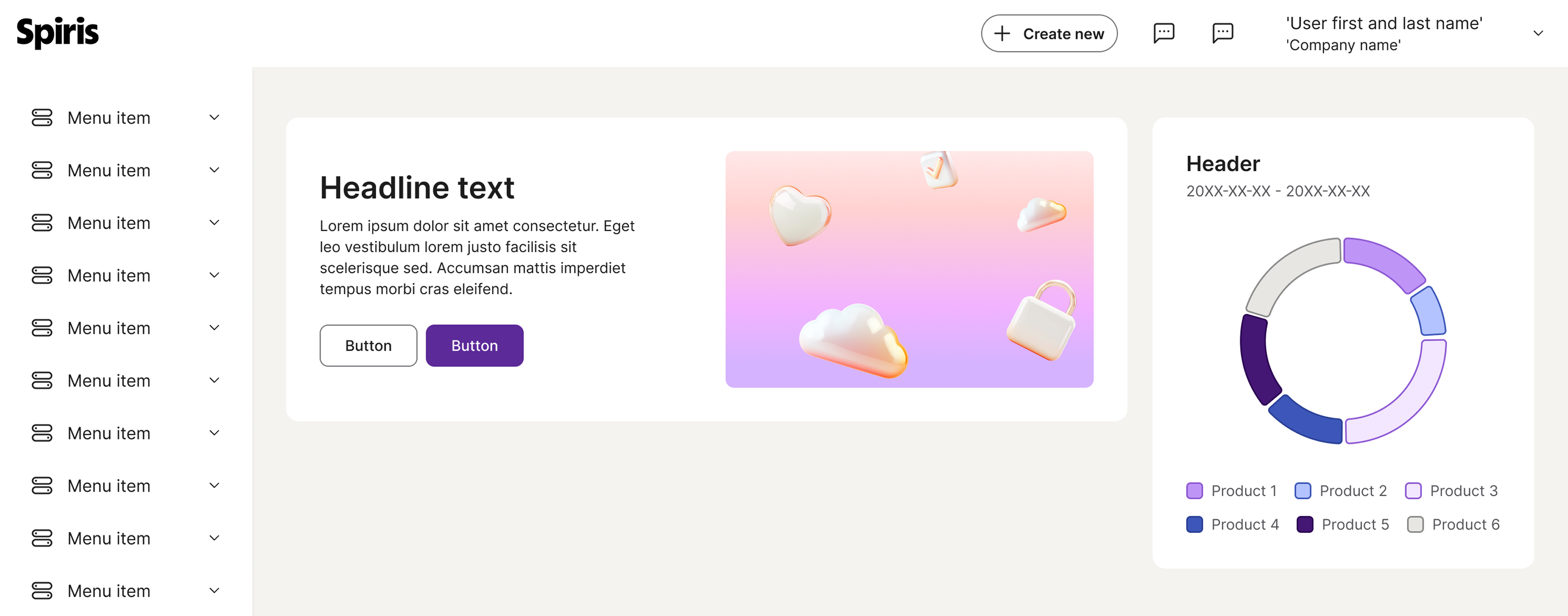
Cards are a way to display information, they can be part of a series or feed of similar content and function as a standalone unit. You can add text link or buttons to a card for primary action. This component is used on the dashboard.
Anatomy
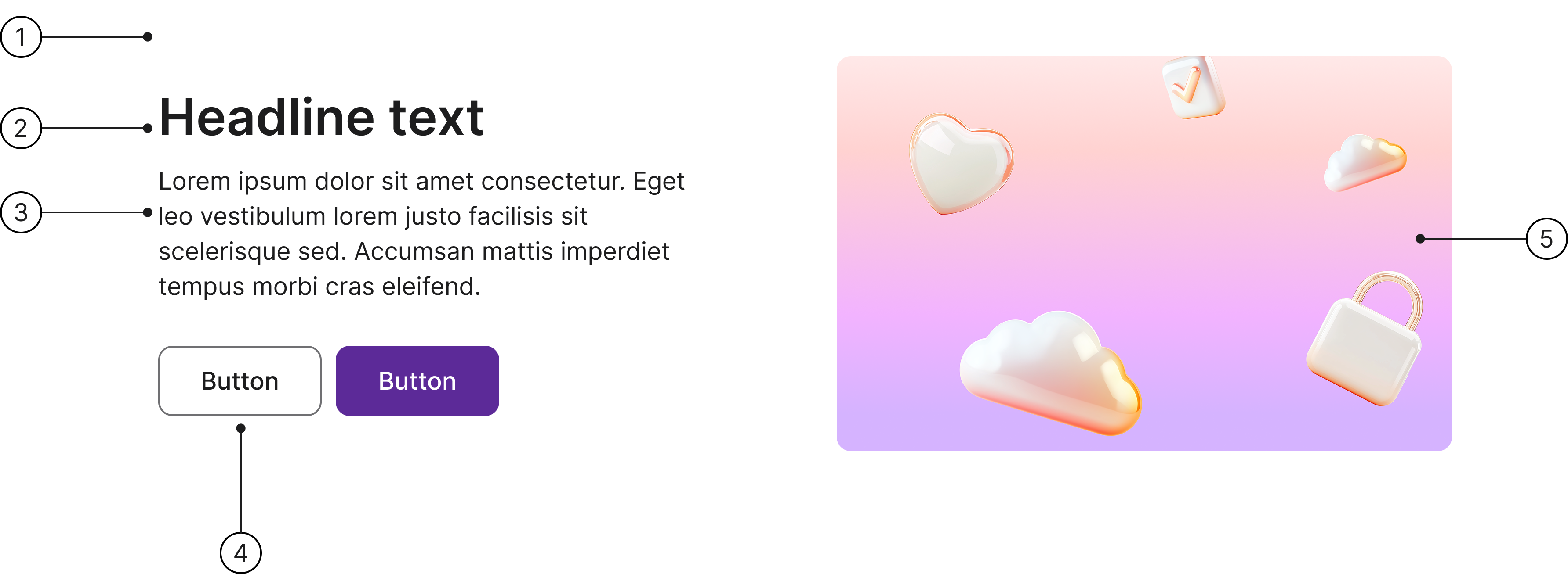
- Container
- Title
- Body
- Actions
- Media
Placement
This component is used on the dashboard.
Flexibility
Cards are flexible containers that group distinct content and actions.
Consistency
To ensure your cards look cohesive throughout the application, maintain consistency by following your design system's guidelines for typography, spacing, colours and borders.
Container
The card container serves as the definitive boundary for all card content and dictates its state. Its inherent flexibility allows it to adjust dynamically, responding to both the volume of content and the constraints of the surrounding user interface.
Although the card container is the sole required component of a card, ensure standard placement guidelines are followed for preview images, content areas, and actions.
If you want to make your own card, please use the "slot component" method.
Accessibility
Keyboard interaction
All components should be reachable via TAB and SHIFT+TAB keys.
Headline text
Lorem ipsum dolor sit amet consectetur. Eget leo vestibulum lorem justo facilisis sit scelerisque sed. Accumsan mattis imperdiet tempus morbi cras eleifend.

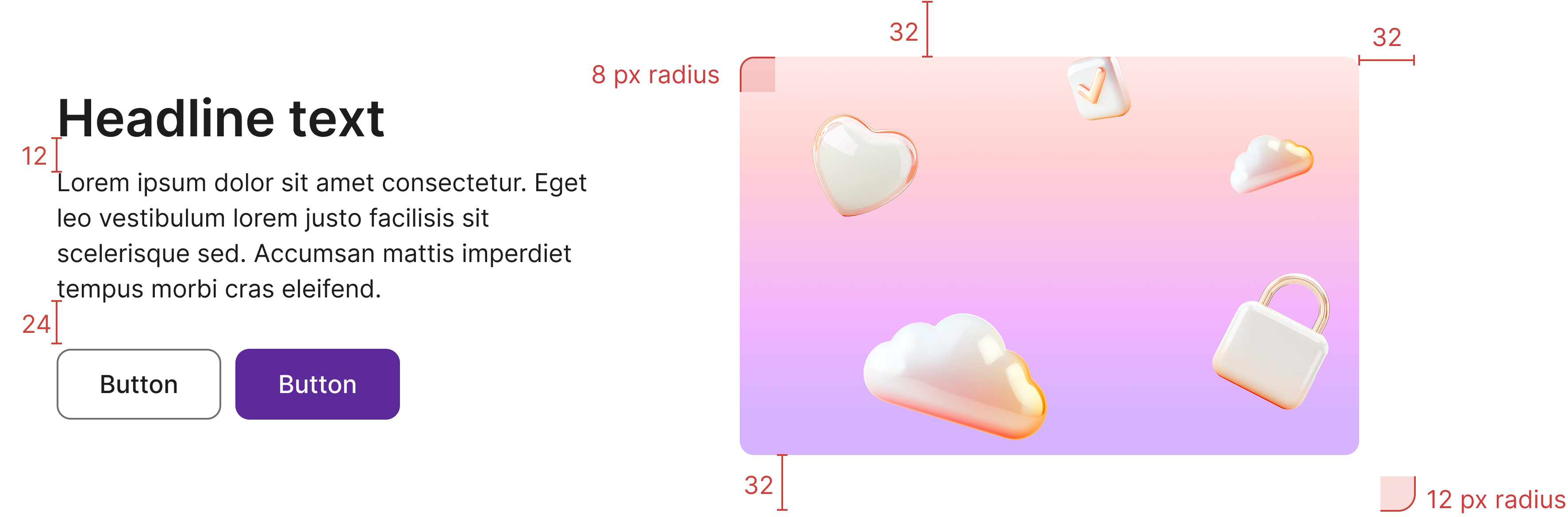
Specs
Developer reference
The following sections describe supported functionality that is not part of the Figma design specification.
Basic design
The hero card uses a flex-based layout together with Spiris helper classes (e.g. spacings, display, flex) and can be placed inside the grid system using standard column classes for better integration in your project.
Headline text
Lorem ipsum dolor sit amet consectetur. Eget leo vestibulum lorem justo facilisis sit scelerisque sed. Accumsan mattis imperdiet tempus morbi cras eleifend.
Stacked layout
For the image to appear below the hero card content, make the content full width using .flex-grow-1 and the illustration full width using .w-100. The card's flex-wrap will stack the illustration underneath.
Welcome, Smith
It's time to onboard a new team member in September. Preparations need to be done by tomorrow, 14 September 2022.
Options
Larger illustration
Add .hero-card-illustration-lg class to the illustration wrapper (.hero-card-illustration) to have a larger illustration.
Welcome, Smith
It's time to onboard a new team member in September. Preparations need to be done by tomorrow, 14 September 2022.