
Dropdown button
 The guideline content on this page is synced with Figma and can be used as a source of truth.
Open in Figma
The guideline content on this page is synced with Figma and can be used as a source of truth.
Open in Figma
A dropdown button shows a list of commands when activated; selecting one performs that command immediately. A dropdown item is a specific action a user can take, presented within a list of similar options.
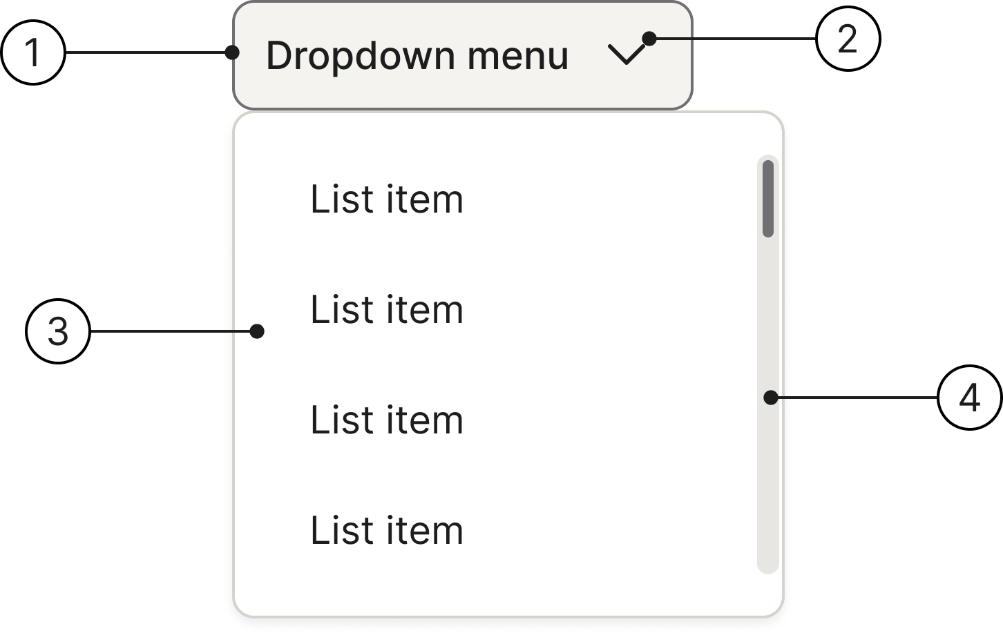
Anatomy
- Button
- Arrow icon
- Dropdown content
- Scrollbar
States
The dropdown button can have the following states.
- Enabled
- Hover
- Pressed
- Selected
- Disabled
- Focused
The static .hover, .focus, and .pressed helper classes (inherited from .btn) render each state without user interaction; the .open class on the wrapping .dropdown renders the Selected state.
Medium
Small
Sizes
We have two different sizes for our dropdown buttons (Medium and Small). They are designed so you can adjust the size of their content, ensuring visual balance. While their sizing can vary by context, they have a standard default size used throughout the product.
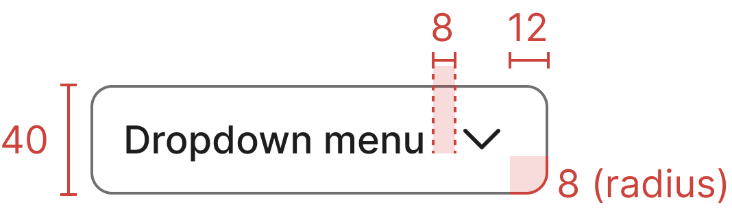
- Medium (default) — 40 px tall
- Small — 32 px tall, add
.btn-smto the trigger
Usage
Use a dropdown button when you have 5 to 15 items for users to choose from. They are ideal for navigation or command menus where the trigger initiates a specific action.
Content guidelines
- Keep dropdown items to a single line of text.
- Use sentence case for all labels.
Accessibility
Keyboard interaction
All components should be reachable via TAB and SHIFT+TAB keys.
Nested menus
When designing nested menus, try to limit them to two layers. Menus with more layers than that can be difficult for users to navigate and operate.
Best practices
Icon usage

Use icons consistently. This keeps text aligned, making the list of options easier for the eye to scan.

Avoid inconsistent icon use within the same list.
Specs
Developer reference
The following sections describe supported functionality that is not part of the Figma design specification.
Single button with dropdown
Wrap a .btn.dropdown-toggle in a .dropdown container, followed by a .dropdown-menu list of items. The menu reveals when the toggle is activated.
Use the static .active class on a menu item (and aria-selected="true") to mark the currently chosen option. Mix .divider rows between groups of items.
Disabled
Add the .disabled class to the wrapping .dropdown (or set the disabled attribute on the trigger button) to render the disabled state. The menu cannot be opened while disabled.
Drop-up
Use .dropup on the wrapper to open the menu above the trigger. The chevron points down when the menu is closed and up when it is open, the same as the standard dropdown — it indicates the open / closed state, not the direction the menu expands.
Scrollable menu
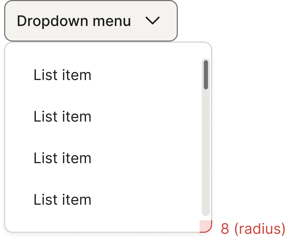
When the menu contains more items than fit within the Figma-mandated max-height: 280px, the menu scrolls vertically and a scrollbar appears on the right edge. No additional markup is needed — the scroll behaviour is provided by the base .dropdown-menu rule (overflow: clip auto).