
Tooltip
 The guideline content on this page is synced with Figma and can be used as a source of truth.
Open in Figma
The guideline content on this page is synced with Figma and can be used as a source of truth.
Open in Figma
Tooltips reveal an element’s label when it’s not otherwise visible.
Anatomy
- Label
- Container
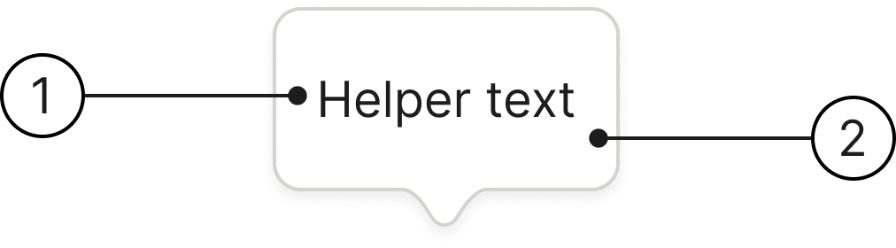
Arrow directions
The primary reason for having different arrow directions is adaptability. A tooltip should not overlap or obscure the interactive element it is describing, nor should it go off-screen. By changing the arrow’s direction — for example, pointing up when the tooltip is below the element, and down when it’s above — the design system ensures the tooltip is always positioned optimally.
Behaviour
Presentation
Tooltips appear while hovering or focusing on an anchor element. They fade out 1 second after the anchor element hover or focus.
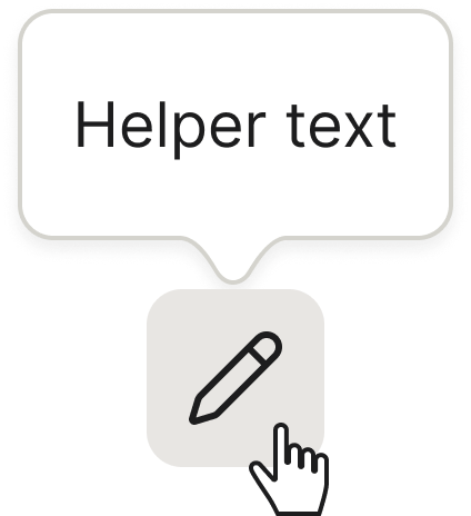
Label
The tooltip’s label is typically automatically filled by the anchor element’s accessible label.
Text copied
When a user copies text, a small, non-intrusive tooltip appears near the cursor or copied element, confirming that the action was successful.
Accessibility
Keyboard interaction
All components should be reachable via TAB and SHIFT+TAB keys.
The tooltip has no focus state of its own and is not focusable — focus always stays on the trigger and never moves into the tooltip.
Best practices

Only show one tooltip at a time.

Avoid overriding the default behaviour of tooltips to show multiple tooltips at once.
Specs
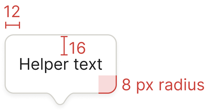
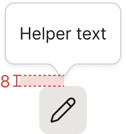
Developer reference
The following sections describe supported functionality that is not part of the Figma design specification.
For this component you need JavaScript! Bootstrap’s tooltip plugin handles positioning via Popper, which is already bundled into bootstrap.bundle.min.js — no separate Popper script is required. We recommend creating your own initialiser scripts following the structure from the examples below.
Usage
Add data-bs-toggle="tooltip" and a title to any anchor element, then initialise the tooltips with JavaScript. The design system styles the generated .tooltip markup — the white container, the directional arrow, and the four placements.
Hover over or focus the links below to see the tooltips.
Info icon
A common tooltip trigger is an info “i” icon beside a field label. The icon carries data-bs-toggle="tooltip" and a title, and is reachable with TAB via tabindex="0". Hover over or focus the icon below to reveal its tooltip.
Four directions
Set data-bs-placement to top, right, bottom, or left to control where the tooltip appears relative to its anchor. Hover over the buttons below to see each placement.
Placement names the tooltip, not the arrow. The placement value describes where the tooltip sits relative to its anchor — not the direction the arrow points. top places the tooltip above the anchor, so its arrow sits on the bottom edge pointing down; likewise bottom puts the arrow on the top edge, left on the right edge, and right on the left edge.
Figma’s Arrow directions guideline labels the same four variants by the direction the arrow points, which maps to: top = Below, bottom = Above, left = Right, right = Left.