
Text area
 The guideline content on this page is synced with Figma and can be used as a source of truth.
Open in Figma
The guideline content on this page is synced with Figma and can be used as a source of truth.
Open in Figma
Text areas are designed for multi-line input.
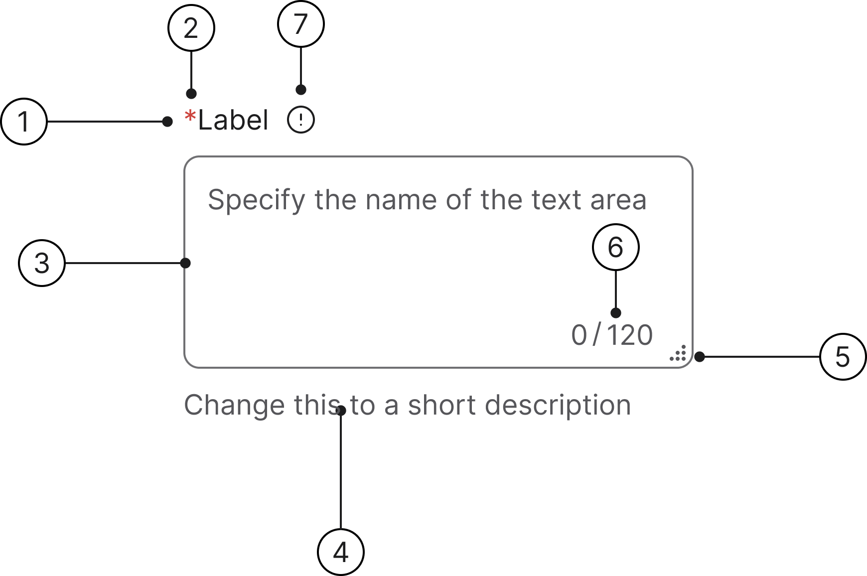
Anatomy
- Label
- Mandatory (optional)
- Container
- Helper text
- Resize indicator
- Character count
- Info icon (optional)
States
- Enabled
- Hover
- Selected
- Focused
- Error
- Error focused
- Disabled
- Read only
Label
A label is mandatory for all text areas and should describe the field's purpose. Labels are included by default. If another element (such as a section title) already serves as a clear description, the default label can be visually hidden.
Required/optional fields
We use an asterisk to indicate a field is required. The convention of using a red asterisk (*) in a label to denote a required field is a long-standing and widely adopted practice in User Experience (UX) and form design.
Helper text
Helper text communicates requirements and disclaimers below the field. An error message will always replace the helper text when a field validation error is triggered.
Character count
A character counter appears whenever there is a limit on the text input. The counter updates in real-time as the user types.
Resize
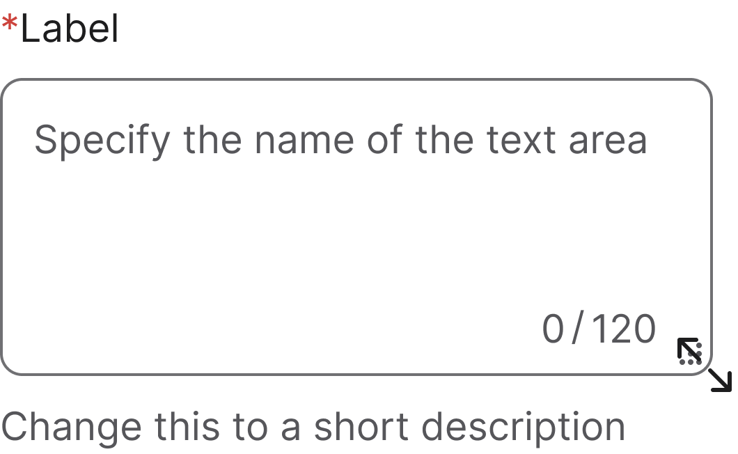
Text area fields automatically include a browser-added resize indicator in the lower right. Users can drag this corner to dynamically change the field's dimensions (width and height). This feature should be disabled when the resizing behaviour negatively impacts the layout.
Error message
An error message appears beneath a field when the user either leaves a required field empty or submits an invalid value. This message replaces any existing helper text.
Accessibility
Keyboard interaction
All text areas should be reachable via Tab and Shift+Tab keys.
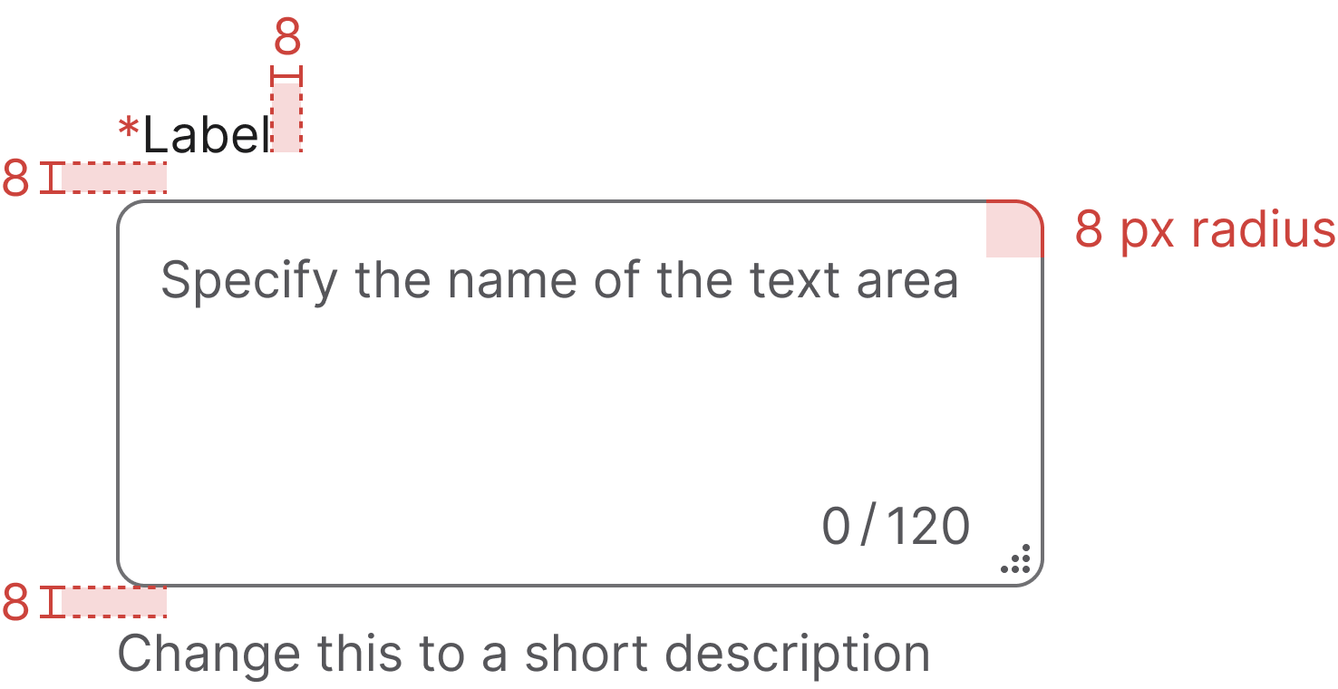
Specs
Developer reference
The following sections describe supported functionality that is not part of the Figma design specification.
Demo enabled on this page! The enhanced keyboard-focus behaviour is active on this page — the .keyboard-focus class is added to each .form-group while a control is keyboard-focused, and removed on blur, click or typing. Try pressing Tab to navigate through the form fields. Read more in the Forms accessibility guidelines.
Tab vs click focus
New in 2.5Textareas paint two visually distinct focus states depending on how focus arrived:
- Click places the caret and paints a 1 px purple Selected border (cursor-active).
- Tab paints a 2 px blue Focused border (tabbed-in but not yet interacted with).
The runtime distinction is driven by keyboard-focus.js, which adds .keyboard-focus to the parent .form-group while the user is keyboard-navigating and removes it on click or typing. Without .keyboard-focus, :focus always paints the Selected look — so the same CSS selector evaluates to two different appearances.
The static .focus and .selected helper classes mirror these two looks for documentation chips and JS-driven state demos:
.focus→ 2 px blue (keyboard-focused look).selected→ 1 px purple (mouse-focused / cursor-active look)
Try clicking into the example on the right, then tabbing in and out — the border colour and width will change accordingly.
Textarea wrapper
New in 2.5The .textarea-wrapper is a positioning shell used only when a character counter overlay is needed. It provides the position: relative flex container the .textarea-counter anchors to so the counter can sit inside the textarea's visual box.
The <textarea> itself owns all of its visual styling — borders, background, border-radius, focus ring, hover, selected, disabled, readonly, and error states. State classes (.hover, .selected, .focus, .disabled, .readonly) belong on the textarea, not the wrapper.
Use the wrapper when you need a counter; use a plain <textarea class="form-control"> when you don't.
With wrapper (counter overlay)
Without wrapper
Character count implementation
Use the native maxlength attribute on the <textarea> to enforce the limit.
The character count requires JavaScript to update in real-time. The design system provides the CSS styling only — the consuming application is responsible for implementing the counting logic and updating the .textarea-counter-current element.
Implementation guidance
The recommended pattern for framework components (React, Angular, Vue, etc.) is to check the maxlength attribute on the <textarea> element. If maxlength is present, wrap the textarea in .textarea-wrapper, render the .textarea-counter element next to it, and update the current count on input. If maxlength is absent, omit both the wrapper and the counter — a plain <textarea class="form-control"> is sufficient.
Without counter
Accessibility implementation
Always associate a <label> with the <textarea> using matching for and id attributes.
Info icon
Wrap the <label> and an icon <button> in .label-with-info to place the info icon beside the label with the 8 px gap from the Figma anatomy. On hover or keyboard focus, the tooltip opens upwards (data-bs-placement="top") to reveal the supporting text.
Keep the button outside the <label for> so clicking the icon does not focus the textarea, and mirror the tooltip text into a visually-hidden element that the textarea references via aria-describedby — that way assistive tech users hear the same help text without depending on the tooltip.
Tooltip behaviour relies on Bootstrap's tooltip plugin (with Popper for positioning). See the Tooltip page for setup details.
Basic design
Default
A basic text area with a label. Apply the .form-control class to the <textarea> element. Use the rows attribute to set the initial visible height.
Additional examples
The following examples are also used by our Playwright CSS property assertion tests.
Keyboard focus — wrapped vs bare textarea
Demonstrates the keyboard-focus indicator on both wrapped and bare textareas, including error states.