
Combobox
 The guideline content on this page is synced with Figma and can be used as a source of truth.
Open in Figma
The guideline content on this page is synced with Figma and can be used as a source of truth.
Open in Figma
The combobox merges a standard text field with a popover menu. This allows users to either filter and select an option from a predefined list or enter a custom value not already present in the options.
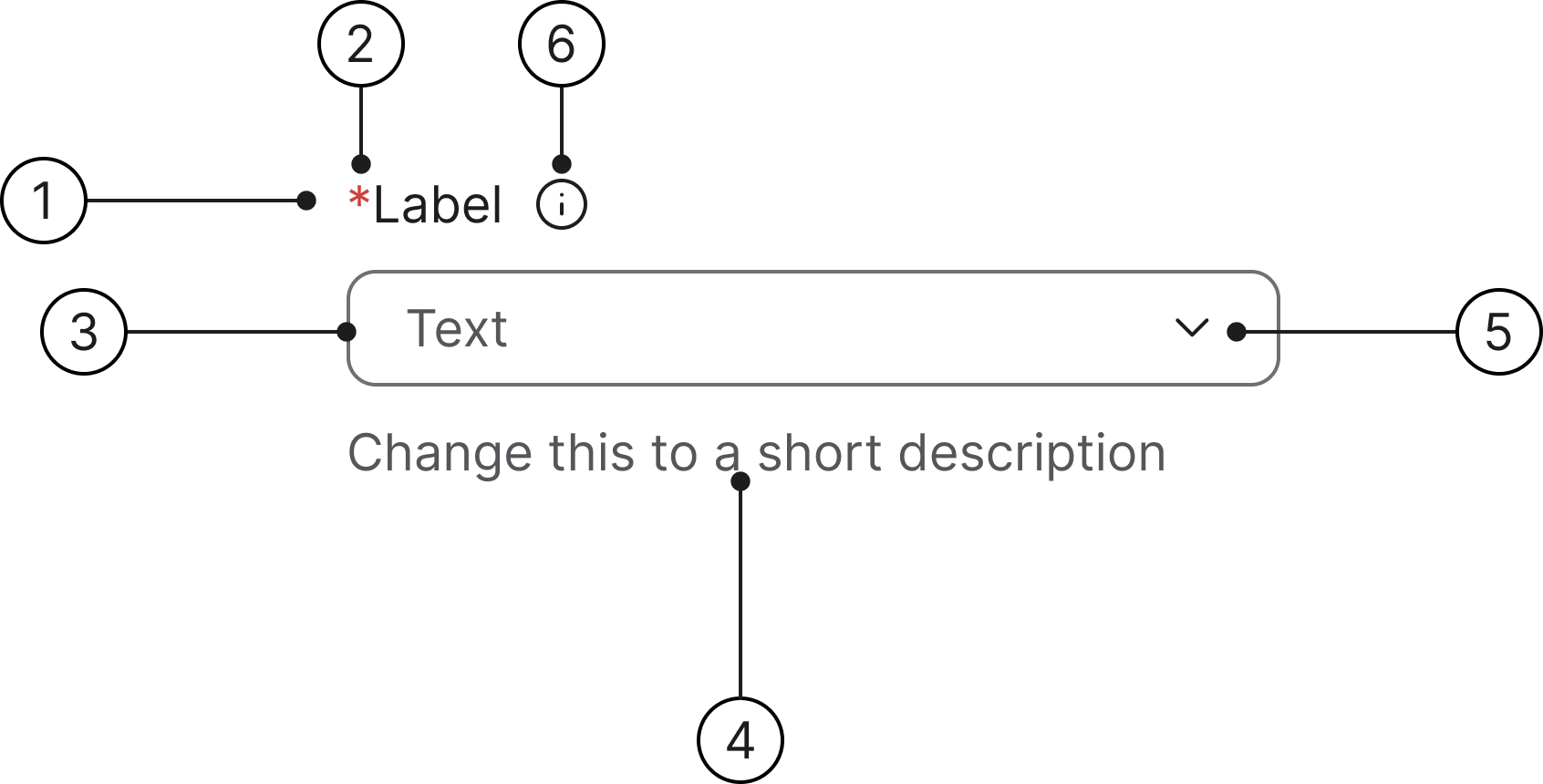
Anatomy
- Label
- Mandatory (optional)
- Container
- Helper text
- Dropdown button
- Info icon (optional)
States
- Enabled
- Hover
- Focused
- Selected
- No results
- Error
- Error focused
- Read only
- Disabled
- Option selected
Enabled
Hover
Focused
Selected
No results
This field is required
This field is required
Read only
Disabled
Option selected
Single-select
Upon selection in a single-select combobox, the system immediately hides the menu and registers the chosen value. This value is then displayed as the sole content within the input field.
Label
A label is mandatory for all text fields and should describe the field's purpose. Labels are included by default. If another element (such as a section title) already serves as a clear description, the default label can be visually hidden.
Helper text
Helper text communicates requirements and disclaimers below the field. An error message will always replace the helper text when a field validation error is triggered.
Required/optional fields
We use an asterisk to indicate a field is required.
The convention of using a red asterisk (*) in a label to denote a required field is a long-standing and widely adopted practice in User Experience (UX) and form design.
No search results
When a user types a value that does not match any option in the list, the combobox will display zero results. The popover menu will either close or show a "No results found" message, clearly indicating that the entered text did not successfully filter the predetermined dataset.
Accessibility
Keyboard interaction
All combobox controls should be reachable via Tab and Shift+Tab keys.
Specs
Developer reference
The following sections describe supported functionality that is not part of the Figma design specification.
The functionality for this component, i.e. the script, is not provided. The documentation has a demo functionality that you can draw inspiration from in your work.
Demo enabled on this page! The enhanced keyboard-focus behaviour is active on this page — the .keyboard-focus class is added to each .form-group while a control is keyboard-focused, and removed on blur, click or typing. Try pressing Tab to navigate through the form fields. Read more in the Forms accessibility guidelines.
Single selection
See the filtering data mechanism when the data set is visible before filtering, or autocomplete for common search behaviour.
As soon as the user has started typing in the text field, an "x" icon is shown to remove the typed text and revert suggestions to those shown for an empty search string.
When the combobox is closed, it shows the selected option (if any).
You need to be able to navigate in the dropdown box with the keyboard (in the example is used: Arrow Down, Arrow Up, Page Up, Page Down, End, Home, Esc, and for select Enter).
Info icon
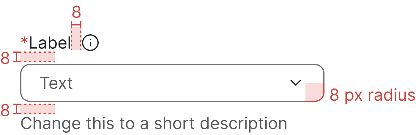
Wrap the <label> and an info icon in .label-with-info to place the icon beside the label with the 8 px gap from the Figma anatomy. On hover or keyboard focus, the tooltip opens upwards (data-bs-placement="top") to reveal the supporting text.
Keep the icon outside the <label for> so activating it does not focus the combobox input, and mirror the tooltip text into a visually-hidden element that the input references via aria-describedby so assistive-tech users hear the same help text without depending on the tooltip.
Tooltip behaviour relies on Bootstrap's tooltip plugin (with Popper for positioning). See the Tooltip page for setup details.
Multiple selection
For the multiple selection the selected option is shown as a tag (chip) in the textbox, and after a selection, the combobox remains open.
For the multi-select documentation and guidelines, see Combobox multi select.
Header and footer sections
By adding a wrapper with .combobox-dropdown-header or .combobox-dropdown-footer class inside the .combobox-dropdown will create a header or footer zone, for additional controls.
Disabled state
For a proper disabled state for the combobox follow the code snippet below (it is recommended to add a disabled attribute to the input as well).
Error state
For error (on validation) on the combobox you need to add .has-error class as in the code snippet below.
Read-only state
Add the .readonly class (or the native readonly attribute on the input) to render the combobox in its read-only state. The value remains visible and selectable, but not editable.
Combogrid
Combogrid allows the user to select one item out of a set of predefined options. It is similar to the combobox, but contains more information in the form of more than one column and is presented as a grid instead of a list. Combogrids also allow text entry to search from a very long list of options or to add items that are not present in the list.
| ID | Name | Address | City | Country |
|---|