
Pagination
 The guideline content on this page is synced with Figma and can be used as a source of truth.
Open in Figma
The guideline content on this page is synced with Figma and can be used as a source of truth.
Open in Figma
Use pagination to navigate a large, ordered collection of items or pages. The users click buttons to move between pages.
Anatomy
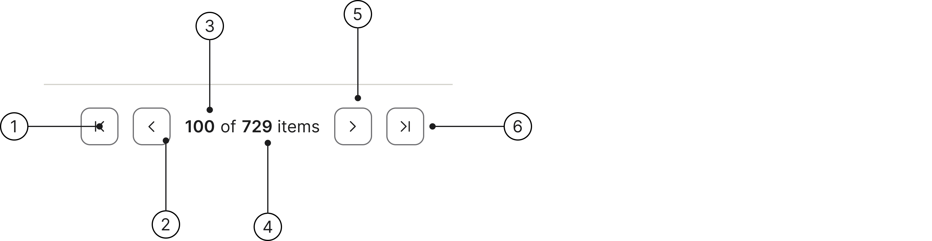
- Go to first page
- Previous page
- Current item
- Total items
- Next page
- Go to last page
Placement
Pagination is a key component of a design system, especially when dealing with tables that contain a large amount of data.
The pagination control is placed in the bottom of the data table.
| # | First name | Last name | Username |
|---|---|---|---|
| 1 | Mark | Otto | @mdo |
| 2 | Jacob | Thornton | @fat |
| 3 | Larry | the Bird | |
Accessibility
Keyboard interaction
All components should be reachable via Tab and Shift + Tab keys. Disabled navigation buttons are skipped in the tab order — either through the native disabled attribute, or, when the button must stay in the DOM, with tabindex="-1" and aria-disabled="true" — so keyboard users never land on them.
Best practices
Single page
Use pagination to break up long collections. When everything fits on a single page there is nothing to navigate, so the control adds clutter without adding value.

Use pagination when there are more than 20 items.

Don't use pagination for a small number of items.
Specs

Developer reference
The following sections describe supported functionality that is not part of the Figma design specification.
In a table
Placing the pagination in a table footer is probably the primary use case of the component. Put the .pagination inside a <tfoot> cell that spans the full width of the table — the footer cell supplies the divider line and the surrounding spacing, so the control stays transparent and inherits the table's surface.
| # | Product | Category | Stock |
|---|---|---|---|
| 1 | Wireless mouse | Accessories | 128 |
| 2 | Mechanical keyboard | Accessories | 54 |
| 3 | 27" monitor | Displays | 17 |
Basic
Each navigation button is an icon-only secondary button: no visible text, an accessible name supplied via aria-label, and a spirisicon chevron glyph marked aria-hidden="true". Use .first, .prev, .next and .last with the matching spirisicon-chevron-* glyph.
Items per page and jump to page
Add an optional items-per-page <select class="quantity"> and a jump-to-page number input for large data sets. Use the .mr-8 / .ml-8 utilities to space the form controls from the navigation buttons.
Editable page number
For a large number of pages, render the current page as an editable <input type="number"> in place of the static current-page number, so users can type a page and jump straight to it. Keep the total page count beside it as static text. Give the input an aria-label and matching min / max bounds.