
Tab 1 content. Lorem ipsum dolor sit amet, consectetur adipiscing elit. Donec in ipsum sit amet ligula luctus volutpat.
Breaking Changes: This page contains breaking changes. Please read the change log carefully.
Tabs
 The guideline content on this page is synced with Figma and can be used as a source of truth.
Open in Figma
The guideline content on this page is synced with Figma and can be used as a source of truth.
Open in Figma
Tabs help organise content by letting users switch between different sections or views on the same page. Use tabs to switch between different, independent sections of content, while segmented button groups are best for filtering or changing how content is displayed within the same section.
Use tabs when navigating between different, independent views or content areas. Use segmented controls to filter or change how content is presented within the same view.
Anatomy
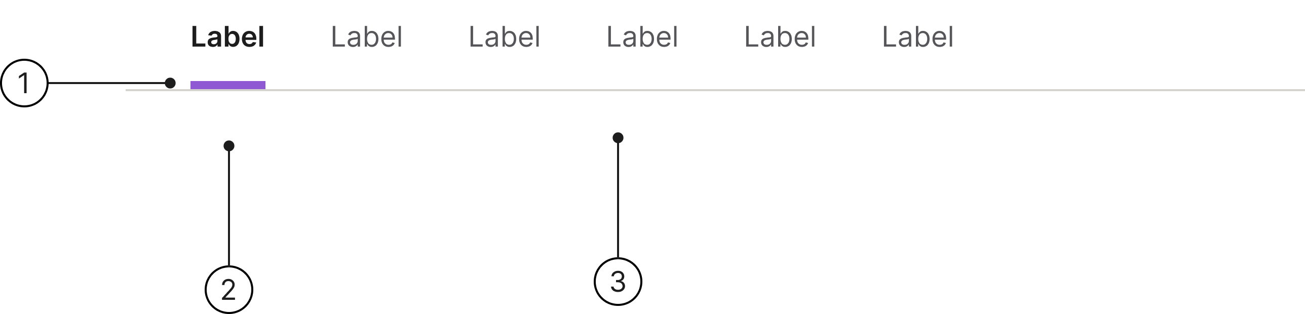
- Label
- Indicator
- Divider
States
The tab component can have various states, such as enabled, disabled, hover, focused, and active, which visually communicate its current behaviour and interactivity to the user.
- Enabled
- Hover
- Active
- Focused
- Disabled
Placement
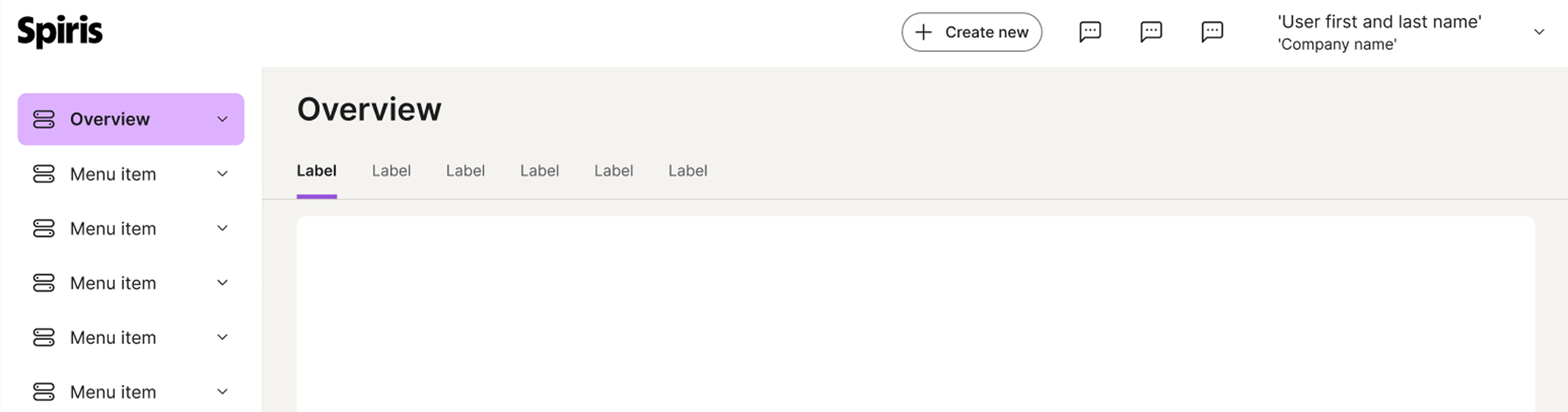
A tab bar or set of navigation tabs should be positioned directly below the table header on a page.
The tabs are visually linked to the data set they control.
Clickable area
It is important that the entire label is clickable to ensure usability and accessibility, making it easier and more efficient for all users to interact with.

Accessibility
Keyboard interaction
All components should be reachable via TAB and SHIFT+TAB keys.
Best practices
Labels

Keep tab labels short.

Avoid using long labels for tabs.
Specs

Developer reference
The following sections describe supported functionality that is not part of the Figma design specification.
For this component you need JavaScript! We recommend creating your own scripts following the structure from the examples below. You can also use the scripts we use for our examples — for tabs you need tabdrop.js and dropdowns.js.
Basic
Bare .nav-tabs renders the Figma-aligned minimal underline-style tabs by default.
Use .active on the selected .nav-item and aria-selected="true" on its anchor. Disable individual tabs with .disabled on the .nav-item and tabindex="-1" on the anchor.
Tab 2 content.
Tab 3 content.
Tab 4 content.
Tab 5 content.
Justified
Add the .nav-justified utility class to .nav-tabs to spread the tabs evenly across the available width.
Overflow
When more tabs are present than the container can fit, the tabdrop.js helper collapses the overflowing tabs into a three-dot dropdown trigger appended to the strip.
This script is provided as a documentation example. Consuming applications should bring their own equivalent JavaScript — Spiris ships only the CSS for the trigger.