
Toast
 The guideline content on this page is synced with Figma and can be used as a source of truth.
Open in Figma
The guideline content on this page is synced with Figma and can be used as a source of truth.
Open in Figma
A toast is a brief, non-disruptive message that appears at the top of the screen. It provides quick feedback about the result of an action.
Anatomy
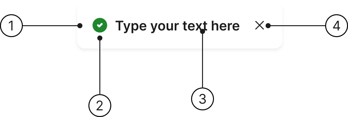
- Container
- Icon
- Body
- Close
Types
Toasts are a set of predefined styles that use consistent visual treatments to convey different meanings and states.
- Success: Use to confirm a success or a completed action.
- Info: Use for general updates or tips that provide context.
- Warning: Use to highlight potential issues the user should be cautious about.
- Error: Use for errors, failed states, or items that need immediate attention.
- Loading: Use to indicate that a process or action is in progress.
Placement
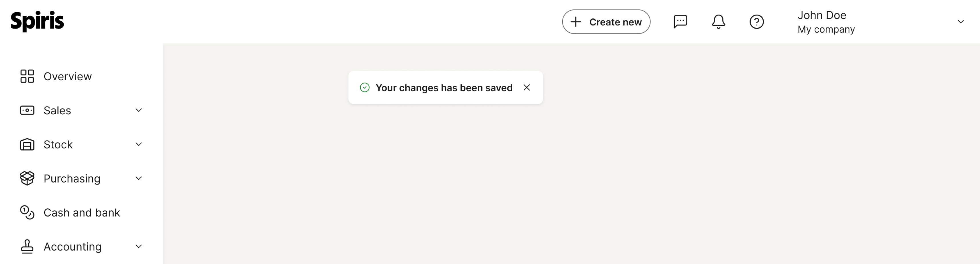
Toasts appear top centre on all screens. On smaller screens they can span full width. The toast is placed on top of all other content on the screen.
Accessibility
Keyboard interaction
All components should be reachable via TAB and SHIFT+TAB keys. The toast itself has no focus state and is not focusable, but any actions inside it are focusable and have their own focus state.
Best practices

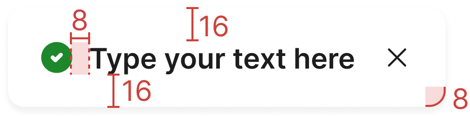
Make sure toasts don't block the user's ability to navigate and complete tasks. The bottom margin should be the same size as the left and right margins.

Do not let toasts block navigation controls or get too close to the edges of a navigation bar.
Prioritise showing only one toast at a time, with errors and acknowledgements taking precedence over other notifications.
Avoid stacking multiple toasts, as this can block the user's view and hinder their ability to interact with the interface.
Keep toast messages concise to avoid blocking the user's view.
Make sure toast messages are concise, so they don't block content. They should remain on screen long enough for users to read them completely. Keep messages short enough to read at a glance; if a message wraps, limit it to two lines so it stays easy to understand.
Specs
Developer reference
The following sections describe supported functionality that is not part of the Figma design specification.
Usage
Wrap any short message in .toast. Apply a type with one of .toast-success, .toast-info, .toast-warning, .toast-error or .toast-loading. The leading icon is added automatically.
The dismiss button is the small Icon Button (.btn.btn-icon.btn-sm) with a spirisicon-close glyph. It replaces the .close helper class; .toast still keeps a legacy .close flowing correctly in its row, but at 16×16 rather than the 24×24 the design calls for, and with none of the Icon Button's hover, pressed or disabled states. The toast itself is not focusable; only the actions inside it (the close button) are keyboard-focusable, each with its own focus state.
Toasts are positioned absolutely, top centre, on top of all other content. You can change the position or the left/top/right/bottom value using helper classes.
Animation
A toast is short-lived. We recommend that it starts fading into the background after 2500 ms and is gone after 5000 ms.
In the example below we set the toast to be displayed in the top right corner of our viewport (example box).