
Upload
 The guideline content on this page is synced with Figma and can be used as a source of truth.
Open in Figma
The guideline content on this page is synced with Figma and can be used as a source of truth.
Open in Figma
Uploaders let users select and upload one or more files to a designated location. To indicate that a file has been selected or uploaded, use the standalone File component, which lives on its own page.
Anatomy
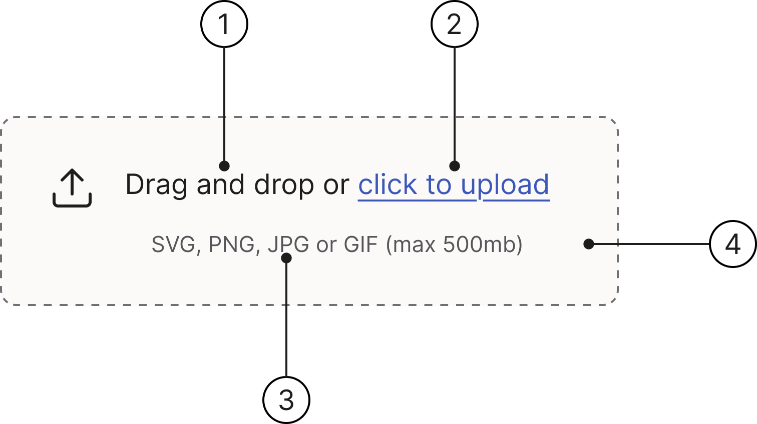
- Heading
- Complementary link
- Description
- Drop zone
States
- Default
- Hover
- Drag
- Focused
- Error
- Disabled
Drag and drop or click to upload
SVG, PNG, JPG or GIF (max 500mb)
Drag and drop or click to upload
SVG, PNG, JPG or GIF (max 500mb)
Drag and drop or click to upload
SVG, PNG, JPG or GIF (max 500mb)
Drag and drop or click to upload
SVG, PNG, JPG or GIF (max 500mb)
Drag and drop or click to upload
SVG, PNG, JPG or GIF (max 500mb)
Drag and drop or click to upload
SVG, PNG, JPG or GIF (max 500mb)
Description
The item description is optional and can be provided to help users understand the file's purpose.
Drag and drop or click to upload
SVG, PNG, JPG or GIF (max 500mb)
Accessibility
Keyboard interaction
All components should be reachable via TAB and SHIFT+TAB keys.
Drag and drop or click to upload
SVG, PNG, JPG or GIF (max 500mb)
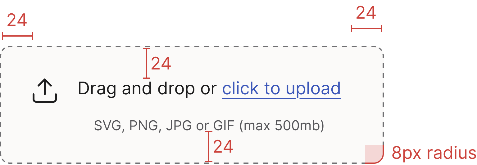
Specs
Developer reference
The following sections describe supported functionality that is not part of the Figma design specification.
For this component you need JavaScript! The functionality for the drop area (file selection, drag-and-drop handling, upload progress) is not provided by the design system. The examples below use a documentation-only script you can adapt for your own application. To show the files a user has selected, render one File row per file from your own upload handler — the design system styles those rows but never creates them.
File inputs
In cases where the file upload is of less importance or part of a large form, use a native file input to draw less attention to it. In cases where the file upload is one of the primary actions, use a drop area instead to highlight its importance.
Drop area markup
Wrap a hidden file input with the .drop-area class. The .drop-area-upload label is positioned to cover the whole drop zone so any click or keyboard activation opens the file picker. The visible heading, link and description live inside a sibling .drop-area-content block.
Drag and drop or click to upload
SVG, PNG, JPG or GIF (max 500mb)
Drag highlight
Add .highlight (or the equivalent .drop-area-drag) to the .drop-area wrapper while a file is being dragged over it to switch the dashed border to the solid purple Drag state. The legacy .highlight class is retained for compatibility with existing scripts.
Default version:
Drag and drop documents here to upload
Compact/small version:
Spinner
Use the spinner to indicate a drop-area-level upload in progress — for example while the dropped files are being read or sent, before any individual File rows are rendered. Once individual files appear, communicate their progress with the File component's Loading state (a per-file progress bar) instead. To show the spinner, place a <span class="spinner"></span> inside the .drop-area wrapper (see the spinner helper classes for variants). The spinner is hidden by default and reveals when the consuming script adds .show.
Default version:
Drag and drop documents here to upload
Compact/small version:
Compact version
Add the .drop-area-sm modifier to render a compact drop area for low-emphasis contexts.