
Chips
 The guideline content on this page is synced with Figma and can be used as a source of truth.
Open in Figma
The guideline content on this page is synced with Figma and can be used as a source of truth.
Open in Figma
Chips are designed for user input and have a limited set of interactions. For any other action use a button instead.
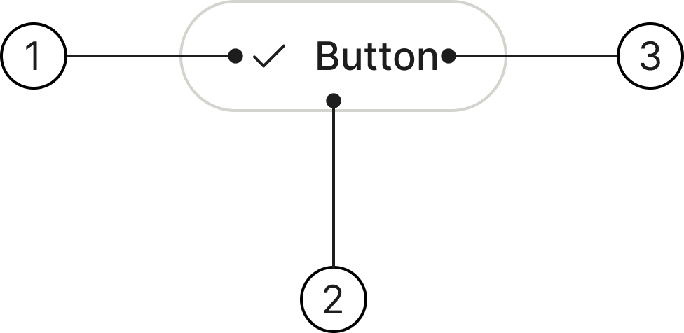
Anatomy
- Leading icon (optional)
- Container
- Button label
States
Chips have the following states: Enabled, Hover, Pressed, Selected, Selected hover, Focused and Disabled.
Selection
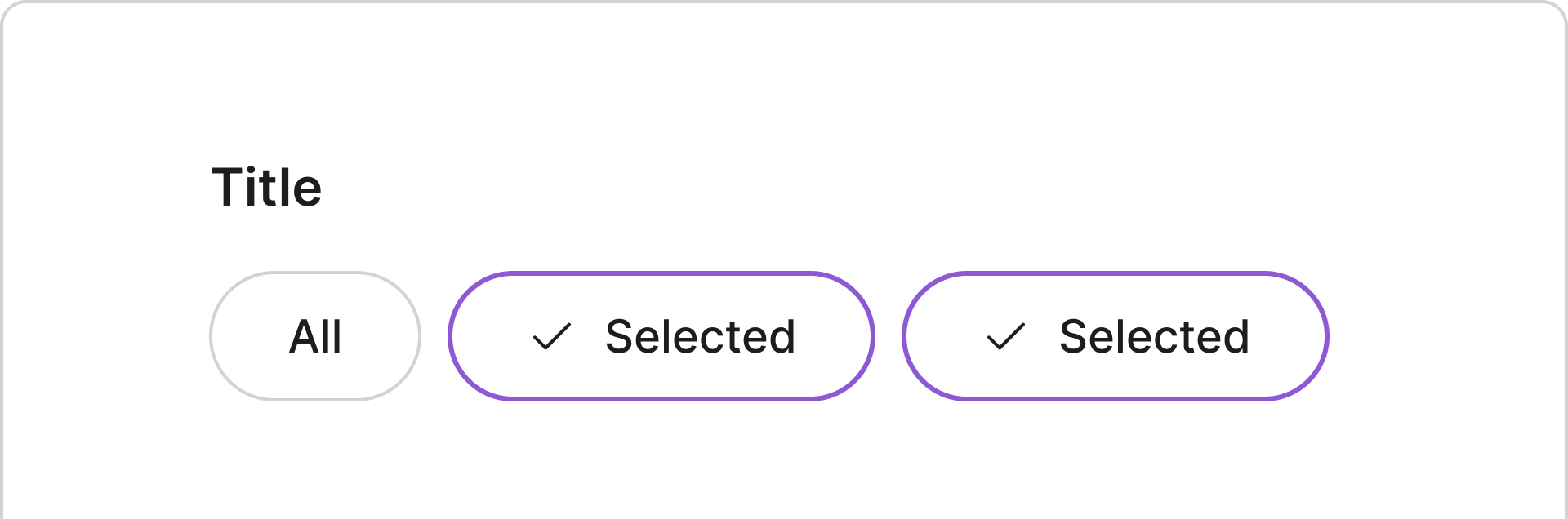
Users can filter content instantly by selecting a discrete chip; re-selecting it will remove the filter. As they only require one interaction, discrete chips are the default and preferred choice.
Width
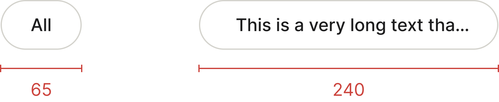
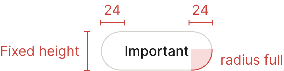
For a typical chip, having a minimum width is important to prevent it from looking like a single dot or a cramped, unreadable label if the text is very short.
A maximum width is also important to prevent the chip from growing too long. If a user enters an excessively long tag, the chip should not stretch across the entire screen. If the text is too long we truncate the text with an ellipsis.
Chips aren't buttons
Both chips and buttons prompt user actions and selections through visual cues. However, their roles differ:
Chips are dynamic, appearing as groups of interactive elements to enhance the user's current journey and encourage immediate action.
Buttons offer consistent, familiar calls to action, guiding users through the product for significant progression.
Accessibility
Keyboard interaction
All chips should be reachable via TAB and SHIFT+TAB keys.
Best practices
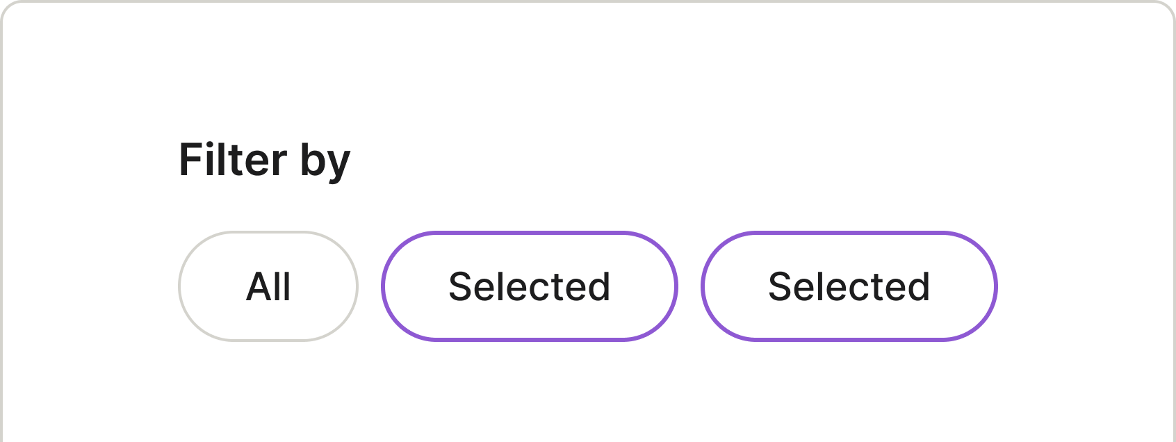

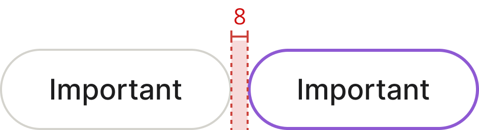
Use chips in groups of two or more to present users with a choice.
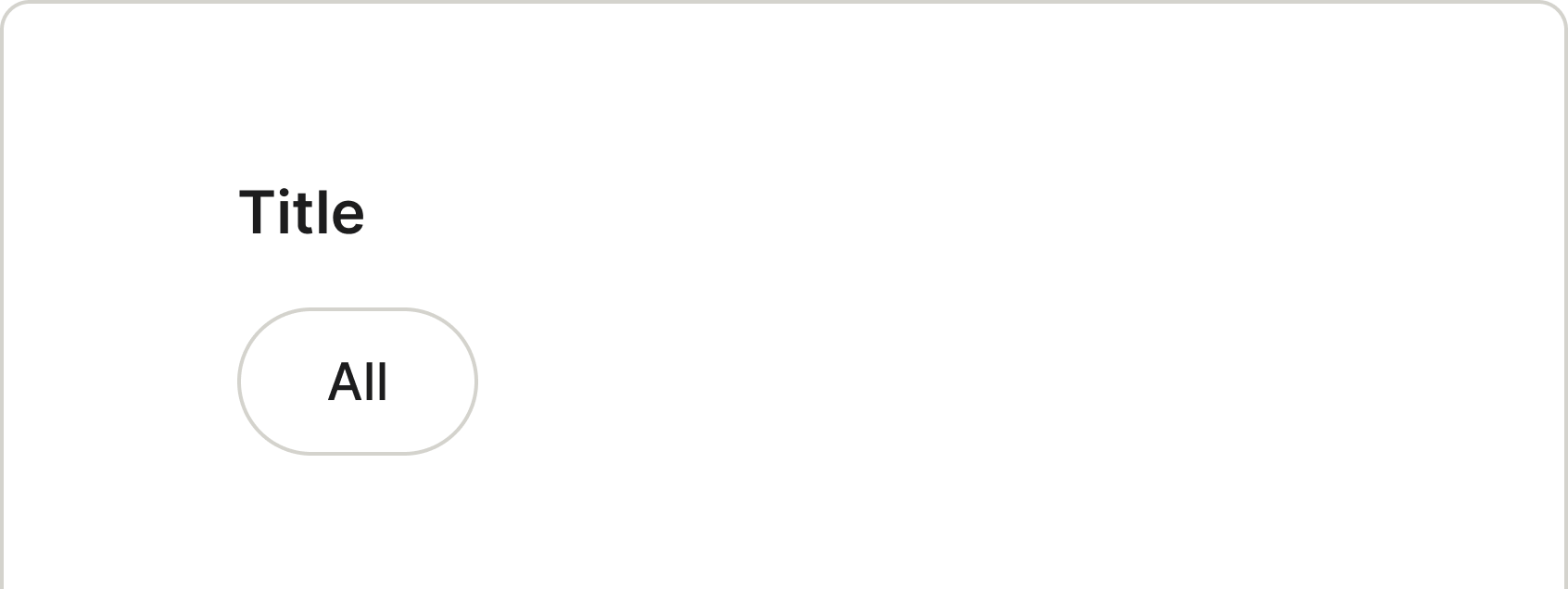

Chips shouldn't be presented as a single option.
Keep labels in chips short and concise for better readability.
Avoid using long labels for chips.
Specs
Developer reference
The following sections describe supported functionality that is not part of the Figma design specification.
Basic design
The default chip style with all interactive states.