
Time picker
 The guideline content on this page is synced with Figma and can be used as a source of truth.
Open in Figma
The guideline content on this page is synced with Figma and can be used as a source of truth.
Open in Figma
The time picker displays a grid of selectable times. Time pickers can be set to a specific time or used to choose from preset alternatives, and can be combined with date pickers for full datetime selection.
Anatomy
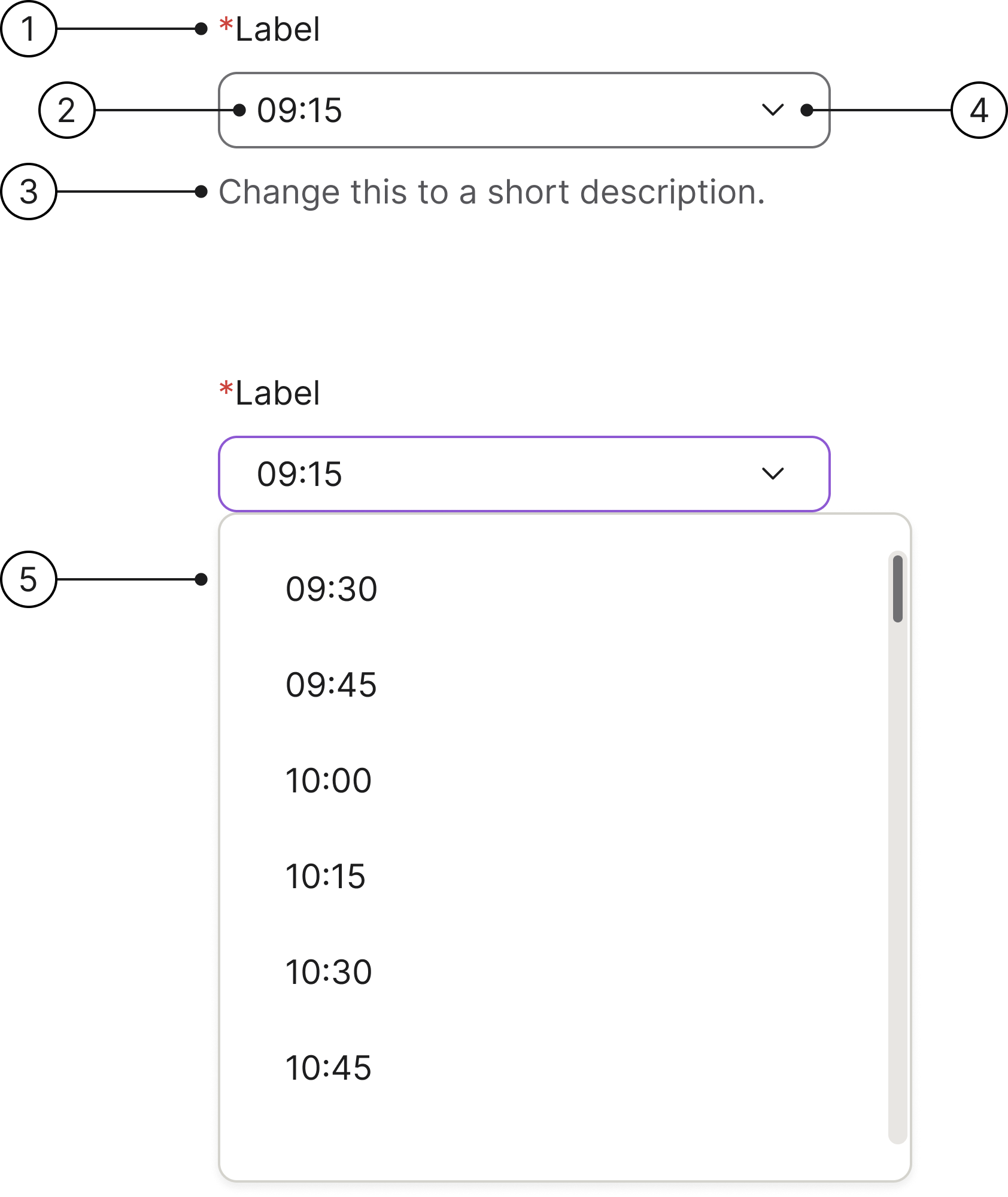
- Label: the label is left-aligned above the input area.
- Time input field: clicking this field opens a dropdown menu of available times for the selected date.
- Description: this field helps users understand what is needed for this interaction.
- Dropdown arrow: this icon helps users understand that we have a dropdown menu in this component.
- Time dropdown: this is how the dropdown menu looks showing the available times for the selected date.
States
- Enabled
- Hover
- Focused
- Selected
- Error
- Error focused
- Read only
- Disabled
Content guidelines
To ensure users see dates and times in a familiar format, make sure the locale is set appropriately. Use a clear label to indicate what the date and time selections refer to.
Clickable area
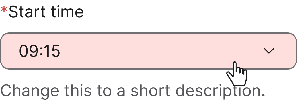
Making the entire field of a time picker clickable is essential for usability and accessibility. It creates a more efficient and forgiving experience for all users.
Accessibility
Keyboard interaction
All components should be reachable via Tab and Shift+Tab keys.
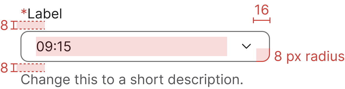
Specs
Developer reference
The following sections describe supported functionality that is not part of the Figma design specification.
Third-party plugin. The interactive time picker example below is wired up using the jQuery timepicker plugin (timepicker.js). Spiris ships CSS only — no JavaScript is bundled. To run this example, consuming applications load timepicker.js alongside the Spiris stylesheet.
With input
An input with a dropdown menu of selectable times. Clicking the field or the chevron-down trigger opens the dropdown.