
Checkbox
This component allows the user to select multiple options from a list, or a single option.
 The guideline content on this page is synced with Figma and can be used as a source of truth.
Open in Figma
The guideline content on this page is synced with Figma and can be used as a source of truth.
Open in Figma
Anatomy
- Checkbox
- Label

Unchecked
A component’s state defines its appearance and behaviour.
Checked
These are the different states for the checked states.
Mix
These are the different states for the mix states.
Label
A label is required for all checkboxes. They should be short and represent a value or yes/no decision.

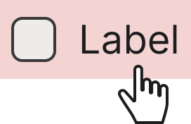
Clickable area
It is crucial for both the label and the checkbox to be clickable to ensure usability and accessibility for all users. By making the label also clickable, you provide a much larger and more forgiving target, which reduces user frustration and the chance of accidental errors.
Accessibility
Keyboard interaction
All components should be reachable via TAB and SHIFT+TAB keys.
Best practices
Content guidelines

Start with capital letters.

Don’t start with small letters.
Specs

Design
Checkboxes
The disabled style will be applied for any of these: add .disabled class to your .checkbox or <fieldset>, or disabled attribute or disabled class on the input.
Indeterminate / mixed state
The third checkbox state, when it is between checked and unchecked, can be added by adding .mixed class to the wrapper that contains the .checkbox class.
Indeterminate via JavaScript
Or you can utilise the :indeterminate pseudo class (MDN Web Docs or caniuse) when manually set via JavaScript (there is no available HTML attribute for specifying it).
Disabled as readonly
To present a checkbox in a non-interactive state that preserves its current value, apply the disabled attribute to the input. You can optionally use the .disabled class on the wrapper, for example when disabling a group or to reinforce the visual disabled state.
Why not use the readonly attribute?
The HTML readonly attribute has no effect on checkboxes. It is only supported on text-based inputs such as <input type="text"> and <textarea>. Browsers silently ignore readonly on checkboxes, meaning users can still change the value despite the attribute being present.
Use the disabled attribute instead to prevent user interaction. If the value must be submitted with the form, consider adding a hidden <input> that carries the value alongside the disabled control.
Checkboxes in a block/list format
The vertical/list format of checkboxes can be achieved by using the classic <br> tag, a different approach is by using an unordered list element, or flex box helper classes on a wrapper for the items.
In the following example the flexbox helper classes approach is presented, with a flex-direction column and align-items value as flex-start.