Label badges
 The guideline content on this page is synced with Figma and can be used as a source of truth.
Open in Figma
The guideline content on this page is synced with Figma and can be used as a source of truth.
Open in Figma
Label badges inform users about the status of an object or the outcome of an action. They are read-only indicators that display a status or category. They aren’t interactive, so you can’t click on them.
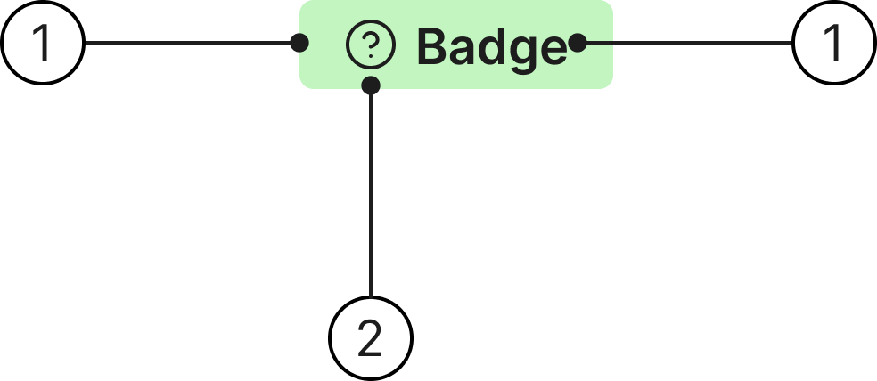
Anatomy
- Container
- Icon (optional)
- Label
States
Label badges are a set of predefined styles that use consistent visual treatments to convey different meanings and states.
- Default: use for neutral, passive states like drafts or general info that don’t require any action from the user.
- Success: use to confirm a success or a completed action.
- Info: use for general updates or tips that provide context.
- Error: use for errors, failed states, or items that need immediate attention.
- Warning: use to highlight potential issues the user should be cautious about.
- Automation: use to indicate that AI or automation has assisted, completed, or suggested something.
- Beta: use to mark beta, demo, or add-on features that aren’t part of the standard experience.
Badge with icon
Use an icon before the badge label to further indicate status.
Usage
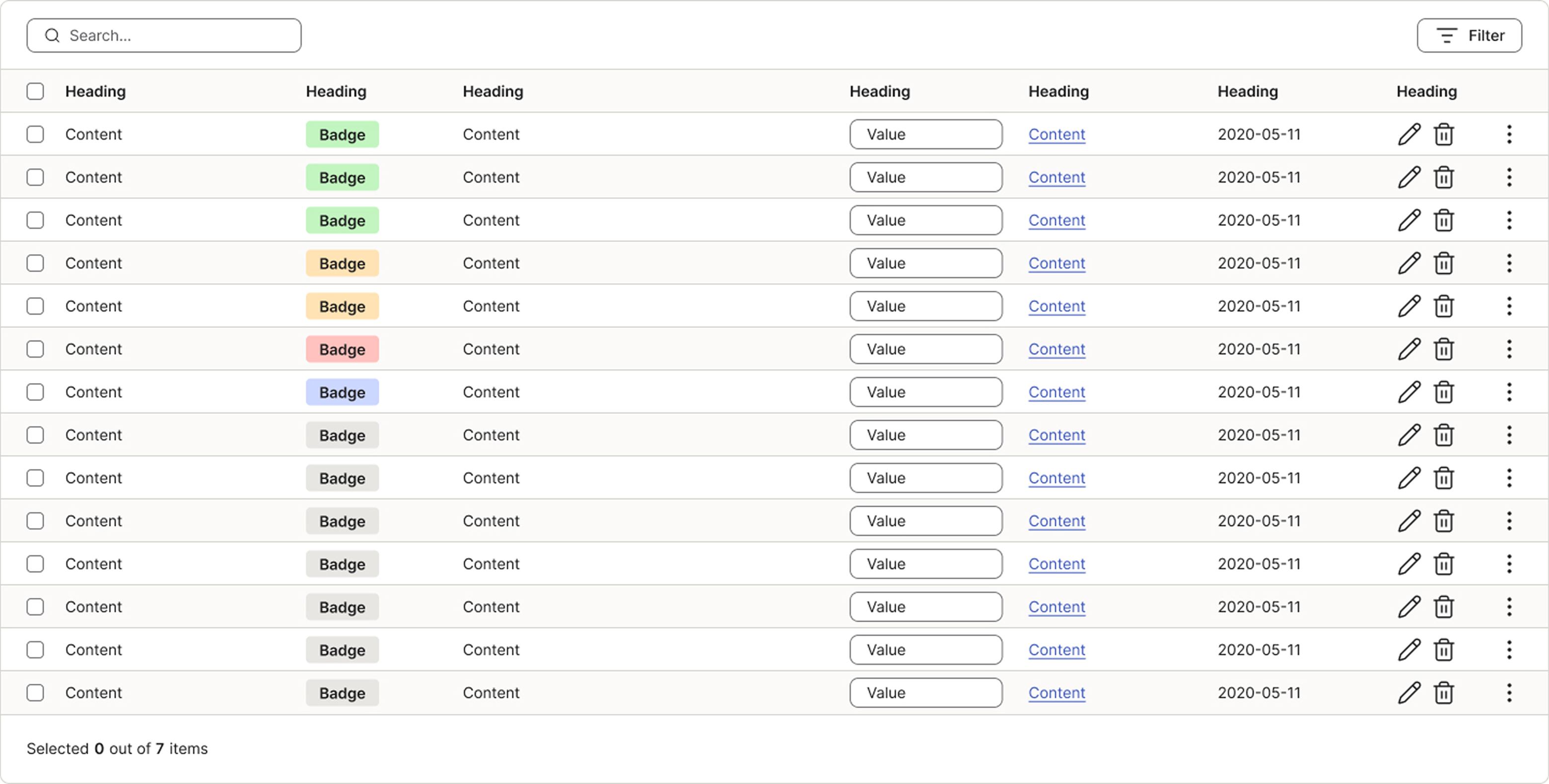
Use label badges to quickly communicate status, counts, necessary attention, or featured content. For accessibility, label badges should never use colour as the only indicator of meaning. Maximise clarity by always combining elements like text, icons, and visual emphasis.
Temporary and static badges
A badge can be either temporary or static depending on what it communicates.
A temporary badge appears for a limited time and disappears once it’s no longer relevant - e.g. “New”, which is removed after the user has seen the item. Always define a clear rule for when a temporary badge stops showing.
A static badge reflects a lasting state and stays as long as that state applies - e.g. “Done” or “Paid”. It only changes when the object’s actual status changes.
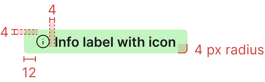
Specs