
Progress circle
 The guideline content on this page is synced with Figma and can be used as a source of truth.
Open in Figma
The guideline content on this page is synced with Figma and can be used as a source of truth.
Open in Figma
This component visually communicates the status of a task. It shows users how much work remains.
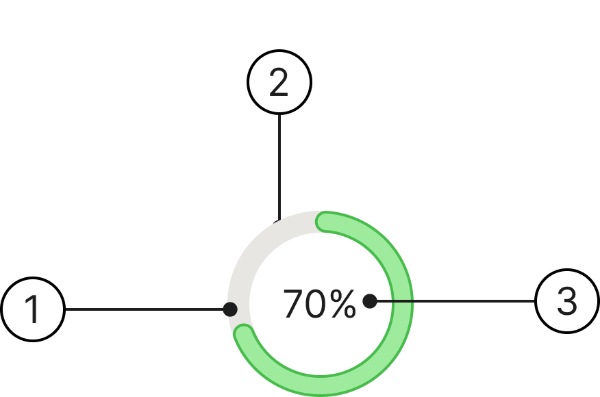
Anatomy
- Active indicator
- Separator
- Progress label
Usage
Circle progress bars are best when centred in an element.
Always use the same type of progress indicator for a given process across the platform. For instance, if refreshing uses a circular indicator in one view, it must use a circular indicator everywhere.
Variants
We have two distinct colours for the progress circle component to clearly communicate the status and user context of the ongoing process.
Green
Usage: It signifies a normal, positive, or successful state.
Purple
Usage: It signifies a specific, non-standard, or emphasised process.
Accessibility
Progress circles show status, so they don't need a focus state and can't be tabbed to. They just need to tell screen readers how far along they are (or that something's loading). Only add a focus state if the circle is also clickable.
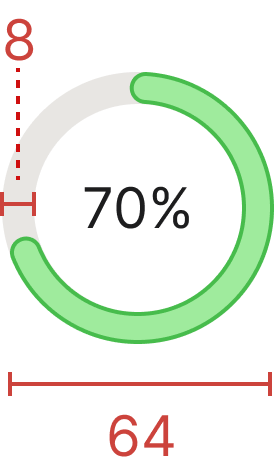
Specs
Developer reference
The following sections describe supported functionality that is not part of the Figma design specification.
When to use
There are two types of work indicators, determinate and indeterminate.
- Use the determinate work indicator (progress bar or circle) when there is either a clear endpoint for the process or some other way to track progress.
- Use an indeterminate work indicator (spinner) when there is no clear endpoint, or when it cannot be known when the process will be finished. A typical case is waiting for a server response.
Fill values
The active-indicator arc length is driven by the data-value attribute (a number from 0 to 100) on the .progress-circle wrapper. A small script converts the value to the SVG stroke-dashoffset (see Required JavaScript).
Purple variant
Add .progress-circle-purple alongside .progress-circle to switch the active indicator to the purple variant. The default (no modifier) is green.
Required JavaScript
The Spiris package ships CSS and SVG only. The progress circle needs a small script to translate each data-value into the active indicator's stroke-dashoffset. The active indicator is drawn as two stacked arcs (.progress-bar-border and .progress-bar), so set the offset on both. The circumference base is 176 (matching the r="28" circle). Implement an equivalent in your application:
document.querySelectorAll('.progress-circle').forEach(function (circle) {
  var value = Math.min(100, Math.max(0, Number(circle.getAttribute('data-value')) || 0));
  var arcs = circle.querySelectorAll('.progress-bar, .progress-bar-border');
  arcs.forEach(function (arc) {
    arc.style.strokeDashoffset = String(176 - (176 * value) / 100);
  });
});