
Stepper
 The guideline content on this page is synced with Figma and can be used as a source of truth.
Open in Figma
The guideline content on this page is synced with Figma and can be used as a source of truth.
Open in Figma
Progress steppers visually indicate a user's progress through a process. It comes in two type variants - dot and number - and two directions - horizontal and vertical. Each step is interactive, so users can move forward and backward through the flow.
Anatomy
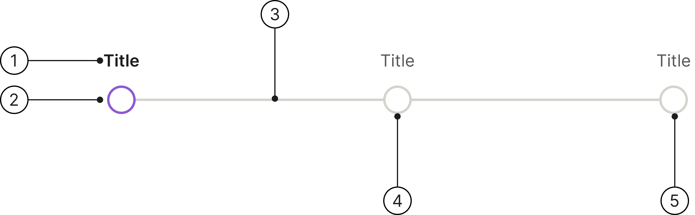
- Label
- Dot / number
- Leading line
- Upcoming step
- Last step
Variants
We have two types of steppers: one with dots and one with numbers.
Dot: Used for simpler flows where steps carry equal weight and the exact position is less important.
Number: Used when the sequence or total number of steps matters to the user, such as in a checkout or onboarding flow.
Label
Every step requires a primary label to describe an important milestone in a process. Keep labels short, ideally one or two words, so they stay readable. If a label needs more than that, it's likely a description rather than a step name and should be shortened. For longer labels, use the vertical stepper, where the label has room to the side.
Horizontal stepper
Use horizontal steppers when you need to save vertical space.
Vertical stepper
Use vertical steppers when you don't need to save vertical space.
Number of steps
Steppers should have between 3 and 5 steps. To avoid overwhelming the user, focus on the most important milestones and use as few steps as possible.
Clickable area
Make the whole step clickable - the label, dot, and the space around them. This enlarges the target well beyond the dot itself, which matters on touch devices and for users with reduced motor precision, since it takes less precision to move between steps. The connecting line between steps is not part of the target.
Behaviour
All steps are interactive. Users can select any step to navigate directly to it, both forward and backward through the process.

Sizing
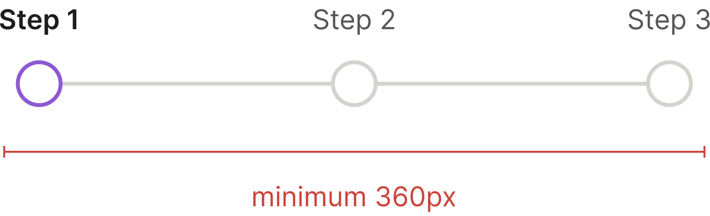
The stepper has a minimum size of 360px along its main axis - width for the horizontal stepper, height for the vertical stepper. There is no maximum: it expands to fill the available space in its container.
Best practices
Number of steps

Steppers should have a minimum of 3 steps.

Don't use progress steppers for processes with only one or two steps. Instead, consider using a different design pattern.
Specs

Developer reference
The following sections describe how to implement the stepper in code.
Usage
Build a stepper from an ordered list (<ol class="stepper">). Each .stepper-step holds a .stepper-trigger button wrapping a .stepper-indicator and a .stepper-label.
State classes on the step:
.visited- a completed step..active- the current step (also setaria-current="step").- no class - an upcoming (future) step.
Add .stepper-number to show numbered indicators and .stepper-vertical to switch to the vertical direction.