
Split button
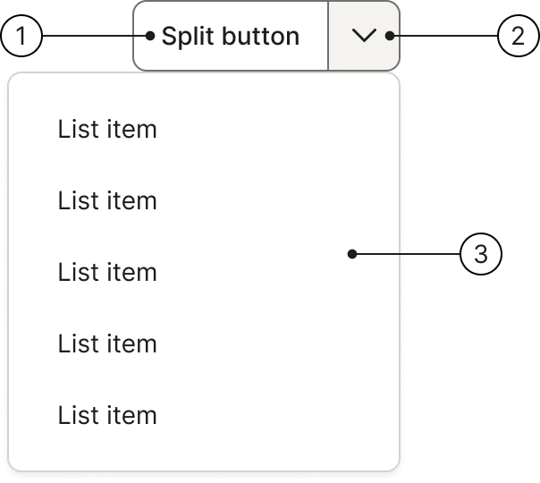
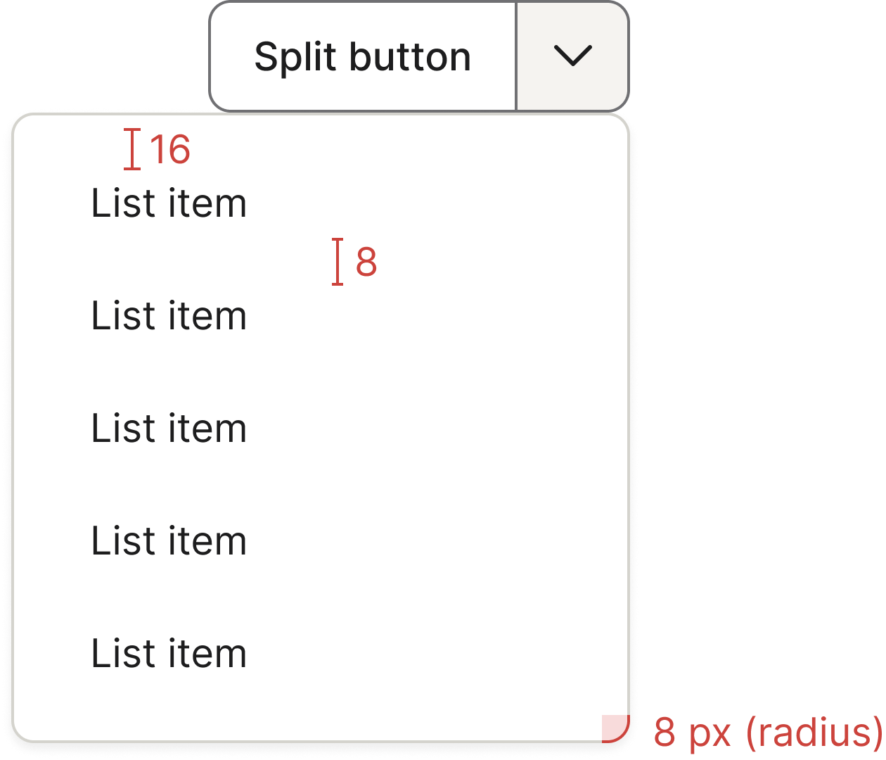
The split button allows users to trigger different actions via two interactive areas: a default action on the left and a menu with additional actions on the right.
 The guideline content on this page is synced with Figma and can be used as a source of truth.
Open in Figma
The guideline content on this page is synced with Figma and can be used as a source of truth.
Open in Figma
Anatomy
- Main action button
- Dropdown menu icon button
- Secondary action menu
Primary
Button states
The primary split button has the following states.
Arrow states
The primary split button arrow has the following states.
Secondary
Button states
Secondary split buttons are white in their normal state and can therefore not use purple for hover and focus state. The secondary split button has the following states.
Arrow states
Secondary arrows are white in their normal state and can therefore not use purple for hover and focus state. The secondary split button arrows have the following states.
Sizes
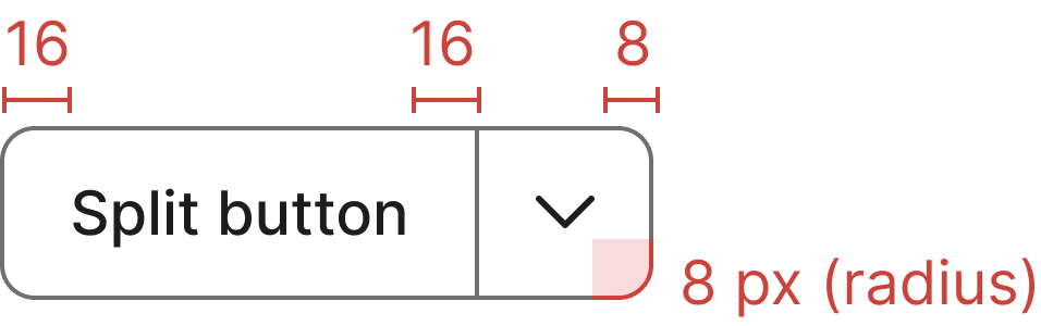
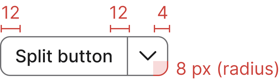
We have two different sizes for our split buttons (small and medium). They are designed so you could adjust the size of their content, ensuring visual balance. While their sizing can vary by context, they have a standard default size used throughout the product.
Small
Add .btn-group-sm to the wrapper and .btn-sm to each button for smaller split buttons.
Medium (default)
The default size. No additional classes are needed.
Drop-up
Add .dropup to the wrapper to open the dropdown menu above the button instead of below.
Usage
Used for this
To let users select multiple parallel actions. Actions available in the dropdown menu should always belong to the main action. You should use a split button when you have a single, highly frequent primary action that needs to be immediately accessible, along with a few related secondary actions that should remain easily discoverable. The split button solves the problem of needing to offer a family of similar commands without cluttering the interface.
Optimising user interaction
The small menu can be easily overlooked and demands more user attention. Therefore, anticipate that users will primarily opt for the main action button. When there's no obvious default action, present all available options equally. You can achieve this by using a basic dropdown button.
Clear default action
The most crucial requirement is that one action must be significantly more common than the others. This action gets the prominent main button.

Group related actions under the split button's dropdown menu. Actions available in the dropdown menu should always belong to the main action.

Avoid using a split button to group actions that aren't directly related or similar.
Accessibility
Keyboard interaction
All buttons should be reachable via TAB and SHIFT+TAB keys.
Best practices
The label in the button needs to be brief.
Avoid using very long labels or changing the icon.
Use clear and concise labels for both the main and secondary actions.
Do not repeat the main button action as an item within the dropdown menu.
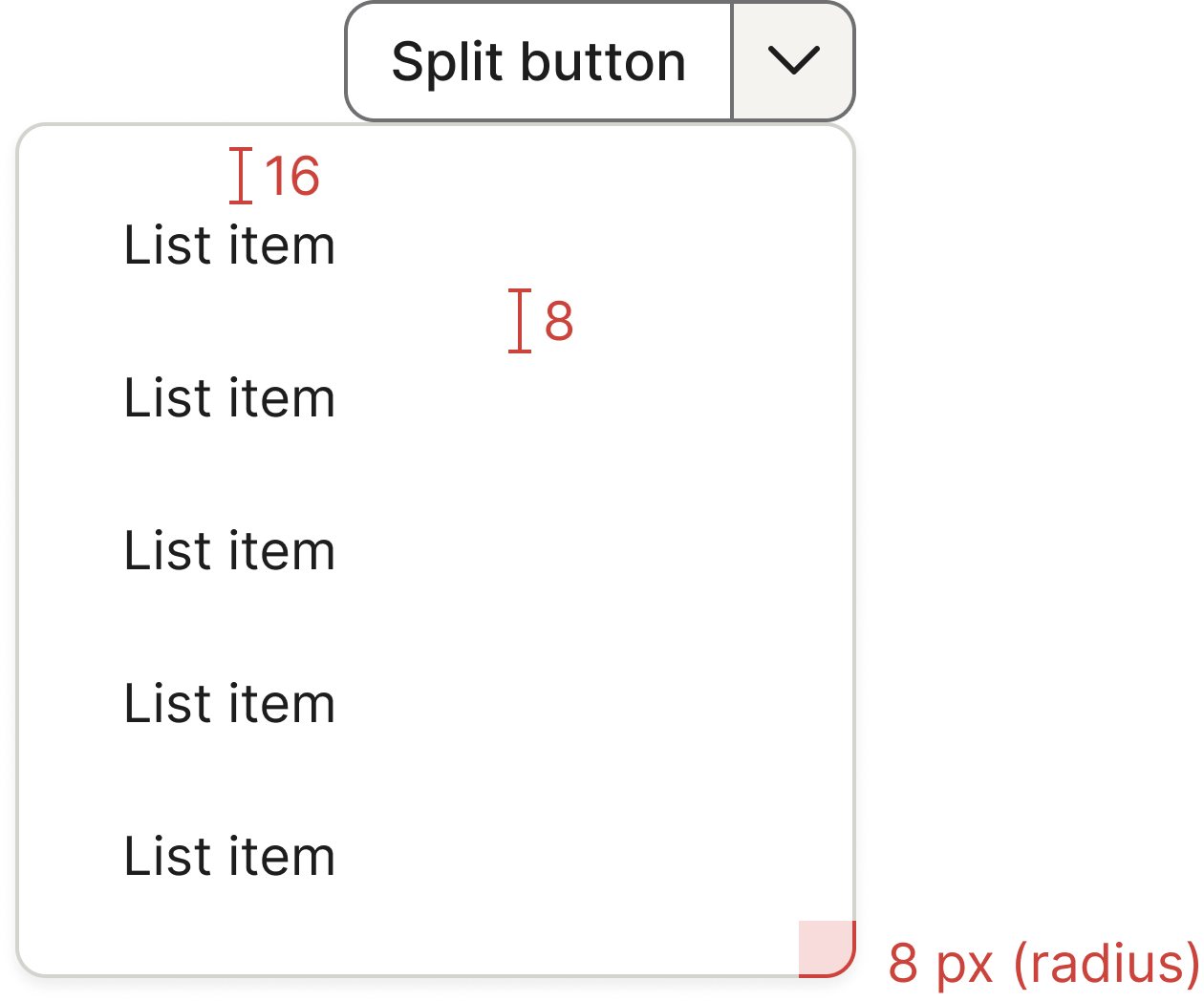
Specs
Disabled
Add .disabled to the wrapper (.btn-group.btn-split) or to each button individually to disable the split button.
Drop-right
By default, the dropdown menu is right-aligned to the button. Add .btn-split-drop-right to the wrapper to left-align the dropdown menu instead.