
Segmented button group
 The guideline content on this page is synced with Figma and can be used as a source of truth.
Open in Figma
The guideline content on this page is synced with Figma and can be used as a source of truth.
Open in Figma
Segmented button group displays multiple related actions stacked or in a horizontal row to help with arrangement and spacing. The buttons are displayed as a horizontal group of buttons, where only one option can be selected at a time.
Anatomy
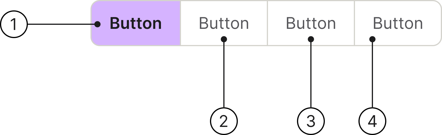
- Selected content tab
- Content tab
- Label text
- Container
With icon
An icon should be used in a segmented control when it provides quick, universal understanding of the option and can replace or supplement text for clarity and space efficiency.
States
This component has the following states:
- Default
- Hover
- Focus
- Selected
- Disabled
States
Usage
Information
When a user clicks an option, it becomes active, and the previously selected option becomes inactive. Segmented buttons are visually connected, typically contained within a single border or container.
The primary function is to enable users to switch between different views of the same content, sort data, or choose a single setting from a limited set of options.
The number of segments should be small, typically 2 to 5, to prevent the component from becoming too wide or overwhelming for the user.
The effect of selecting a button should be immediate and obvious, with no need for a “Submit” or “Apply” button.
Badge
You can display a number next to the text in the segmented button. This feature can be toggled on or off in the settings menu located in the top right corner of Figma.
Placement
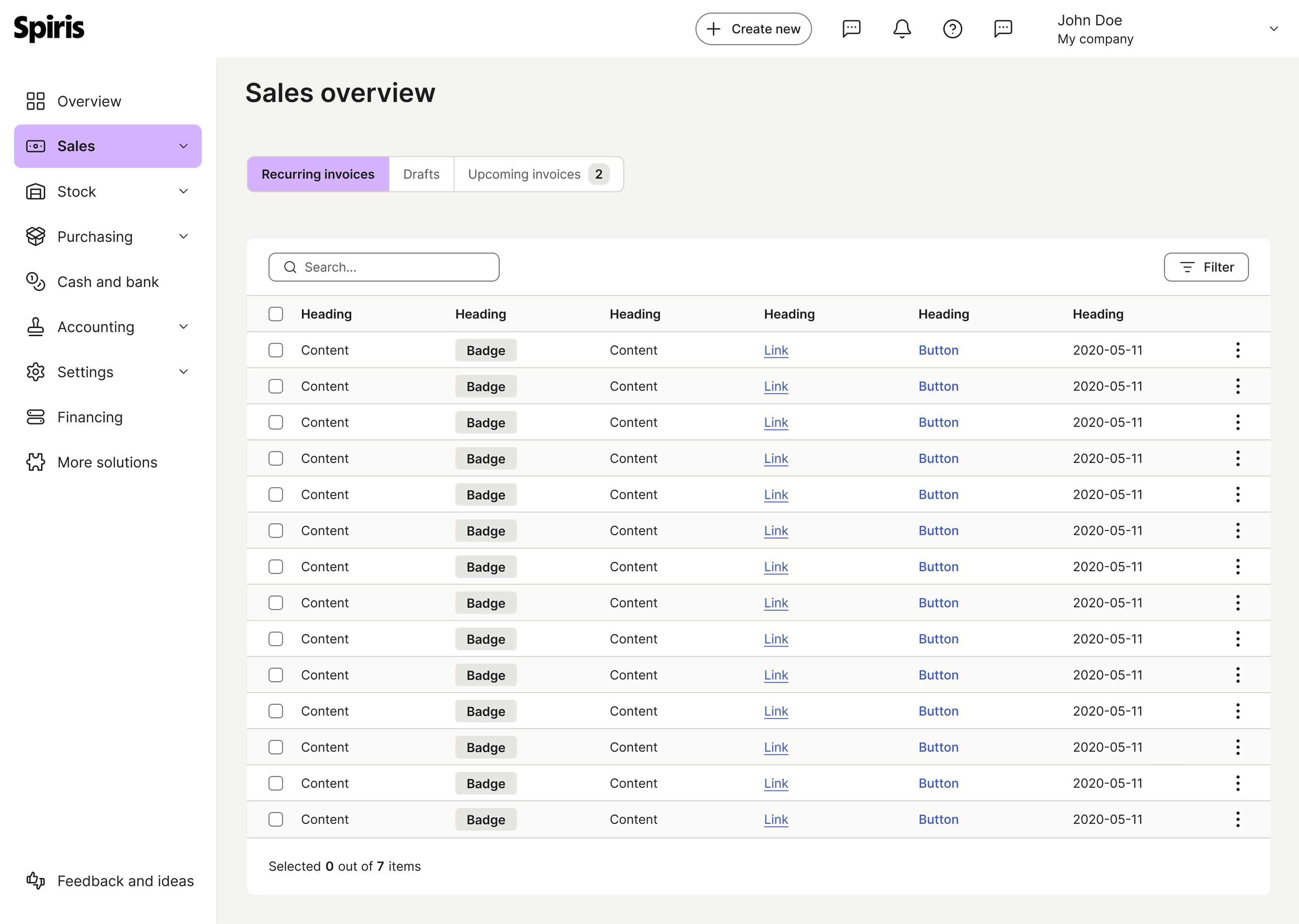
Segmented button groups are positioned within the sub-header region, situated between the page title and the primary data container.
This placement establishes a definitive visual hierarchy, designating the component as a high-level view controller that governs the scope of the underlying content.
Accessibility
Keyboard interaction
All components should be reachable via TAB and SHIFT+TAB keys.
Best practices
Short text

Keep labels short and concise. If a label is too long for a segmented control, use a different component like a dropdown or quick filter.

Don’t use long labels.
Consistent size
Keep button widths consistent across all segments.
Don’t change the width of individual buttons.
Specs

Developer reference
The following sections describe supported functionality that is not part of the Figma design specification.
Design
Default
Add .btn-group-tabs class to the .btn-group to create segmented controls. Use .active on the selected button and aria-selected="true" for accessibility.
Small size
Add .btn-group-tabs-sm class to the wrapper for a smaller variant.
Disabled
Add the disabled attribute to individual buttons to disable them.
Single disabled button
All disabled
Animated segmented control
The documentation has a demo implementation that you can draw inspiration from in your work.
Add the .btn-group-animation class to the .btn-group-tabs wrapper. The selected button is highlighted by a ::before pseudo-element on the wrapper, which slides between segments instead of the background moving with the button.
To move the indicator, read the selected button's border-box width and its offset from the .btn-group-animation wrapper's content edge, then pass both to the pseudo-element. You can either target ::before from your own stylesheet, or — as the demo below does — set two CSS custom properties on the wrapper: --btn-grp-animation-width for the selected button's width, and --btn-grp-animation-offset for its X-axis offset. Both default to 0, so the indicator stays invisible until your script sets them.
Default size
Combine .btn-group-tabs with .btn-group-animation for the 40 px variant.
Small size
Add .btn-group-tabs-sm as well for the 32 px variant. Use a layout utility such as .d-flex.flex-wrap.gap-8 to place two groups side by side — never a wrapping .btn-group, which would style them as one connected control.