
Password
 The guideline content on this page is synced with Figma and can be used as a source of truth.
Open in Figma
The guideline content on this page is synced with Figma and can be used as a source of truth.
Open in Figma
The password field masks input by default. It features a trailing icon that allows users to toggle visibility and reveal their entry.
Anatomy
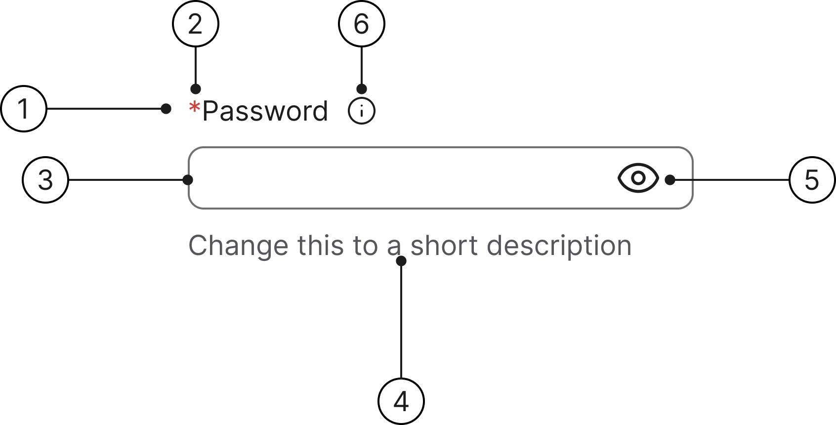
- Label
- Mandatory (optional)
- Container
- Helper text
- Help label
- Info icon (optional)
States
- Enabled
- Hover
- Focused
- Error
- Error focused
- Disabled
- Show password
- Read only
- Selected
Label
A label is required for all password fields and defaults to "Password." If an adjacent text element already serves as the label, the included default label can be visually hidden.
Helper text
Helper text communicates requirements and disclaimers below the field. An error message will always replace the helper text when a field validation error is triggered.
Error message
Upon validation failure, the helper text is replaced by a concise error message. This message includes an error icon and provides direct instructions to help the user satisfy the password requirements.
Privacy toggle
Use the privacy icon to toggle password visibility for easy review. The icon always represents the action it will perform upon interaction, meaning: a hidden password shows the 'Show' icon, and a visible password shows the 'Hide' icon.
Hovering the trailing icon button paints the hover surface on the button only — the surrounding input row stays in its enabled-state colours and does not enter the Hover state. The row only enters Hover when the input itself (not the toggle) is the hover target.
Accessibility
Keyboard interaction
All buttons should be reachable via Tab and Shift+Tab keys.
Specs
Developer reference
The following sections describe supported functionality that is not part of the Figma design specification.
Demo enabled on this page! The enhanced keyboard-focus behaviour is active on this page — the .keyboard-focus class is added to each .form-group while a control is keyboard-focused, and removed on blur, click or typing. Try pressing Tab to navigate through the form fields. Read more in the Forms accessibility guidelines.
Privacy toggle implementation
The password visibility toggle requires JavaScript. The design system provides CSS styling only — the consuming application is responsible for implementing the toggle logic (switching between type="password" and type="text") and updating the icon.
Markup
Wrap the <input> and the .password-toggle button in a .password-input element. The wrapper provides the position: relative context the toggle anchors to so the eye icon sits 16px from the input's right edge regardless of the surrounding column width. The wrapper carries the 520px max-width cap; the inner .form-control is max-width: none so it fills the wrapper. This mirrors the .input-group pattern used for numeric suffixes.
To allow a wider field, override .password-input { max-width: none; } in the consuming application.
Implementation guidance
Add a trailing button or icon element beside the input. On click, toggle the input's type attribute between "password" and "text". Update the icon to reflect the current state: use the 'eye' icon when the password is hidden (action: show), and 'eye-off' when the password is visible (action: hide).
Accessibility implementation
Always associate a <label> with the <input> using matching for and id attributes. For the privacy toggle button, use aria-label to describe its action (e.g. "Show password" or "Hide password").
Info icon
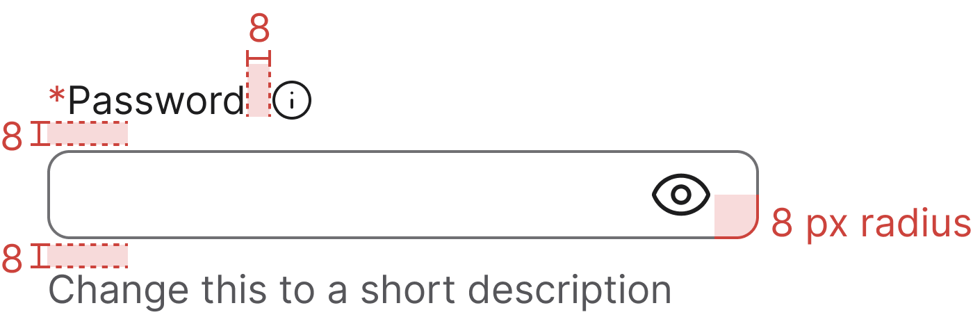
Wrap the <label> and an icon trigger in .label-with-info to place the info icon beside the label with the 8 px gap from the Figma anatomy. On hover or keyboard focus, the tooltip opens upwards (data-bs-placement="top") to reveal the supporting text.
Keep the trigger outside the <label for> so clicking the icon does not focus the input, and mirror the tooltip text into a visually-hidden element that the input references via aria-describedby — that way assistive tech users hear the same help text without depending on the tooltip.
Tooltip behaviour relies on Bootstrap's tooltip plugin (with Popper for positioning). See the Tooltip page for setup details.
Basic design
Default
A basic password field with a label. Apply the .form-control class to the <input type="password"> element and wrap it together with the .password-toggle button in a .password-input — see Privacy toggle implementation.
Legacy
A plain password field without the .password-input wrapper or the .password-toggle button. The input renders as a standard .form-control and the user cannot reveal the typed value. Use this only when the visibility toggle is not desired.