
Text field
 The guideline content on this page is synced with Figma and can be used as a source of truth.
Open in Figma
The guideline content on this page is synced with Figma and can be used as a source of truth.
Open in Figma
Users enter and edit text or numbers in a form using an text input field.
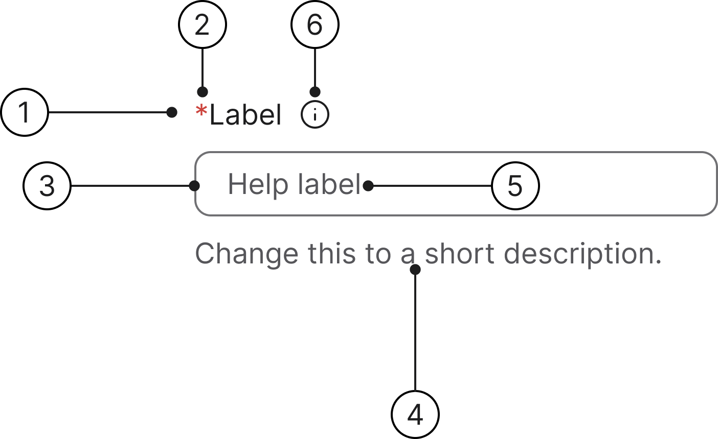
Anatomy
- Label
- Mandatory (optional)
- Container
- Helper text
- Help label
- Info icon (optional)
States
- Enabled
- Hover
- Selected
- Focused
- Error
- Error focused
- Read only
- Disabled
Label
A label is mandatory for all text fields and should describe the field's purpose. Labels are included by default. If another element (such as a section title) already serves as a clear description, the default label can be visually hidden.
Required/optional fields
We use an asterisk to indicate a field is required.
The convention of using a red asterisk (*) in a label to denote a required field is a long-standing and widely adopted practice in User Experience (UX) and form design.
Helper text
Helper text communicates requirements and disclaimers below the field. An error message will always replace the helper text when a field validation error is triggered.
Numeric
The numeric indicators (like character counts or currency values) can have an optional currency indicator.
Accessibility
Keyboard interaction
All input fields should be reachable via Tab and Shift+Tab keys.
Specs
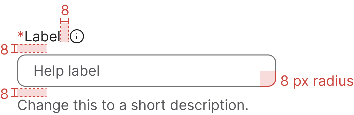
Developer reference
The following sections describe supported functionality that is not part of the Figma design specification.
Demo enabled on this page! The enhanced keyboard-focus behaviour is active on this page — the .keyboard-focus class is added to each .form-group while a control is keyboard-focused, and removed on blur, click or typing. Try pressing Tab to navigate through the form fields. Read more in the Forms accessibility guidelines.
Basic design
Default
A basic input field with a label. Apply the .form-control class to the <input> element. Supports all HTML5 text-like input types: text, password, email, number, tel, url, search, date, time, color and related variants.
Info icon
Wrap the <label> and an info icon in .label-with-info to place the icon beside the label with the 8 px gap from the Figma anatomy. On hover or keyboard focus, the tooltip opens upwards (data-bs-placement="top") to reveal the supporting text.
Keep the icon outside the <label for> so clicking the icon does not focus the input, and mirror the tooltip text into a visually-hidden element that the input references via aria-describedby — that way assistive tech users hear the same help text without depending on the tooltip.
Tooltip behaviour relies on Bootstrap's tooltip plugin (with Popper for positioning). See the Tooltip page for setup details.
Numeric currency implementation
Wrap the input and a static suffix in .input-group and apply the .input-group-text class to a <span> for the static, non-interactive content. The addon shares its border edge with the input so the two read as a single visual control.
Use a meaningful aria-label on the suffix (e.g. aria-label="Currency: SEK") and reference the suffix from the input's aria-describedby so screen-reader users understand the value's unit before they type.
Disabled state
Add the disabled attribute on an input to prevent user interaction and trigger the disabled visual treatment. The attribute can also be applied to a parent <fieldset> to disable every form control inside it at once.
Error message implementation
Add the .has-error class to the parent .form-group to show the error treatment. Replace the .help-block content with the alert icon plus the error message; the colour switches to --text-error automatically.
Read-only state
Add the readonly attribute on an input to prevent editing while still allowing the value to be selected and copied. The field uses the muted background and border to indicate the value is not editable.
Accessibility implementation
Always associate a <label> with the <input> using matching for and id attributes. When the input has an associated helper or error message, link it via aria-describedby so assistive technology can announce the additional context.
Size variants
The Figma design only documents the standard 32 px input. Two additional size variants are supported in code for backwards compatibility:
.input-lg— 48 px tall, used for large hero forms.input-sm— 24 px tall, used for compact layouts and toolbars
New designs should default to the standard 32 px size unless there is a specific reason to deviate.