Header Breaking changenavigation, top, menu, top navigation, navbar, nav bar, navigation bar, second level, 2-level menu, sub navigation, Skatt & Bokslut
Breaking Changes: This page contains breaking changes. Please read the change log carefully.
Header
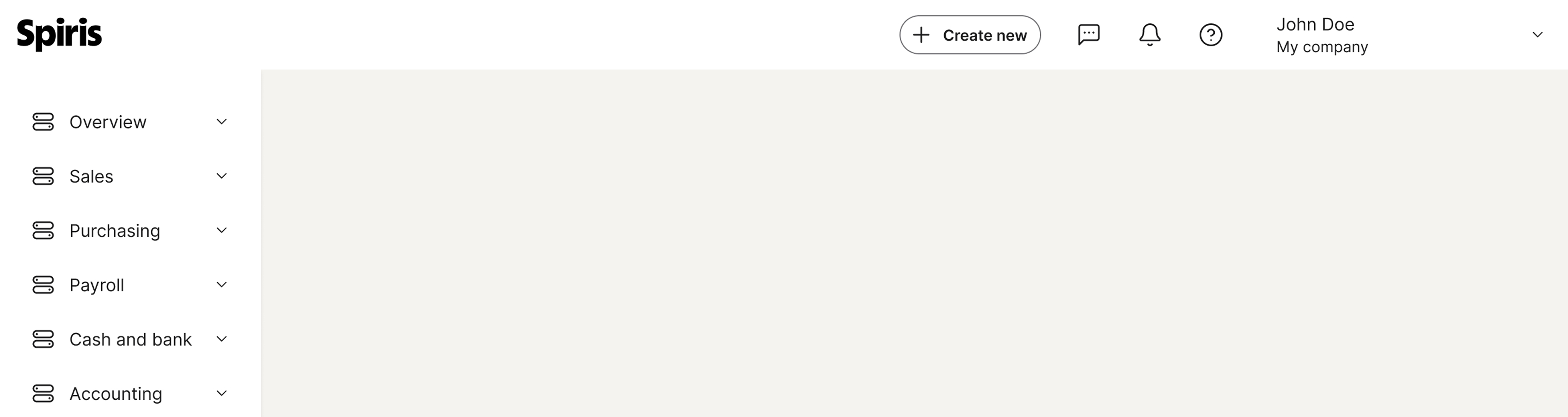
The header identifies the product and provides universal access to key tools and elements across all pages.
The guideline content on this page is synced with Figma and can be used as a source of truth.
Open in Figma
Anatomy
Logo
Menu item
Icon button
Search field
User menu
Usage
The header is a foundational element found on virtually every page of a digital product. It’s the first thing users see and acts as a central hub for essential functions.
It prominently displays the brand logo, helping users immediately identify the company. This builds trust and reinforces brand identity.
States
A component can have various states — such as enabled, hover, focused, and selected — which visually communicate its current behaviour and interactivity to the user.
When a menu link is selected, we are using distinct visual cues to clearly indicate to the user that they are on the current page. This is essential for user orientation, preventing confusion, and ensuring a predictable navigation experience.
<headerclass="navbar navbar-default"id="vudNavHeaderKbdFocus"role="navigation"><divclass="navbar-header"><divclass="navbar-brand"><atabindex="0"href="#!"id="vudNavHeaderKbdFocusApps"title="Spiris"aria-label="Spiris"><imgsrc="../../assets/img/spiris/spiris-logo.svg"title="Spiris"alt="Spiris logo"></a></div></div><navclass="collapse navbar-collapse"id="vudNavHeaderKbdFocusCollapseMain"aria-label="Menu"><ulclass="nav navbar-nav nav-tabs first-level"id="vudNavHeaderKbdFocusFlMenu"role="menubar"aria-label="Menu"><lirole="none"><ahref="#!"class="nav-item fl-menu-item focus"role="menuitem">Menu item</a></li><lirole="none"><ahref="#!"class="nav-item fl-menu-item"role="menuitem">Menu item</a></li><lirole="none"><ahref="#!"class="nav-item fl-menu-item"role="menuitem">Menu item</a></li></ul><ulclass="nav navbar-nav nav-tabs navbar-right first-level context-selector"><liclass="icon"><buttontype="button"class="btn btn-icon"aria-label="Messages"><spanaria-hidden="true"class="spirisicon spirisicon-message"></span></button></li><liclass="icon"><buttontype="button"class="btn btn-icon"aria-label="Messages"><spanaria-hidden="true"class="spirisicon spirisicon-message"></span></button></li><liclass="icon"><buttontype="button"class="btn btn-icon"aria-label="Messages"><spanaria-hidden="true"class="spirisicon spirisicon-message"></span></button></li><liclass="navbar-form"role="search"><formclass="form-group search-group"><labelclass="sr-only"for="vudNavHeaderKbdFocusSearch">Search</label><inputid="vudNavHeaderKbdFocusSearch"class="form-control"aria-label="Search in help"type="search"placeholder="Search in help…"><spanaria-hidden="true"class="search-icon">Search icon</span><buttontype="button"class="clear-search"aria-label="Close">Close</button></form></li><liclass="dropdown user-dropdown"><ahref="#!"tabindex="0"class="dropdown-toggle button-context"data-toggle="dropdown"role="button"aria-expanded="false"aria-haspopup="true"aria-controls="vudNavKbDdMenu"aria-label="User menu">
User first and last name
<spanaria-hidden="true"class="spirisicon spirisicon-user"></span><smallclass="selectedContext">Company name</small><spanclass="caret"></span></a><ulclass="dropdown-menu company-selection"id="vudNavKbDdMenu"><liclass="form-group"><labelfor="vudNavKbDdCompany">Company</label><divclass="dropdown"><buttontype="button"id="vudNavKbDdCompany"class="dropdown-toggle dropdown-field"data-toggle="dropdown"aria-haspopup="true"aria-expanded="false">
Company
</button><ulclass="dropdown-menu"role="menu"aria-labelledby="vudNavKbDdCompany"><liclass="dropdown-item"role="none"><ahref="#!"role="menuitem">Company</a></li><liclass="dropdown-item"role="none"><ahref="#!"role="menuitem">Another company</a></li></ul></div></li><liclass="divider"></li><liclass="form-group"><labelfor="vudNavKbDdLanguage">Language</label><divclass="dropdown"><buttontype="button"id="vudNavKbDdLanguage"class="dropdown-toggle dropdown-field has-value"data-toggle="dropdown"aria-haspopup="true"aria-expanded="false"><spanaria-hidden="true"class="spirisicon spirisicon-flags spirisicon-sweden"></span> Swedish
</button><ulclass="dropdown-menu"role="menu"aria-labelledby="vudNavKbDdLanguage"><liclass="dropdown-item"role="none"><ahref="#!"role="menuitem"><spanaria-hidden="true"class="spirisicon spirisicon-flags spirisicon-sweden"></span> Swedish</a></li><liclass="dropdown-item"role="none"><ahref="#!"role="menuitem"><spanaria-hidden="true"class="spirisicon spirisicon-flags spirisicon-english"></span> English</a></li></ul></div></li><liclass="divider"></li><liclass="dropdown-item"><ahref="#!">List item</a></li><liclass="divider"></li><liclass="dropdown-item"><ahref="#!"class="d-flex align-items-center"><spanaria-hidden="true"class="spirisicon spirisicon-digital-invoices-documents"></span> List item
<spanaria-hidden="true"class="spirisicon spirisicon-sm spirisicon-chevron-right ms-auto"></span></a></li><liclass="divider"></li><li><labelclass="switch light-dark-toggle"for="vudNavKbDdMode"><spanclass="light">Light mode</span><inputid="vudNavKbDdMode"type="checkbox"name="vudNavKbDdMode"><spanclass="togglemark"><bclass="details"></b></span><spanclass="dark">Dark mode</span></label></li><liclass="divider divider-strong"></li><liclass="text-center"><buttonclass="btn btn-secondary"type="button"><spanaria-hidden="true"class="spirisicon spirisicon-sm spirisicon-logout"></span>
Sign out
</button></li></ul></li></ul></nav></header>
Best practices
Use brief text labels to identify the destination’s purpose. Long labels truncate, wrap, or push other items into the overflow menu — making the navigation harder to scan.
Use brief text labels to identify the destination’s purpose.
Don’t use long text labels.
Specs
Function-specific 2-level menu
Use the navigation bar component to help users move between closely related content that is grouped together within a page.
The guideline content on this page is synced with Figma and can be used as a source of truth.
Open in Figma
Anatomy
Page link
Current page
States
A component can have various states, such as enabled, disabled, hover, focused, and selected, which visually communicate its current behaviour and interactivity to the user.
<headerclass="navbar navbar-default docs-navbar-static docs-second-level-static"id="navBarStatesDemo"><navclass="navbar-collapse"aria-label="Navigation bar states demonstration"><ulclass="second-level"id="navBarStates"role="menu"aria-label="Navigation bar states"><lirole="none"><ahref="#!"role="menuitem"class="nav-item sl-menu-item dropdown-toggle">
Enabled<spanclass="caret"></span></a></li><lirole="none"><ahref="#!"role="menuitem"class="nav-item sl-menu-item dropdown-toggle hover">
Hover<spanclass="caret"></span></a></li><lirole="none"class="active"><ahref="#!"role="menuitem"class="nav-item sl-menu-item dropdown-toggle"aria-current="page">
Selected<spanclass="caret"></span></a></li><lirole="none"><ahref="#!"role="menuitem"class="nav-item sl-menu-item dropdown-toggle focus">
Focused<spanclass="caret"></span></a></li><lirole="none"class="disabled"><ahref="#!"role="menuitem"tabindex="-1"class="nav-item sl-menu-item dropdown-toggle"aria-disabled="true">
Disabled<spanclass="caret"></span></a></li></ul></nav></header>
Placement
Our platform currently utilises a specific Navigation Bar component which is positioned directly beneath the main header and the page header. It is important to note that this navigation bar is only used by the “Skatt & Bokslut” section of our platform. This navigation bar is considered a legacy component and will be deprecated and removed entirely from the design system.
Clickable area
It is important that the entire label, icon, and surrounding area of an interactive component (like a checkbox, radio button, or accordion header) is clickable to guarantee usability and accessibility for all users. This practice creates a larger, more forgiving target area, which is a fundamental element of good design.
Accessibility
Keyboard interaction
All components should be reachable via TAB and SHIFT+TAB keys.
<headerclass="navbar navbar-default docs-navbar-static docs-second-level-static"id="navBarAccessibilityDemo"><navclass="navbar-collapse"aria-label="Navigation bar focused state demonstration"><ulclass="second-level"id="navBarAccessibility"role="menu"aria-label="Navigation bar focused state"><lirole="none"><ahref="#!"role="menuitem"class="nav-item sl-menu-item dropdown-toggle focus">
Focused<spanclass="caret"></span></a></li></ul></nav></header>
Specs
Developer reference
The examples below show ready-to-copy markup for the canonical white header (.navbar-default), the only supported colour variant.
The header examples on this page are constrained to the documentation column, so the responsive script collapses them. To see the full-width header with every element visible, open the full-page header demo and resize the browser to watch the responsive collapse behaviour.
For this component you need JavaScript. The Spiris Design System ships CSS only — the responsive navigation behaviour (collapse / dropdowns / overflow) must be wired up in the consuming application. The responsive behaviour on this docs site is driven by the reference script navbar-responsive.js.
Responsive collapse order. As the available width shrinks, the reference script reclaims space in this order — the user menu always collapses before the primary menu items, so the menu links stay visible as long as possible:
User menu collapses to an icon-only button.
Search field shortens to its compact (icon) width.
Primary menu items move into the overflow (“more”) menu, last item first; the selected item is kept visible.
Icon buttons (when more than four) move into an icon overflow menu.
Below the mobile breakpoint the whole bar switches to the mobile layout (hamburger menu).
Accessibility implementation
Beyond reachability via TAB / SHIFT+TAB, wire up the following ARIA semantics in the consuming application:
Selected menu items must use aria-current="page" — the lavender background fill alone is colour-only.
Icon buttons that carry a notification badge or dot must include the count in their accessible name (for example aria-label="Notifications, 2 unread").
The user menu trigger is a disclosure widget: pair aria-expanded with aria-controls pointing at the dropdown panel.
Complex example (three levels, product selection dropdown, user details dropdown)
The complex example retains the three-level navigation demo so consumers can see the second- and third-level sub-menu styles in context. Sub-menus are still supported — only the primary level was refreshed in 2.6.
If you need an item to have an icon instead of text in the main menu, add .icon on the <li> element that you want, and place a <button type="button" class="btn btn-icon"> inside it wrapping a <span> with the relevant icon class. Give the button an aria-label and mark the icon aria-hidden="true". The anchor-based form (<a href="#!"> inside the <li>) was deprecated in 2.6 and removed in 3.0.
Badge on items. You can add a badge on icon items by inserting a <span class="badge">+99</span>, or by adding the .attention class on the <li> tag to render a dot.
 The guideline content on this page is synced with Figma and can be used as a source of truth.
Open in Figma
The guideline content on this page is synced with Figma and can be used as a source of truth.
Open in Figma