
Dropdown lists
 The guideline content on this page is synced with Figma and can be used as a source of truth.
Open in Figma
The guideline content on this page is synced with Figma and can be used as a source of truth.
Open in Figma
A dropdown lets a user select one or more options from a list. The dropdown list is the popup that appears when the user opens a dropdown — it is used inside the Dropdown button, Split button, and Combobox components.
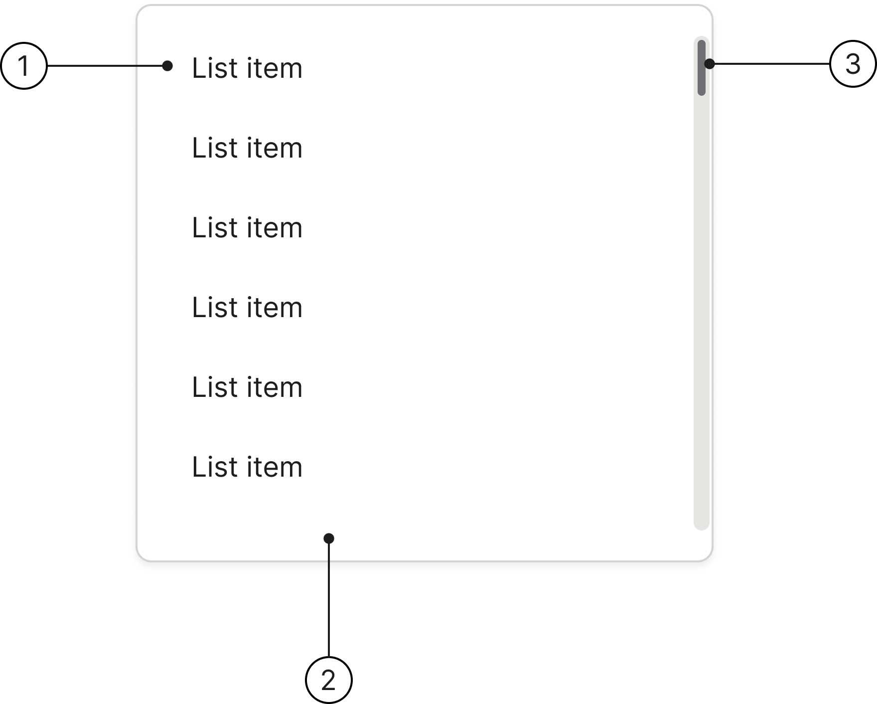
Anatomy
- Select content
- Container
- Scrollbar
Variants & States
Single select: use a single-select dropdown when the user needs to choose only one item from a predefined list of options, and selecting multiple items is not allowed or does not make sense for the context.
Country select: use a country select dropdown when you need a user to specify their country.
Each item can be in one of six states: Enabled, Hover, Selected, Selected hover, Focused, or Disabled.
Single select
Country select
Accessibility
Keyboard interaction
All items should be reachable via TAB and SHIFT+TAB keys.
The focused item shows a 2 px blue border. Disabled items must carry tabindex="-1" and aria-disabled="true" so they are skipped during keyboard traversal.
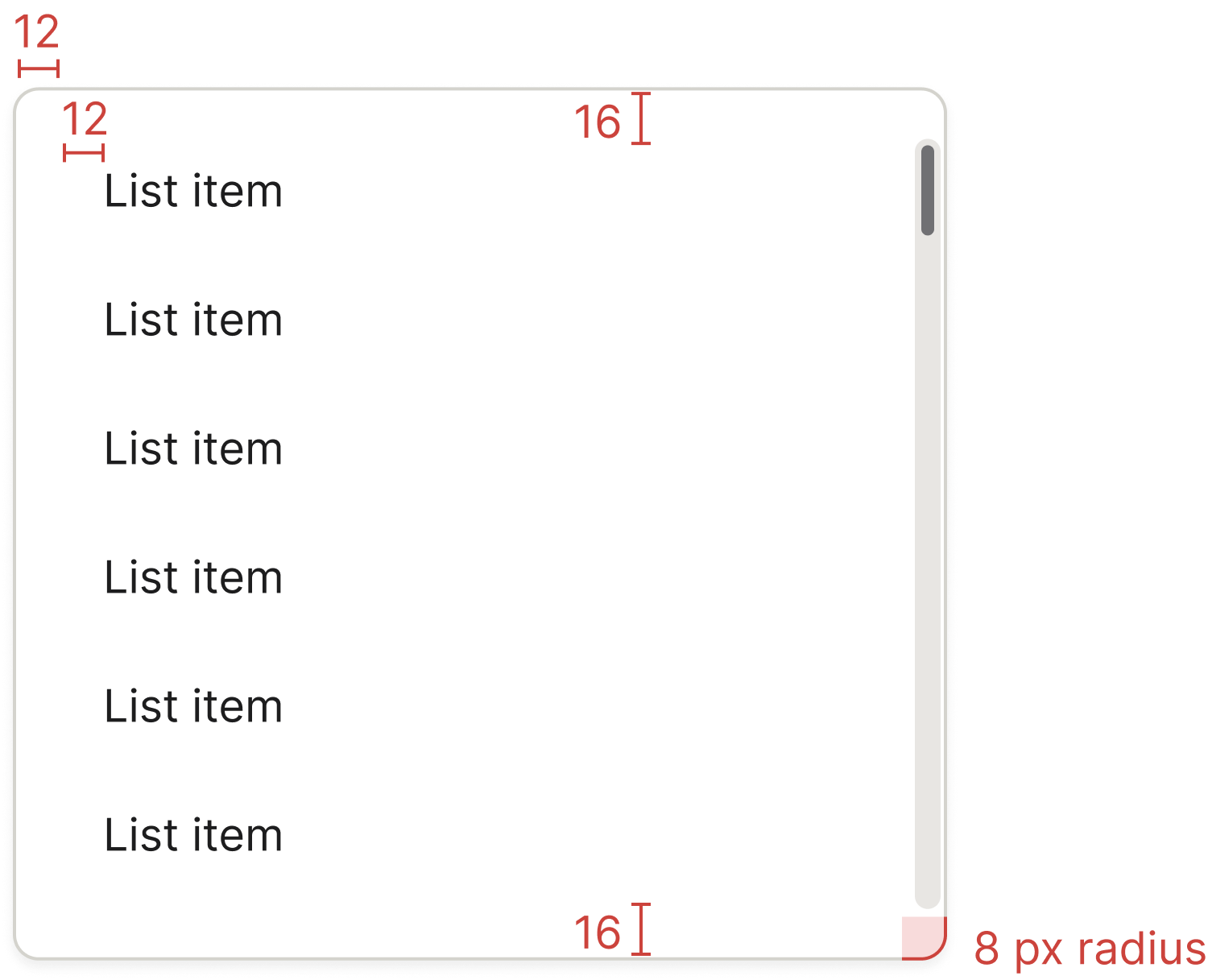
Specs
Developer reference
The section below provides an interactive code example demonstrating single-select behaviour on a .dropdown-menu. Spiris ships only the CSS; consuming applications implement their own click and keyboard handlers. The .dropdown-menu popup is also consumed by the Dropdown button, Split button, and Combobox components.
Interactive single select
Click any item to select it — the trailing checkmark moves to the clicked row, the previous selection clears, and aria-selected="true" follows the .active modifier on the wrapping <li>. Disabled items (with aria-disabled="true") are skipped.
Spiris ships only the CSS. The script below is a documentation example — consuming applications wire their own click / keyboard handlers.