
Modals
Modals appear over other content to inform users or ask them for a decision.
 The guideline content on this page is synced with Figma and can be used as a source of truth.
Open in Figma
The guideline content on this page is synced with Figma and can be used as a source of truth.
Open in Figma
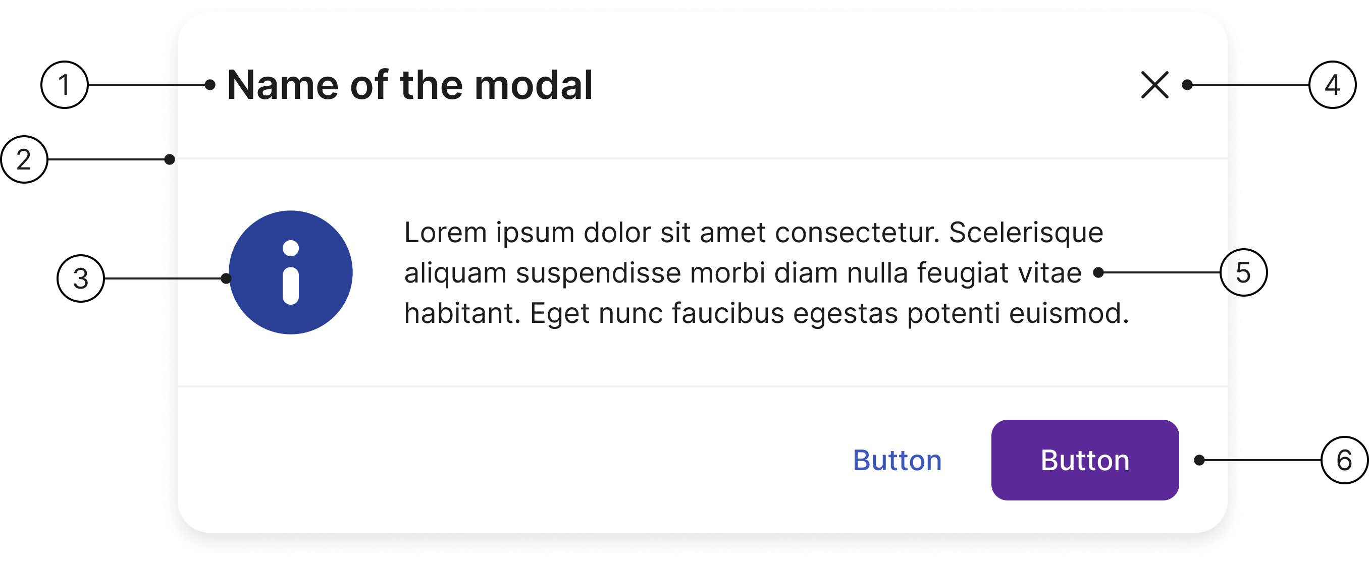
Anatomy
- Header title
- Divider
- Icon (optional)
- Close button
- Container
- Footer
Sizes
We have two different sizes for a modal — small and large — to ensure usability and flexibility.
Small
A small modal is used for simple, focused tasks that require minimal information. It’s ideal for actions that need a quick user decision, like confirming a deletion, giving a simple warning, or capturing a very short amount of information.
The small size keeps the user’s attention on the primary task without distracting them with the main page’s content, making the interaction fast and efficient.
Name of the modal
Lorem ipsum dolor sit amet consectetur. Scelerisque aliquam suspendisse morbi diam nulla feugiat vitae habitant. Eget nunc faucibus egestas potenti euismod.
development/documentation/docs/modal/examples/size-small.html<!-- Modal pattern follows the W3C WAI-ARIA Dialog (Modal) pattern: https://www.w3.org/WAI/ARIA/apg/patterns/dialog-modal/ -->
<div id="sizeSmallModal" class="modal modal-warning fade in example-modal" tabindex="-1" role="dialog" aria-labelledby="modal-title-size-small" aria-describedby="modal-body-size-small" aria-modal="true">
<div class="modal-dialog" role="document">
<div class="modal-content">
<div class="modal-header">
<h2 id="modal-title-size-small" class="modal-title">Name of the modal</h2>
<button type="button" class="close" data-toggle="modal" data-target="#sizeSmallModal" aria-label="Close"></button>
</div>
<div class="modal-body" id="modal-body-size-small">
<p>Lorem ipsum dolor sit amet consectetur. Scelerisque aliquam suspendisse morbi diam nulla feugiat vitae habitant. Eget nunc faucibus egestas potenti euismod.</p>
</div>
<div class="modal-footer">
<button type="button" class="btn btn-tertiary" data-toggle="modal" data-target="#sizeSmallModal">Button</button>
<button type="button" class="btn btn-primary" data-toggle="modal" data-target="#sizeSmallModal">Button</button>
</div>
</div>
</div>
</div>
Large
A large modal is used for more complex tasks that require more screen real estate. This includes detailed forms, multi-step wizards, or displaying a significant amount of information, like an image gallery or a document preview.
The larger size provides enough space for all the necessary content without forcing the user to scroll excessively. It keeps the user within the context of the main application whilst still providing a focused, task-oriented view.
Large modal
Lorem ipsum dolor sit amet consectetur. Scelerisque aliquam suspendisse morbi diam nulla feugiat vitae habitant. Eget nunc faucibus egestas potenti euismod.
development/documentation/docs/modal/examples/size-large.html<!-- Modal pattern follows the W3C WAI-ARIA Dialog (Modal) pattern: https://www.w3.org/WAI/ARIA/apg/patterns/dialog-modal/ -->
<div id="sizeLargeModal" class="modal modal-warning fade in example-modal" tabindex="-1" role="dialog" aria-labelledby="modal-title-size-large" aria-describedby="modal-body-size-large" aria-modal="true">
<div class="modal-dialog modal-lg" role="document">
<div class="modal-content">
<div class="modal-header">
<h2 id="modal-title-size-large" class="modal-title">Large modal</h2>
<button type="button" class="close" data-toggle="modal" data-target="#sizeLargeModal" aria-label="Close"></button>
</div>
<div class="modal-body" id="modal-body-size-large">
<p>Lorem ipsum dolor sit amet consectetur. Scelerisque aliquam suspendisse morbi diam nulla feugiat vitae habitant. Eget nunc faucibus egestas potenti euismod.</p>
</div>
<div class="modal-footer">
<button type="button" class="btn btn-tertiary" data-toggle="modal" data-target="#sizeLargeModal">Button</button>
<button type="button" class="btn btn-primary" data-toggle="modal" data-target="#sizeLargeModal">Button</button>
</div>
</div>
</div>
</div>
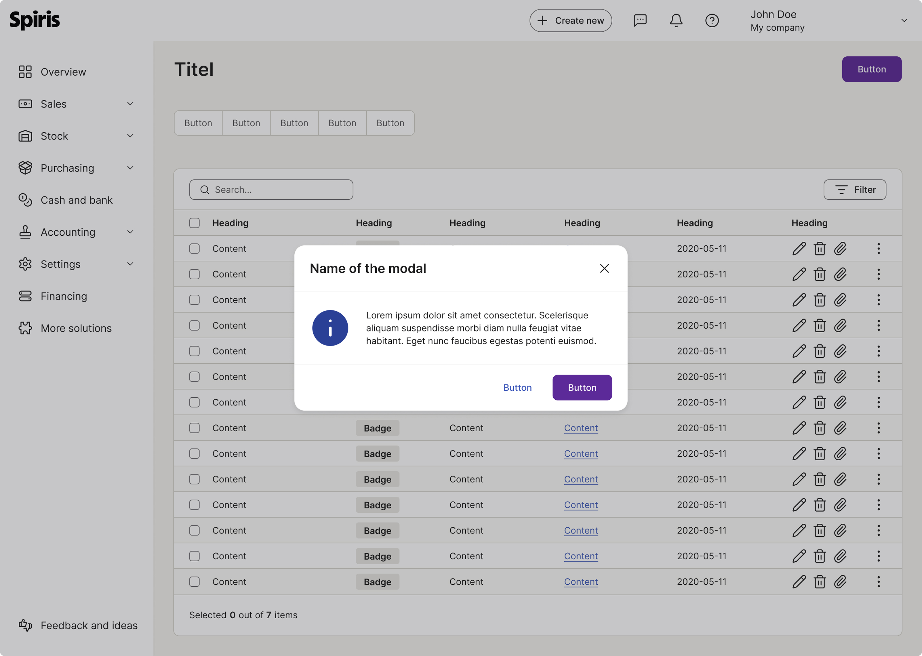
Modal backdrop (overlay)
The modal backdrop (or overlay) is the layer of semi-transparent colour that covers the rest of the application interface when a modal window is open. Its primary purpose is to direct the user’s focus solely to the content within the modal, visually indicating that the background content is temporarily inactive or blocked.
To ensure consistency and clear visual hierarchy, the modal backdrop uses a specific colour variable and opacity settings. This is the same colour for all places using this functionality (drawer etc).
- Colour variable:
surface/strong - Opacity: 25% (or 0.25)
Slot component
Slot components are designed to be as flexible as possible. Here you can place a variety of content.
The container adjusts to the content of the modal.
Name of the modal
development/documentation/docs/modal/examples/slot-component.html<!-- Slot component example — demonstrates flexible content within the modal body -->
<!-- Modal pattern follows the W3C WAI-ARIA Dialog (Modal) pattern: https://www.w3.org/WAI/ARIA/apg/patterns/dialog-modal/ -->
<div id="slotComponentModal" class="modal fade in example-modal" tabindex="-1" role="dialog" aria-labelledby="modal-title-slot" aria-modal="true">
<div class="modal-dialog" role="document">
<div class="modal-content">
<div class="modal-header">
<h2 id="modal-title-slot" class="modal-title">Name of the modal</h2>
<button type="button" class="close" data-toggle="modal" data-target="#slotComponentModal" aria-label="Close"></button>
</div>
<div class="modal-body">
<div class="d-flex align-items-center justify-content-center p-8 rounded-sm docs-slot-placeholder"><span class="font-size-sm">Slot</span></div>
</div>
<div class="modal-footer">
<button type="button" class="btn btn-tertiary" data-toggle="modal" data-target="#slotComponentModal">Button</button>
<button type="button" class="btn btn-primary" data-toggle="modal" data-target="#slotComponentModal">Button</button>
</div>
</div>
</div>
</div>
Variants
The modal component is available in several variants to support different types of messages and user interactions.
Basic information
Used for general information or actions that do not require a specific status or level of urgency.
Name of the modal
Lorem ipsum dolor sit amet consectetur. Scelerisque aliquam suspendisse morbi diam nulla feugiat vitae habitant. Eget nunc faucibus egestas potenti euismod.
development/documentation/docs/modal/examples/variants-basic-info.html<!-- Basic information variant — shows a modal with an optional icon and text content -->
<!-- Modal pattern follows the W3C WAI-ARIA Dialog (Modal) pattern: https://www.w3.org/WAI/ARIA/apg/patterns/dialog-modal/ -->
<div id="variantsBasicInfoModal" class="modal fade in example-modal" tabindex="-1" role="dialog" aria-labelledby="modal-title-basic-info" aria-describedby="modal-body-basic-info" aria-modal="true">
<div class="modal-dialog" role="document">
<div class="modal-content">
<div class="modal-header">
<h2 id="modal-title-basic-info" class="modal-title">Name of the modal</h2>
<button type="button" class="close" data-toggle="modal" data-target="#variantsBasicInfoModal" aria-label="Close"></button>
</div>
<div class="modal-body" id="modal-body-basic-info">
<p>Lorem ipsum dolor sit amet consectetur. Scelerisque aliquam suspendisse morbi diam nulla feugiat vitae habitant. Eget nunc faucibus egestas potenti euismod.</p>
</div>
<div class="modal-footer">
<button type="button" class="btn btn-tertiary" data-toggle="modal" data-target="#variantsBasicInfoModal">Button</button>
<button type="button" class="btn btn-primary" data-toggle="modal" data-target="#variantsBasicInfoModal">Button</button>
</div>
</div>
</div>
</div>
Alert
Used to communicate status messages or situations that require the user’s attention. The alert type reflects the meaning of the message.
- Info: Communicates neutral information.
- Help: Provides guidance or support to help the user complete a task.
- Warning: Indicates a potentially risky action or situation.
- Error: Indicates that something went wrong or an action failed.
- Success: Confirms that an action was completed successfully.
Name of the modal
Lorem ipsum dolor sit amet consectetur. Scelerisque aliquam suspendisse morbi diam nulla feugiat vitae habitant. Eget nunc faucibus egestas potenti euismod.
development/documentation/docs/modal/examples/variants-alert-info.html<!-- Alert variant — Info tone -->
<!-- Modal pattern follows the W3C WAI-ARIA Dialog (Modal) pattern: https://www.w3.org/WAI/ARIA/apg/patterns/dialog-modal/ -->
<div id="variantsAlertInfoModal" class="modal modal-info fade in example-modal" tabindex="-1" role="dialog" aria-labelledby="modal-title-variant-info" aria-describedby="modal-body-variant-info" aria-modal="true">
<div class="modal-dialog" role="document">
<div class="modal-content">
<div class="modal-header">
<h2 id="modal-title-variant-info" class="modal-title">Name of the modal</h2>
<button type="button" class="close" data-toggle="modal" data-target="#variantsAlertInfoModal" aria-label="Close"></button>
</div>
<div id="modal-body-variant-info" class="modal-body">
<p>Lorem ipsum dolor sit amet consectetur. Scelerisque aliquam suspendisse morbi diam nulla feugiat vitae habitant. Eget nunc faucibus egestas potenti euismod.</p>
</div>
<div class="modal-footer">
<button type="button" class="btn btn-tertiary" data-toggle="modal" data-target="#variantsAlertInfoModal">Button</button>
<button type="button" class="btn btn-primary" data-toggle="modal" data-target="#variantsAlertInfoModal">Button</button>
</div>
</div>
</div>
</div>
Name of the modal
Lorem ipsum dolor sit amet consectetur. Scelerisque aliquam suspendisse morbi diam nulla feugiat vitae habitant. Eget nunc faucibus egestas potenti euismod.
development/documentation/docs/modal/examples/variants-alert-help.html<!-- Alert variant — Help tone -->
<!-- Modal pattern follows the W3C WAI-ARIA Dialog (Modal) pattern: https://www.w3.org/WAI/ARIA/apg/patterns/dialog-modal/ -->
<div id="variantsAlertHelpModal" class="modal modal-help fade in example-modal" tabindex="-1" role="dialog" aria-labelledby="modal-title-variant-help" aria-describedby="modal-body-variant-help" aria-modal="true">
<div class="modal-dialog" role="document">
<div class="modal-content">
<div class="modal-header">
<h2 id="modal-title-variant-help" class="modal-title">Name of the modal</h2>
<button type="button" class="close" data-toggle="modal" data-target="#variantsAlertHelpModal" aria-label="Close"></button>
</div>
<div id="modal-body-variant-help" class="modal-body">
<p>Lorem ipsum dolor sit amet consectetur. Scelerisque aliquam suspendisse morbi diam nulla feugiat vitae habitant. Eget nunc faucibus egestas potenti euismod.</p>
</div>
<div class="modal-footer">
<button type="button" class="btn btn-tertiary" data-toggle="modal" data-target="#variantsAlertHelpModal">Button</button>
<button type="button" class="btn btn-primary" data-toggle="modal" data-target="#variantsAlertHelpModal">Button</button>
</div>
</div>
</div>
</div>
Name of the modal
Lorem ipsum dolor sit amet consectetur. Scelerisque aliquam suspendisse morbi diam nulla feugiat vitae habitant. Eget nunc faucibus egestas potenti euismod.
development/documentation/docs/modal/examples/variants-alert-warning.html<!-- Alert variant — Warning tone -->
<!-- Modal pattern follows the W3C WAI-ARIA Dialog (Modal) pattern: https://www.w3.org/WAI/ARIA/apg/patterns/dialog-modal/ -->
<div id="variantsAlertWarningModal" class="modal modal-warning fade in example-modal" tabindex="-1" role="dialog" aria-labelledby="modal-title-variant-warning" aria-describedby="modal-body-variant-warning" aria-modal="true">
<div class="modal-dialog" role="document">
<div class="modal-content">
<div class="modal-header">
<h2 id="modal-title-variant-warning" class="modal-title">Name of the modal</h2>
<button type="button" class="close" data-toggle="modal" data-target="#variantsAlertWarningModal" aria-label="Close"></button>
</div>
<div id="modal-body-variant-warning" class="modal-body">
<p>Lorem ipsum dolor sit amet consectetur. Scelerisque aliquam suspendisse morbi diam nulla feugiat vitae habitant. Eget nunc faucibus egestas potenti euismod.</p>
</div>
<div class="modal-footer">
<button type="button" class="btn btn-tertiary" data-toggle="modal" data-target="#variantsAlertWarningModal">Button</button>
<button type="button" class="btn btn-primary" data-toggle="modal" data-target="#variantsAlertWarningModal">Button</button>
</div>
</div>
</div>
</div>
Name of the modal
Lorem ipsum dolor sit amet consectetur. Scelerisque aliquam suspendisse morbi diam nulla feugiat vitae habitant. Eget nunc faucibus egestas potenti euismod.
development/documentation/docs/modal/examples/variants-alert-error.html<!-- Alert variant — Error tone -->
<!-- Modal pattern follows the W3C WAI-ARIA Dialog (Modal) pattern: https://www.w3.org/WAI/ARIA/apg/patterns/dialog-modal/ -->
<div id="variantsAlertErrorModal" class="modal modal-error fade in example-modal" tabindex="-1" role="dialog" aria-labelledby="modal-title-variant-error" aria-describedby="modal-body-variant-error" aria-modal="true">
<div class="modal-dialog" role="document">
<div class="modal-content">
<div class="modal-header">
<h2 id="modal-title-variant-error" class="modal-title">Name of the modal</h2>
<button type="button" class="close" data-toggle="modal" data-target="#variantsAlertErrorModal" aria-label="Close"></button>
</div>
<div id="modal-body-variant-error" class="modal-body">
<p>Lorem ipsum dolor sit amet consectetur. Scelerisque aliquam suspendisse morbi diam nulla feugiat vitae habitant. Eget nunc faucibus egestas potenti euismod.</p>
</div>
<div class="modal-footer">
<button type="button" class="btn btn-tertiary" data-toggle="modal" data-target="#variantsAlertErrorModal">Button</button>
<button type="button" class="btn btn-primary" data-toggle="modal" data-target="#variantsAlertErrorModal">Button</button>
</div>
</div>
</div>
</div>
Name of the modal
Lorem ipsum dolor sit amet consectetur. Scelerisque aliquam suspendisse morbi diam nulla feugiat vitae habitant. Eget nunc faucibus egestas potenti euismod.
development/documentation/docs/modal/examples/variants-alert-success.html<!-- Alert variant — Success tone -->
<!-- Modal pattern follows the W3C WAI-ARIA Dialog (Modal) pattern: https://www.w3.org/WAI/ARIA/apg/patterns/dialog-modal/ -->
<div id="variantsAlertSuccessModal" class="modal modal-success fade in example-modal" tabindex="-1" role="dialog" aria-labelledby="modal-title-variant-success" aria-describedby="modal-body-variant-success" aria-modal="true">
<div class="modal-dialog" role="document">
<div class="modal-content">
<div class="modal-header">
<h2 id="modal-title-variant-success" class="modal-title">Name of the modal</h2>
<button type="button" class="close" data-toggle="modal" data-target="#variantsAlertSuccessModal" aria-label="Close"></button>
</div>
<div id="modal-body-variant-success" class="modal-body">
<p>Lorem ipsum dolor sit amet consectetur. Scelerisque aliquam suspendisse morbi diam nulla feugiat vitae habitant. Eget nunc faucibus egestas potenti euismod.</p>
</div>
<div class="modal-footer">
<button type="button" class="btn btn-tertiary" data-toggle="modal" data-target="#variantsAlertSuccessModal">Button</button>
<button type="button" class="btn btn-primary" data-toggle="modal" data-target="#variantsAlertSuccessModal">Button</button>
</div>
</div>
</div>
</div>
Buttons
In a design system, placing the primary button on the right side of a modal is a key practice for user experience and usability.
This placement aligns with common reading patterns and user expectations, making the modal’s primary action easier to find and click.
Name of the modal
Lorem ipsum dolor sit amet consectetur. Scelerisque aliquam suspendisse morbi diam nulla feugiat vitae habitant. Eget nunc faucibus egestas potenti euismod.
development/documentation/docs/modal/examples/default-icon-on-left.html<!-- Modal pattern follows the W3C WAI-ARIA Dialog (Modal) pattern: https://www.w3.org/WAI/ARIA/apg/patterns/dialog-modal/ -->
<div id="infoModal" class="modal modal-info fade in example-modal" tabindex="-1" role="dialog" aria-labelledby="modal-title-2" aria-modal="true">
<div class="modal-dialog" role="document">
<div class="modal-content">
<div class="modal-header">
<h2 id="modal-title-2" class="modal-title">Name of the modal</h2>
<button type="button" class="close" data-toggle="modal" data-target="#infoModal" aria-label="Close"></button>
</div>
<div class="modal-body">
<p>Lorem ipsum dolor sit amet consectetur. Scelerisque aliquam suspendisse morbi diam nulla feugiat vitae habitant. Eget nunc faucibus egestas potenti euismod.</p>
</div>
<div class="modal-footer">
<button type="button" class="btn btn-tertiary" data-toggle="modal" data-target="#infoModal">Button</button>
<button type="button" class="btn btn-primary" data-toggle="modal" data-target="#infoModal">Button</button>
</div>
</div>
</div>
</div>
Accessibility
Keyboard interaction
All components should be reachable via TAB and SHIFT+TAB keys.
Name of the modal
Lorem ipsum dolor sit amet consectetur. Scelerisque aliquam suspendisse morbi diam nulla feugiat vitae habitant. Eget nunc faucibus egestas potenti euismod.
development/documentation/docs/modal/examples/accessibility-error.html<!-- Accessibility example — error modal with focus state on primary button -->
<!-- Modal pattern follows the W3C WAI-ARIA Dialog (Modal) pattern: https://www.w3.org/WAI/ARIA/apg/patterns/dialog-modal/ -->
<div id="accessibilityErrorModal" class="modal modal-error fade in example-modal" tabindex="-1" role="dialog" aria-labelledby="modal-title-accessibility" aria-describedby="modal-body-accessibility" aria-modal="true">
<div class="modal-dialog" role="document">
<div class="modal-content">
<div class="modal-header">
<h2 id="modal-title-accessibility" class="modal-title">Name of the modal</h2>
<button type="button" class="close" data-toggle="modal" data-target="#accessibilityErrorModal" aria-label="Close"></button>
</div>
<div id="modal-body-accessibility" class="modal-body">
<p>Lorem ipsum dolor sit amet consectetur. Scelerisque aliquam suspendisse morbi diam nulla feugiat vitae habitant. Eget nunc faucibus egestas potenti euismod.</p>
</div>
<div class="modal-footer">
<button type="button" class="btn btn-tertiary" data-toggle="modal" data-target="#accessibilityErrorModal">Button</button>
<button type="button" class="btn btn-primary focus" data-toggle="modal" data-target="#accessibilityErrorModal">Button</button>
</div>
</div>
</div>
</div>
Best practices
Button alignment
Name of the modal
Lorem ipsum dolor sit amet consectetur. Scelerisque aliquam suspendisse morbi diam nulla feugiat vitae habitant. Eget nunc faucibus egestas potenti euismod.
development/documentation/docs/modal/examples/default-icon-on-left-info.html<!-- Modal pattern follows the W3C WAI-ARIA Dialog (Modal) pattern: https://www.w3.org/WAI/ARIA/apg/patterns/dialog-modal/ -->
<div id="infoModal" class="modal modal-info fade in example-modal" tabindex="-1" role="dialog" aria-labelledby="modal-title-3" aria-modal="true">
<div class="modal-dialog" role="document">
<div class="modal-content">
<div class="modal-header">
<h2 id="modal-title-3" class="modal-title">Name of the modal</h2>
<button type="button" class="close" data-toggle="modal" data-target="#infoModal" aria-label="Close"></button>
</div>
<div class="modal-body">
<p>Lorem ipsum dolor sit amet consectetur. Scelerisque aliquam suspendisse morbi diam nulla feugiat vitae habitant. Eget nunc faucibus egestas potenti euismod.</p>
</div>
<div class="modal-footer">
<button type="button" class="btn btn-tertiary" data-toggle="modal" data-target="#infoModal">Cancel</button>
<button type="button" class="btn btn-primary" data-toggle="modal" data-target="#infoModal">Save</button>
</div>
</div>
</div>
</div>

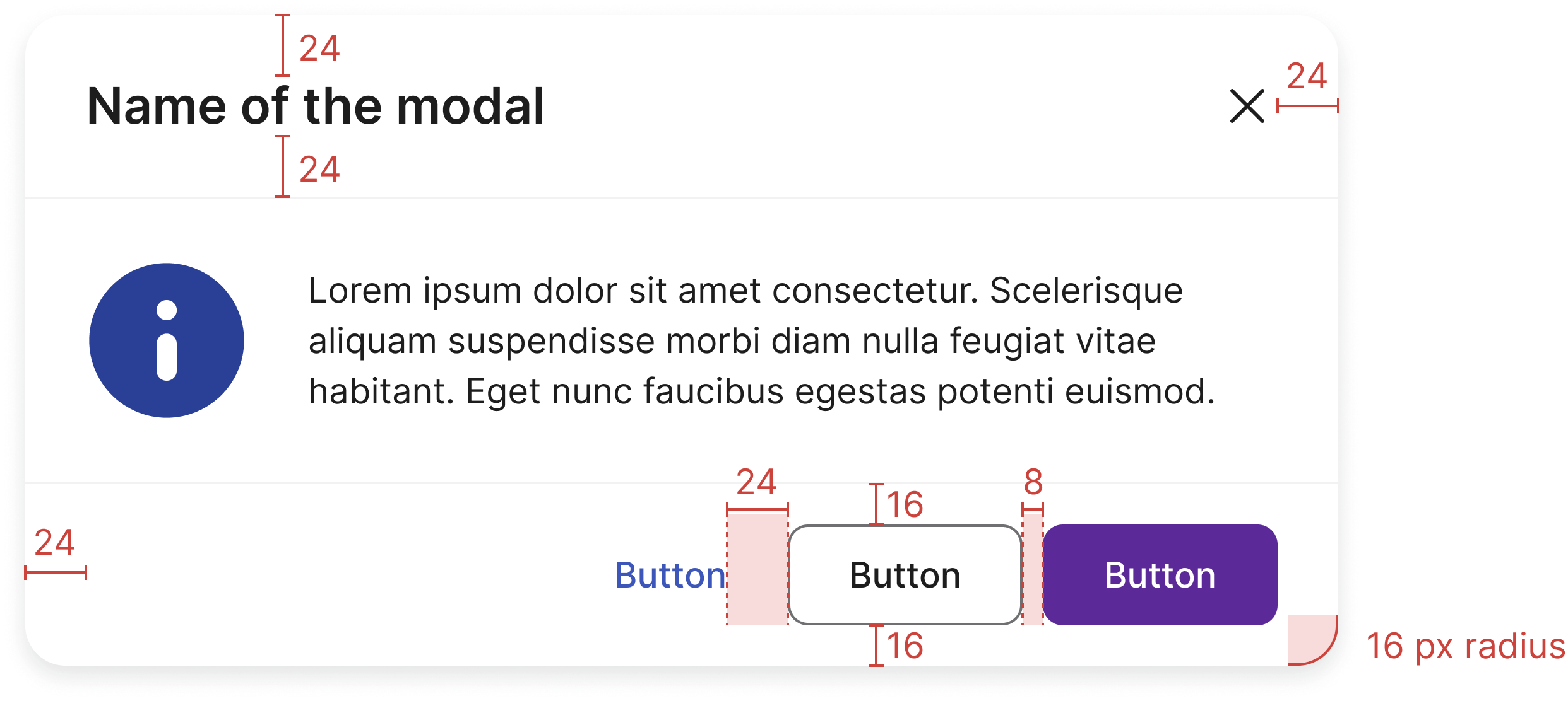
Always align buttons to the right in the footer.
When you have more than one button, place the primary button to the right of the secondary button.
Name of the modal
Lorem ipsum dolor sit amet consectetur. Scelerisque aliquam suspendisse morbi diam nulla feugiat vitae habitant. Eget nunc faucibus egestas potenti euismod.
development/documentation/docs/modal/examples/best-practices-dont.html<!-- Best practices "Don't" example — primary button incorrectly placed on the left -->
<!-- Modal pattern follows the W3C WAI-ARIA Dialog (Modal) pattern: https://www.w3.org/WAI/ARIA/apg/patterns/dialog-modal/ -->
<div id="bestPracticeDontModal" class="modal modal-info fade in example-modal" tabindex="-1" role="dialog" aria-labelledby="modal-title-bp-dont" aria-modal="true">
<div class="modal-dialog" role="document">
<div class="modal-content">
<div class="modal-header">
<h2 id="modal-title-bp-dont" class="modal-title">Name of the modal</h2>
<button type="button" class="close" data-toggle="modal" data-target="#bestPracticeDontModal" aria-label="Close"></button>
</div>
<div class="modal-body">
<p>Lorem ipsum dolor sit amet consectetur. Scelerisque aliquam suspendisse morbi diam nulla feugiat vitae habitant. Eget nunc faucibus egestas potenti euismod.</p>
</div>
<div class="modal-footer justify-content-start">
<button type="button" class="btn btn-primary" data-toggle="modal" data-target="#bestPracticeDontModal">Save</button>
<button type="button" class="btn btn-tertiary" data-toggle="modal" data-target="#bestPracticeDontModal">Cancel</button>
</div>
</div>
</div>
</div>

Don’t place buttons to the left or middle of the footer.
Don’t put primary buttons to the left of the secondary or tertiary buttons.
Specs
Developer reference
The following sections describe supported functionality that is not part of the Figma design specification.
Design
A rendered modal with header, body, and a set of actions in the footer.
A dialog box (default) has a fixed width of 520px, but it shrinks when there is not enough space for it. More sizes are available below.
Also, you can arrange the buttons from a modal using helper classes.
Title of the dialogue box explaining main function
development/documentation/docs/modal/examples/modals-examples.html<!-- Modal pattern follows the W3C WAI-ARIA Dialog (Modal) pattern: https://www.w3.org/WAI/ARIA/apg/patterns/dialog-modal/ -->
<div id="dialogModal" class="modal fade in example-modal" tabindex="-1" role="dialog" aria-labelledby="modal-title-1" aria-modal="true">
<div class="modal-dialog" role="document">
<div class="modal-content">
<div class="modal-header">
<h2 id="modal-title-1" class="modal-title">Title of the dialogue box explaining main function</h2>
<button type="button" class="close" data-toggle="modal" data-target="#dialogModal" aria-label="Close"></button>
</div>
<div class="modal-body">
<form class="form-horizontal">
<div class="form-group required">
<label class="col-md-2 control-label" for="inputEmail3">Email</label>
<div class="col-md-10">
<input type="email" id="inputEmail3" class="form-control">
</div>
</div>
<div class="form-group">
<label class="col-md-2 control-label" for="inputMessage">Message</label>
<div class="col-md-10">
<textarea type="text" id="inputMessage" class="form-control"></textarea>
</div>
</div>
</form>
</div>
<div class="modal-footer gap-8">
<button type="button" class="btn btn-tertiary" data-toggle="modal" data-target="#dialogModal">Cancel</button>
<button type="button" class="btn btn-primary" data-toggle="modal" data-target="#dialogModal">Send</button>
</div>
</div><!-- /.modal-content -->
</div>
</div>
Options
Modals with alert icons
By adding .modal-info, .modal-help, .modal-success, .modal-warning or .modal-error class to the modal wrapper .modal, it will transform the modal into an alert dialogue.
By default the icon will be placed on the left, but you have the option to place it on top and align everything on centre (.modal-center). Follow the examples below. Note: The centred icon placement (.modal-center) is deprecated from 2.4 and will be removed in 3.0.
Name of the modal
Lorem ipsum dolor sit amet consectetur. Scelerisque aliquam suspendisse morbi diam nulla feugiat vitae habitant. Eget nunc faucibus egestas potenti euismod.
development/documentation/docs/modal/examples/default-icon-on-left.html<!-- Modal pattern follows the W3C WAI-ARIA Dialog (Modal) pattern: https://www.w3.org/WAI/ARIA/apg/patterns/dialog-modal/ -->
<div id="infoModal" class="modal modal-info fade in example-modal" tabindex="-1" role="dialog" aria-labelledby="modal-title-2" aria-modal="true">
<div class="modal-dialog" role="document">
<div class="modal-content">
<div class="modal-header">
<h2 id="modal-title-2" class="modal-title">Name of the modal</h2>
<button type="button" class="close" data-toggle="modal" data-target="#infoModal" aria-label="Close"></button>
</div>
<div class="modal-body">
<p>Lorem ipsum dolor sit amet consectetur. Scelerisque aliquam suspendisse morbi diam nulla feugiat vitae habitant. Eget nunc faucibus egestas potenti euismod.</p>
</div>
<div class="modal-footer">
<button type="button" class="btn btn-tertiary" data-toggle="modal" data-target="#infoModal">Button</button>
<button type="button" class="btn btn-primary" data-toggle="modal" data-target="#infoModal">Button</button>
</div>
</div>
</div>
</div>
Default — icon placed on left
Name of the modal
Lorem ipsum dolor sit amet consectetur. Scelerisque aliquam suspendisse morbi diam nulla feugiat vitae habitant. Eget nunc faucibus egestas potenti euismod.
development/documentation/docs/modal/examples/default-icon-on-left-info.html<!-- Modal pattern follows the W3C WAI-ARIA Dialog (Modal) pattern: https://www.w3.org/WAI/ARIA/apg/patterns/dialog-modal/ -->
<div id="infoModal" class="modal modal-info fade in example-modal" tabindex="-1" role="dialog" aria-labelledby="modal-title-3" aria-modal="true">
<div class="modal-dialog" role="document">
<div class="modal-content">
<div class="modal-header">
<h2 id="modal-title-3" class="modal-title">Name of the modal</h2>
<button type="button" class="close" data-toggle="modal" data-target="#infoModal" aria-label="Close"></button>
</div>
<div class="modal-body">
<p>Lorem ipsum dolor sit amet consectetur. Scelerisque aliquam suspendisse morbi diam nulla feugiat vitae habitant. Eget nunc faucibus egestas potenti euismod.</p>
</div>
<div class="modal-footer">
<button type="button" class="btn btn-tertiary" data-toggle="modal" data-target="#infoModal">Cancel</button>
<button type="button" class="btn btn-primary" data-toggle="modal" data-target="#infoModal">Save</button>
</div>
</div>
</div>
</div>
Title of the success message
Brief phrase describing the information for the user.
The following text has additional information about the message
development/documentation/docs/modal/examples/default-icon-on-left-success.html<!-- Modal pattern follows the W3C WAI-ARIA Dialog (Modal) pattern: https://www.w3.org/WAI/ARIA/apg/patterns/dialog-modal/ -->
<div id="successModal" class="modal modal-success fade in example-modal" tabindex="-1" role="dialog" aria-labelledby="modal-title-4" aria-modal="true">
<div class="modal-dialog" role="document">
<div class="modal-content">
<div class="modal-header">
<h2 id="modal-title-4" class="modal-title">Title of the success message</h2>
<button type="button" class="close" data-toggle="modal" data-target="#successModal" aria-label="Close"></button>
</div>
<div class="modal-body">
<p>Brief phrase describing the information for the user.</p>
<p>The following text has additional information about the message</p>
</div>
<div class="modal-footer gap-8">
<button type="button" class="btn btn-tertiary" data-toggle="modal" data-target="#successModal">No</button>
<button type="button" class="btn btn-primary" data-toggle="modal" data-target="#successModal">Yes</button>
</div>
</div><!-- /.modal-content -->
</div>
</div>
Name of the modal
Lorem ipsum dolor sit amet consectetur. Scelerisque aliquam suspendisse morbi diam nulla feugiat vitae habitant. Eget nunc faucibus egestas potenti euismod.
development/documentation/docs/modal/examples/default-icon-on-left-warning.html<!-- Modal pattern follows the W3C WAI-ARIA Dialog (Modal) pattern: https://www.w3.org/WAI/ARIA/apg/patterns/dialog-modal/ -->
<div id="warningModal" class="modal modal-warning fade in example-modal" tabindex="-1" role="dialog" aria-labelledby="modal-title-5" aria-modal="true">
<div class="modal-dialog" role="document">
<div class="modal-content">
<div class="modal-header">
<h2 id="modal-title-5" class="modal-title">Name of the modal</h2>
<button type="button" class="close" data-toggle="modal" data-target="#warningModal" aria-label="Close"></button>
</div>
<div class="modal-body">
<p>Lorem ipsum dolor sit amet consectetur. Scelerisque aliquam suspendisse morbi diam nulla feugiat vitae habitant. Eget nunc faucibus egestas potenti euismod.</p>
</div>
<div class="modal-footer">
<button type="button" class="btn btn-tertiary" data-toggle="modal" data-target="#warningModal">Button</button>
<button type="button" class="btn btn-primary focus" data-toggle="modal" data-target="#warningModal">Button</button>
</div>
</div>
</div>
</div>
Title of the error message
Brief explanation of the error that has occurred and what the user can do to solve it.
The following text has additional information about the message
development/documentation/docs/modal/examples/default-icon-on-left-error.html<!-- Modal pattern follows the W3C WAI-ARIA Dialog (Modal) pattern: https://www.w3.org/WAI/ARIA/apg/patterns/dialog-modal/ -->
<div id="errorpModal" class="modal modal-error fade in example-modal" tabindex="-1" role="dialog" aria-labelledby="modal-title-6" aria-modal="true">
<div class="modal-dialog" role="document">
<div class="modal-content">
<div class="modal-header">
<h2 id="modal-title-6" class="modal-title">Title of the error message</h2>
<button type="button" class="close" data-toggle="modal" data-target="#errorpModal" aria-label="Close"></button>
</div>
<div class="modal-body">
<p>Brief explanation of the error that has occurred and what the user can do to solve it.</p>
<p>The following text has additional information about the message</p>
</div>
<div class="modal-footer gap-8">
<button type="button" class="btn btn-tertiary" data-toggle="modal" data-target="#errorpModal">No</button>
<button type="button" class="btn btn-primary" data-toggle="modal" data-target="#errorpModal">Yes</button>
</div>
</div><!-- /.modal-content -->
</div>
</div>
Centred — icon placed on centre
Title of the question message
Main instruction for the question message ending with a question mark?
The following text has additional information about the message
development/documentation/docs/modal/examples/centered-icon-on-center.html<!-- Modal pattern follows the W3C WAI-ARIA Dialog (Modal) pattern: https://www.w3.org/WAI/ARIA/apg/patterns/dialog-modal/ -->
<!-- Example visible only on screens larger than sm -->
<p id="modal-center" class="mb-32 font-weight-bold text-center"></p>
<div id="helpModal" class="modal modal-center modal-help fade in example-modal" tabindex="-1" role="dialog" aria-labelledby="modal-title-2" aria-modal="true">
<div class="modal-dialog" role="document">
<div class="modal-content">
<div class="modal-header">
<h2 id="modal-title-2" class="modal-title">Title of the question message</h2>
<button type="button" class="close" data-toggle="modal" data-target="#helpModal" aria-label="Close"></button>
</div>
<div class="modal-body">
<p>Main instruction for the question message ending with a question mark?</p>
<p>The following text has additional information about the message</p>
</div>
<div class="modal-footer justify-content-center gap-8">
<button type="button" class="btn btn-tertiary" data-toggle="modal" data-target="#helpModal">No</button>
<button type="button" class="btn btn-primary" data-toggle="modal" data-target="#helpModal">Yes</button>
</div>
</div><!-- /.modal-content -->
</div><!-- /.modal-dialog -->
</div>
Title of the information message with additional info
Brief phrase describing the information for the user.
development/documentation/docs/modal/examples/centered-icon-on-center-info.html<!-- Modal pattern follows the W3C WAI-ARIA Dialog (Modal) pattern: https://www.w3.org/WAI/ARIA/apg/patterns/dialog-modal/ -->
<div id="infoModal" class="modal modal-center modal-info fade in example-modal" tabindex="-1" role="dialog" aria-labelledby="modal-title-3" aria-modal="true">
<div class="modal-dialog" role="document">
<div class="modal-content">
<div class="modal-header">
<h2 id="modal-title-3" class="modal-title">Title of the information message with additional info</h2>
<button type="button" class="close" data-toggle="modal" data-target="#infoModal" aria-label="Close"></button>
</div>
<div class="modal-body">
<p>Brief phrase describing the information for the user.</p>
</div>
<div class="modal-footer justify-content-center gap-8">
<button type="button" class="btn btn-tertiary" data-toggle="modal" data-target="#infoModal">No</button>
<button type="button" class="btn btn-primary" data-toggle="modal" data-target="#infoModal">Yes</button>
</div>
</div><!-- /.modal-content -->
</div>
</div>
Title of the success message
Brief phrase describing the information for the user.
The following text has additional information about the message
development/documentation/docs/modal/examples/centered-icon-on-center-success.html<!-- Modal pattern follows the W3C WAI-ARIA Dialog (Modal) pattern: https://www.w3.org/WAI/ARIA/apg/patterns/dialog-modal/ -->
<div id="successModal" class="modal modal-center modal-success fade in example-modal" tabindex="-1" role="dialog" aria-labelledby="modal-title-4" aria-modal="true">
<div class="modal-dialog" role="document">
<div class="modal-content">
<div class="modal-header">
<h2 id="modal-title-4" class="modal-title">Title of the success message</h2>
<button type="button" class="close" data-toggle="modal" data-target="#successModal" aria-label="Close"></button>
</div>
<div class="modal-body">
<p>Brief phrase describing the information for the user.</p>
<p>The following text has additional information about the message</p>
</div>
<div class="modal-footer justify-content-center gap-8">
<button type="button" class="btn btn-tertiary" data-toggle="modal" data-target="#successModal">No</button>
<button type="button" class="btn btn-primary" data-toggle="modal" data-target="#successModal">Yes</button>
</div>
</div><!-- /.modal-content -->
</div>
</div>
Title of the warning message
Brief explanation of the source of the warning message
The following text has additional information about the message
development/documentation/docs/modal/examples/centered-icon-on-center-warning.html<!-- Modal pattern follows the W3C WAI-ARIA Dialog (Modal) pattern: https://www.w3.org/WAI/ARIA/apg/patterns/dialog-modal/ -->
<div id="warningModal" class="modal modal-center modal-warning fade in example-modal" tabindex="-1" role="dialog" aria-labelledby="modal-title-5" aria-modal="true">
<div class="modal-dialog" role="document">
<div class="modal-content">
<div class="modal-header">
<h2 id="modal-title-5" class="modal-title">Title of the warning message</h2>
<button type="button" class="close" data-toggle="modal" data-target="#warningModal" aria-label="Close"></button>
</div>
<div class="modal-body">
<p>Brief explanation of the source of the warning message</p>
<p>The following text has additional information about the message</p>
</div>
<div class="modal-footer justify-content-center gap-8">
<button type="button" class="btn btn-tertiary" data-toggle="modal" data-target="#warningModal">No</button>
<button type="button" class="btn btn-primary" data-toggle="modal" data-target="#warningModal">Yes</button>
</div>
</div><!-- /.modal-content -->
</div>
</div>
Title of the error message
Brief explanation of the error that has occurred and what the user can do to solve it.
The following text has additional information about the message
development/documentation/docs/modal/examples/centered-icon-on-center-error.html<!-- Modal pattern follows the W3C WAI-ARIA Dialog (Modal) pattern: https://www.w3.org/WAI/ARIA/apg/patterns/dialog-modal/ -->
<div id="errorpModal" class="modal modal-center modal-error fade in example-modal" tabindex="-1" role="dialog" aria-labelledby="modal-title-6" aria-modal="true">
<div class="modal-dialog" role="document">
<div class="modal-content">
<div class="modal-header">
<h2 id="modal-title-6" class="modal-title">Title of the error message</h2>
<button type="button" class="close" data-toggle="modal" data-target="#errorpModal" aria-label="Close"></button>
</div>
<div class="modal-body">
<p>Brief explanation of the error that has occurred and what the user can do to solve it.</p>
<p>The following text has additional information about the message</p>
</div>
<div class="modal-footer justify-content-center gap-8">
<button type="button" class="btn btn-tertiary" data-toggle="modal" data-target="#errorpModal">No</button>
<button type="button" class="btn btn-primary" data-toggle="modal" data-target="#errorpModal">Yes</button>
</div>
</div><!-- /.modal-content -->
</div>
</div>
Modal sizes
Modals support 6 sizes (5 modifiers + the default):
- full width (
.modal-full) - extra large (
.modal-xl) - 900px (
.modal-lg) — for complex tasks, detailed forms, or document previews - 520px (default size, or
.modal-sm) — for simple, focused tasks - 480px (
.modal-xs)
Classes need to be placed on .modal-dialog.
By clicking on buttons the modal will show; the functionality is just an example on how it should work.
For this component you need JavaScript! We recommend you to create your own script to show and hide the modal. If you need help just contact us.
Modal title
Lorem ipsum dolor sit amet, consectetur adipiscing elit. Praesent in tortor eu tellus facilisis bibendum et sed ante. Pellentesque sed metus risus. Quisque id dictum eros. Suspendisse auctor, nisi in sodales egestas, leo eros bibendum augue, non dignissim velit tellus sit amet tellus. Suspendisse et massa eu arcu lobortis pharetra. Phasellus dapibus hendrerit tortor eget molestie. Curabitur vel augue sem. Fusce eget iaculis purus. Vivamus orci urna, tempor nec enim lacinia, convallis lobortis magna. Quisque porta convallis interdum. Praesent efficitur velit sit amet quam gravida, in eleifend ligula venenatis. Maecenas bibendum, elit nec hendrerit luctus, lorem dui consequat eros, eu molestie diam nisi finibus metus. Cras arcu velit, sollicitudin vel cursus sit amet, fringilla id dui. Nunc auctor tristique orci eget venenatis. Etiam auctor justo a leo commodo consectetur.
Aenean ac libero id ipsum volutpat placerat ultrices mollis augue. Fusce at metus vitae leo ornare suscipit. Sed finibus luctus diam quis luctus. Mauris at consequat est. In ornare faucibus felis eu hendrerit. Pellentesque vehicula sem id lacus euismod, at finibus tortor imperdiet. Sed sit amet purus vitae erat pharetra cursus et id ex. Mauris tortor nisl, tincidunt eget pharetra sed, aliquet eu libero. Nunc ipsum dui, pharetra eget aliquet vel, eleifend vel nisl. Nam sem elit, semper quis enim et, finibus iaculis ligula. Phasellus posuere bibendum enim, a consectetur turpis consectetur at. Sed quam nunc, mattis at turpis eget, tincidunt euismod enim.
Donec et lorem vitae neque feugiat vehicula a eu ante. Praesent ac gravida magna. Proin at commodo felis. Aenean nec luctus metus, non gravida mauris. Sed ligula sem, scelerisque id orci vel, tempus imperdiet mi. Phasellus condimentum ultrices nunc, id venenatis arcu tempor non. Nulla gravida mauris orci, sed lacinia nibh pellentesque a. Curabitur malesuada diam non elit aliquam pellentesque sed nec velit. Proin nec risus neque. Pellentesque maximus, ex id dignissim imperdiet, justo libero ultrices ex, ut porttitor elit ex ac lacus. Nunc a ligula felis.
Mauris et mi sit amet arcu mattis ultrices. Aenean ornare venenatis tempor. Quisque molestie magna vel elit cursus, sagittis iaculis urna laoreet. Donec feugiat sapien eget arcu condimentum, et rutrum lorem mollis. Nam rhoncus elementum turpis sed feugiat. Morbi tincidunt neque tellus, faucibus dictum elit accumsan et. In malesuada justo nunc, at mattis ex cursus vel. Duis ultricies, justo quis sagittis egestas, nulla erat aliquam mi, eu aliquam enim turpis ac sem. Aliquam a enim et lectus volutpat consequat. Nullam at elit dui. Mauris velit libero, blandit in augue auctor, gravida fermentum enim. Lorem ipsum dolor sit amet, consectetur adipiscing elit. Nulla id hendrerit mi, quis elementum lacus. Integer rhoncus sed ligula quis ornare. Sed eget odio sollicitudin, interdum nibh id, sagittis neque.
Vestibulum id odio dictum, lobortis ante eget, lobortis magna. Quisque pharetra orci et mi gravida tincidunt. Suspendisse tristique velit ut finibus dictum. Vestibulum erat diam, blandit vitae rhoncus eget, gravida dictum nisi. Nulla facilisis efficitur velit quis mattis. Praesent quis neque luctus, aliquet nisl sed, tincidunt nisi. Fusce fringilla ligula sit amet purus congue sagittis. Integer varius mauris eu diam volutpat malesuada. Quisque tempor tempor ipsum vel sagittis. Mauris vitae libero vel libero commodo luctus. Nullam eleifend eget odio at pretium. Fusce pharetra sit amet mi nec vestibulum. Nam pulvinar purus arcu, vitae vulputate lectus accumsan non. Phasellus auctor libero sed dictum laoreet. Nullam rutrum dictum placerat.
Fusce hendrerit lacus eget purus aliquet, in placerat enim interdum. Nullam efficitur non mauris quis dignissim. Vestibulum magna dolor, pretium in metus vehicula, lacinia aliquam lacus. Nullam commodo non augue mattis cursus. Proin et lacinia ipsum. Praesent imperdiet condimentum augue ut feugiat. Donec dictum urna tellus, nec rutrum mi gravida non. Donec arcu enim, imperdiet quis vulputate non, euismod a lectus. Mauris at risus sit amet nisi accumsan pulvinar id in elit. Maecenas egestas velit orci, ac vestibulum orci hendrerit a. Phasellus vestibulum posuere aliquet. Integer vehicula, neque et hendrerit fringilla, sem nibh tincidunt nisl, eget facilisis urna est quis leo. Quisque est velit, scelerisque eu nisi id, semper ullamcorper erat.
Nam placerat vulputate mauris, eget ornare erat consequat at. Aenean quis metus id urna tempus elementum. Nullam molestie felis ac nunc bibendum tristique. Integer porttitor lectus non nisl dapibus, id rhoncus quam maximus. Vestibulum tincidunt tincidunt tempor. Donec nec arcu aliquet, hendrerit augue vel, elementum augue. Phasellus metus neque, accumsan nec aliquam ut, tincidunt non ipsum. Proin consequat ut massa sit amet vehicula. Sed ornare varius metus, vitae suscipit risus volutpat id. Mauris sollicitudin interdum elit, a maximus sem feugiat et. Lorem ipsum dolor sit amet, consectetur adipiscing elit. Vestibulum non aliquam neque, nec porta neque. Maecenas purus purus, iaculis congue sollicitudin nec, porttitor a lacus. Morbi dictum volutpat nunc gravida interdum. Pellentesque vitae tincidunt mi. Pellentesque non nunc elit.
Nunc bibendum molestie imperdiet. Proin a purus neque. Nam urna ex, feugiat sit amet pharetra nec, blandit eget lectus. In aliquet mattis augue, nec imperdiet purus luctus ut. In tincidunt diam ac eros lacinia elementum. Pellentesque iaculis, arcu vel lobortis mattis, sapien nisl consequat lacus, ac ullamcorper nisi massa et justo. Quisque at efficitur erat. Aliquam erat volutpat. In ac erat molestie, sollicitudin lacus quis, luctus lorem. Nam ac orci vitae leo auctor scelerisque. Phasellus faucibus libero sed venenatis commodo. Aenean hendrerit facilisis ex vel consequat. Duis a egestas nisi. Etiam non congue arcu, eu convallis lorem.
Modal title
Lorem ipsum dolor sit amet, consectetur adipiscing elit. Praesent in tortor eu tellus facilisis bibendum et sed ante. Pellentesque sed metus risus. Quisque id dictum eros. Suspendisse auctor, nisi in sodales egestas, leo eros bibendum augue, non dignissim velit tellus sit amet tellus. Suspendisse et massa eu arcu lobortis pharetra. Phasellus dapibus hendrerit tortor eget molestie. Curabitur vel augue sem. Fusce eget iaculis purus. Vivamus orci urna, tempor nec enim lacinia, convallis lobortis magna. Quisque porta convallis interdum. Praesent efficitur velit sit amet quam gravida, in eleifend ligula venenatis. Maecenas bibendum, elit nec hendrerit luctus, lorem dui consequat eros, eu molestie diam nisi finibus metus. Cras arcu velit, sollicitudin vel cursus sit amet, fringilla id dui. Nunc auctor tristique orci eget venenatis. Etiam auctor justo a leo commodo consectetur.
Aenean ac libero id ipsum volutpat placerat ultrices mollis augue. Fusce at metus vitae leo ornare suscipit. Sed finibus luctus diam quis luctus. Mauris at consequat est. In ornare faucibus felis eu hendrerit. Pellentesque vehicula sem id lacus euismod, at finibus tortor imperdiet. Sed sit amet purus vitae erat pharetra cursus et id ex. Mauris tortor nisl, tincidunt eget pharetra sed, aliquet eu libero. Nunc ipsum dui, pharetra eget aliquet vel, eleifend vel nisl. Nam sem elit, semper quis enim et, finibus iaculis ligula. Phasellus posuere bibendum enim, a consectetur turpis consectetur at. Sed quam nunc, mattis at turpis eget, tincidunt euismod enim.
Donec et lorem vitae neque feugiat vehicula a eu ante. Praesent ac gravida magna. Proin at commodo felis. Aenean nec luctus metus, non gravida mauris. Sed ligula sem, scelerisque id orci vel, tempus imperdiet mi. Phasellus condimentum ultrices nunc, id venenatis arcu tempor non. Nulla gravida mauris orci, sed lacinia nibh pellentesque a. Curabitur malesuada diam non elit aliquam pellentesque sed nec velit. Proin nec risus neque. Pellentesque maximus, ex id dignissim imperdiet, justo libero ultrices ex, ut porttitor elit ex ac lacus. Nunc a ligula felis.
Mauris et mi sit amet arcu mattis ultrices. Aenean ornare venenatis tempor. Quisque molestie magna vel elit cursus, sagittis iaculis urna laoreet. Donec feugiat sapien eget arcu condimentum, et rutrum lorem mollis. Nam rhoncus elementum turpis sed feugiat. Morbi tincidunt neque tellus, faucibus dictum elit accumsan et. In malesuada justo nunc, at mattis ex cursus vel. Duis ultricies, justo quis sagittis egestas, nulla erat aliquam mi, eu aliquam enim turpis ac sem. Aliquam a enim et lectus volutpat consequat. Nullam at elit dui. Mauris velit libero, blandit in augue auctor, gravida fermentum enim. Lorem ipsum dolor sit amet, consectetur adipiscing elit. Nulla id hendrerit mi, quis elementum lacus. Integer rhoncus sed ligula quis ornare. Sed eget odio sollicitudin, interdum nibh id, sagittis neque.
Vestibulum id odio dictum, lobortis ante eget, lobortis magna. Quisque pharetra orci et mi gravida tincidunt. Suspendisse tristique velit ut finibus dictum. Vestibulum erat diam, blandit vitae rhoncus eget, gravida dictum nisi. Nulla facilisis efficitur velit quis mattis. Praesent quis neque luctus, aliquet nisl sed, tincidunt nisi. Fusce fringilla ligula sit amet purus congue sagittis. Integer varius mauris eu diam volutpat malesuada. Quisque tempor tempor ipsum vel sagittis. Mauris vitae libero vel libero commodo luctus. Nullam eleifend eget odio at pretium. Fusce pharetra sit amet mi nec vestibulum. Nam pulvinar purus arcu, vitae vulputate lectus accumsan non. Phasellus auctor libero sed dictum laoreet. Nullam rutrum dictum placerat.
Fusce hendrerit lacus eget purus aliquet, in placerat enim interdum. Nullam efficitur non mauris quis dignissim. Vestibulum magna dolor, pretium in metus vehicula, lacinia aliquam lacus. Nullam commodo non augue mattis cursus. Proin et lacinia ipsum. Praesent imperdiet condimentum augue ut feugiat. Donec dictum urna tellus, nec rutrum mi gravida non. Donec arcu enim, imperdiet quis vulputate non, euismod a lectus. Mauris at risus sit amet nisi accumsan pulvinar id in elit. Maecenas egestas velit orci, ac vestibulum orci hendrerit a. Phasellus vestibulum posuere aliquet. Integer vehicula, neque et hendrerit fringilla, sem nibh tincidunt nisl, eget facilisis urna est quis leo. Quisque est velit, scelerisque eu nisi id, semper ullamcorper erat.
Nam placerat vulputate mauris, eget ornare erat consequat at. Aenean quis metus id urna tempus elementum. Nullam molestie felis ac nunc bibendum tristique. Integer porttitor lectus non nisl dapibus, id rhoncus quam maximus. Vestibulum tincidunt tincidunt tempor. Donec nec arcu aliquet, hendrerit augue vel, elementum augue. Phasellus metus neque, accumsan nec aliquam ut, tincidunt non ipsum. Proin consequat ut massa sit amet vehicula. Sed ornare varius metus, vitae suscipit risus volutpat id. Mauris sollicitudin interdum elit, a maximus sem feugiat et. Lorem ipsum dolor sit amet, consectetur adipiscing elit. Vestibulum non aliquam neque, nec porta neque. Maecenas purus purus, iaculis congue sollicitudin nec, porttitor a lacus. Morbi dictum volutpat nunc gravida interdum. Pellentesque vitae tincidunt mi. Pellentesque non nunc elit.
Nunc bibendum molestie imperdiet. Proin a purus neque. Nam urna ex, feugiat sit amet pharetra nec, blandit eget lectus. In aliquet mattis augue, nec imperdiet purus luctus ut. In tincidunt diam ac eros lacinia elementum. Pellentesque iaculis, arcu vel lobortis mattis, sapien nisl consequat lacus, ac ullamcorper nisi massa et justo. Quisque at efficitur erat. Aliquam erat volutpat. In ac erat molestie, sollicitudin lacus quis, luctus lorem. Nam ac orci vitae leo auctor scelerisque. Phasellus faucibus libero sed venenatis commodo. Aenean hendrerit facilisis ex vel consequat. Duis a egestas nisi. Etiam non congue arcu, eu convallis lorem.
Modal title
Cras mattis consectetur purus sit amet fermentum. Cras justo odio, dapibus ac facilisis in, egestas eget quam. Morbi leo risus, porta ac consectetur ac, vestibulum at eros.
Praesent commodo cursus magna, vel scelerisque nisl consectetur et. Vivamus sagittis lacus vel augue laoreet rutrum faucibus dolor auctor.
Aenean lacinia bibendum nulla sed consectetur. Praesent commodo cursus magna, vel scelerisque nisl consectetur et. Donec sed odio dui. Donec ullamcorper nulla non metus auctor fringilla.
Praesent commodo cursus magna, vel scelerisque nisl consectetur et. Vivamus sagittis lacus vel augue laoreet rutrum faucibus dolor auctor.
Cras mattis consectetur purus sit amet fermentum. Cras justo odio, dapibus ac facilisis in, egestas eget quam. Morbi leo risus, porta ac consectetur ac, vestibulum at eros.
Praesent commodo cursus magna, vel scelerisque nisl consectetur et. Vivamus sagittis lacus vel augue laoreet rutrum faucibus dolor auctor.
Aenean lacinia bibendum nulla sed consectetur. Praesent commodo cursus magna, vel scelerisque nisl consectetur et. Donec sed odio dui. Donec ullamcorper nulla non metus auctor fringilla.
Praesent commodo cursus magna, vel scelerisque nisl consectetur et. Vivamus sagittis lacus vel augue laoreet rutrum faucibus dolor auctor.
Cras mattis consectetur purus sit amet fermentum. Cras justo odio, dapibus ac facilisis in, egestas eget quam. Morbi leo risus, porta ac consectetur ac, vestibulum at eros.
Praesent commodo cursus magna, vel scelerisque nisl consectetur et. Vivamus sagittis lacus vel augue laoreet rutrum faucibus dolor auctor.
Aenean lacinia bibendum nulla sed consectetur. Praesent commodo cursus magna, vel scelerisque nisl consectetur et. Donec sed odio dui. Donec ullamcorper nulla non metus auctor fringilla.
Praesent commodo cursus magna, vel scelerisque nisl consectetur et. Vivamus sagittis lacus vel augue laoreet rutrum faucibus dolor auctor.
Title of the question message with additional info
Main instruction for the question message ending with a question mark?
The following text has additional information about the message
Small modal (alias for default)
This modal uses .modal-sm, which is an alias for the default 520px size.
Title of the error message with additional info
Brief explanation of the error that has occurred and what the user can do to solve it.
The following text has additional information about the message
development/documentation/docs/modal/examples/modal-sizes.html<!-- Modal pattern follows the W3C WAI-ARIA Dialog (Modal) pattern: https://www.w3.org/WAI/ARIA/apg/patterns/dialog-modal/ -->
<!-- Note: add aria-modal="true" via JavaScript when the modal opens, and remove it when it closes.
Do not combine aria-modal="true" with aria-hidden="true" in static markup — they are contradictory. -->
<div class="d-flex flex-wrap gap-8">
<button type="button" class="btn" data-toggle="modal" data-target="#fullwidthModal">Show full width modal</button>
<button type="button" class="btn" data-toggle="modal" data-target="#extralargeModal">Show extra-large modal</button>
<button type="button" class="btn" data-toggle="modal" data-target="#largeModal">Show large modal</button>
<button type="button" class="btn" data-toggle="modal" data-target="#normalModal">Show normal modal</button>
<button type="button" class="btn" data-toggle="modal" data-target="#smallModal">Show small modal</button>
<button type="button" class="btn" data-toggle="modal" data-target="#extrasmallModal">Show extra-small modal</button>
</div>
<div id="extralargeModal" class="modal fade" tabindex="-1" role="dialog" aria-labelledby="modal-title-7" aria-hidden="true">
<div class="modal-dialog modal-xl" role="document">
<div class="modal-content">
<div class="modal-header">
<h2 id="modal-title-7" class="modal-title">Modal title</h2>
<button type="button" class="close" data-toggle="modal" data-target="#extralargeModal" aria-label="Close"></button>
</div>
<div class="modal-body">
<p>Lorem ipsum dolor sit amet, consectetur adipiscing elit. Praesent in tortor eu tellus facilisis bibendum et sed ante. Pellentesque sed metus risus. Quisque id dictum eros. Suspendisse auctor, nisi in sodales egestas, leo eros bibendum augue, non dignissim velit tellus sit amet tellus. Suspendisse et massa eu arcu lobortis pharetra. Phasellus dapibus hendrerit tortor eget molestie. Curabitur vel augue sem. Fusce eget iaculis purus. Vivamus orci urna, tempor nec enim lacinia, convallis lobortis magna. Quisque porta convallis interdum. Praesent efficitur velit sit amet quam gravida, in eleifend ligula venenatis. Maecenas bibendum, elit nec hendrerit luctus, lorem dui consequat eros, eu molestie diam nisi finibus metus. Cras arcu velit, sollicitudin vel cursus sit amet, fringilla id dui. Nunc auctor tristique orci eget venenatis. Etiam auctor justo a leo commodo consectetur.</p>
<p>Aenean ac libero id ipsum volutpat placerat ultrices mollis augue. Fusce at metus vitae leo ornare suscipit. Sed finibus luctus diam quis luctus. Mauris at consequat est. In ornare faucibus felis eu hendrerit. Pellentesque vehicula sem id lacus euismod, at finibus tortor imperdiet. Sed sit amet purus vitae erat pharetra cursus et id ex. Mauris tortor nisl, tincidunt eget pharetra sed, aliquet eu libero. Nunc ipsum dui, pharetra eget aliquet vel, eleifend vel nisl. Nam sem elit, semper quis enim et, finibus iaculis ligula. Phasellus posuere bibendum enim, a consectetur turpis consectetur at. Sed quam nunc, mattis at turpis eget, tincidunt euismod enim.</p>
<p>Donec et lorem vitae neque feugiat vehicula a eu ante. Praesent ac gravida magna. Proin at commodo felis. Aenean nec luctus metus, non gravida mauris. Sed ligula sem, scelerisque id orci vel, tempus imperdiet mi. Phasellus condimentum ultrices nunc, id venenatis arcu tempor non. Nulla gravida mauris orci, sed lacinia nibh pellentesque a. Curabitur malesuada diam non elit aliquam pellentesque sed nec velit. Proin nec risus neque. Pellentesque maximus, ex id dignissim imperdiet, justo libero ultrices ex, ut porttitor elit ex ac lacus. Nunc a ligula felis.</p>
<p>Mauris et mi sit amet arcu mattis ultrices. Aenean ornare venenatis tempor. Quisque molestie magna vel elit cursus, sagittis iaculis urna laoreet. Donec feugiat sapien eget arcu condimentum, et rutrum lorem mollis. Nam rhoncus elementum turpis sed feugiat. Morbi tincidunt neque tellus, faucibus dictum elit accumsan et. In malesuada justo nunc, at mattis ex cursus vel. Duis ultricies, justo quis sagittis egestas, nulla erat aliquam mi, eu aliquam enim turpis ac sem. Aliquam a enim et lectus volutpat consequat. Nullam at elit dui. Mauris velit libero, blandit in augue auctor, gravida fermentum enim. Lorem ipsum dolor sit amet, consectetur adipiscing elit. Nulla id hendrerit mi, quis elementum lacus. Integer rhoncus sed ligula quis ornare. Sed eget odio sollicitudin, interdum nibh id, sagittis neque.</p>
<p>Vestibulum id odio dictum, lobortis ante eget, lobortis magna. Quisque pharetra orci et mi gravida tincidunt. Suspendisse tristique velit ut finibus dictum. Vestibulum erat diam, blandit vitae rhoncus eget, gravida dictum nisi. Nulla facilisis efficitur velit quis mattis. Praesent quis neque luctus, aliquet nisl sed, tincidunt nisi. Fusce fringilla ligula sit amet purus congue sagittis. Integer varius mauris eu diam volutpat malesuada. Quisque tempor tempor ipsum vel sagittis. Mauris vitae libero vel libero commodo luctus. Nullam eleifend eget odio at pretium. Fusce pharetra sit amet mi nec vestibulum. Nam pulvinar purus arcu, vitae vulputate lectus accumsan non. Phasellus auctor libero sed dictum laoreet. Nullam rutrum dictum placerat.</p>
<p>Fusce hendrerit lacus eget purus aliquet, in placerat enim interdum. Nullam efficitur non mauris quis dignissim. Vestibulum magna dolor, pretium in metus vehicula, lacinia aliquam lacus. Nullam commodo non augue mattis cursus. Proin et lacinia ipsum. Praesent imperdiet condimentum augue ut feugiat. Donec dictum urna tellus, nec rutrum mi gravida non. Donec arcu enim, imperdiet quis vulputate non, euismod a lectus. Mauris at risus sit amet nisi accumsan pulvinar id in elit. Maecenas egestas velit orci, ac vestibulum orci hendrerit a. Phasellus vestibulum posuere aliquet. Integer vehicula, neque et hendrerit fringilla, sem nibh tincidunt nisl, eget facilisis urna est quis leo. Quisque est velit, scelerisque eu nisi id, semper ullamcorper erat.</p>
<p>Nam placerat vulputate mauris, eget ornare erat consequat at. Aenean quis metus id urna tempus elementum. Nullam molestie felis ac nunc bibendum tristique. Integer porttitor lectus non nisl dapibus, id rhoncus quam maximus. Vestibulum tincidunt tincidunt tempor. Donec nec arcu aliquet, hendrerit augue vel, elementum augue. Phasellus metus neque, accumsan nec aliquam ut, tincidunt non ipsum. Proin consequat ut massa sit amet vehicula. Sed ornare varius metus, vitae suscipit risus volutpat id. Mauris sollicitudin interdum elit, a maximus sem feugiat et. Lorem ipsum dolor sit amet, consectetur adipiscing elit. Vestibulum non aliquam neque, nec porta neque. Maecenas purus purus, iaculis congue sollicitudin nec, porttitor a lacus. Morbi dictum volutpat nunc gravida interdum. Pellentesque vitae tincidunt mi. Pellentesque non nunc elit.</p>
<p>Nunc bibendum molestie imperdiet. Proin a purus neque. Nam urna ex, feugiat sit amet pharetra nec, blandit eget lectus. In aliquet mattis augue, nec imperdiet purus luctus ut. In tincidunt diam ac eros lacinia elementum. Pellentesque iaculis, arcu vel lobortis mattis, sapien nisl consequat lacus, ac ullamcorper nisi massa et justo. Quisque at efficitur erat. Aliquam erat volutpat. In ac erat molestie, sollicitudin lacus quis, luctus lorem. Nam ac orci vitae leo auctor scelerisque. Phasellus faucibus libero sed venenatis commodo. Aenean hendrerit facilisis ex vel consequat. Duis a egestas nisi. Etiam non congue arcu, eu convallis lorem. </p>
</div>
<div class="modal-footer gap-8">
<button type="button" class="btn btn-tertiary" data-toggle="modal" data-target="#extralargeModal">Close</button>
<button type="button" class="btn btn-primary" data-toggle="modal" data-target="#extralargeModal">Save changes</button>
</div>
</div>
</div>
</div>
<div id="fullwidthModal" class="modal fade" tabindex="-1" role="dialog" aria-labelledby="modal-title-8" aria-hidden="true">
<div class="modal-dialog modal-full" role="document">
<div class="modal-content">
<div class="modal-header">
<h2 id="modal-title-8" class="modal-title">Modal title</h2>
<button type="button" class="close" data-toggle="modal" data-target="#fullwidthModal" aria-label="Close"></button>
</div>
<div class="modal-body">
<p>Lorem ipsum dolor sit amet, consectetur adipiscing elit. Praesent in tortor eu tellus facilisis bibendum et sed ante. Pellentesque sed metus risus. Quisque id dictum eros. Suspendisse auctor, nisi in sodales egestas, leo eros bibendum augue, non dignissim velit tellus sit amet tellus. Suspendisse et massa eu arcu lobortis pharetra. Phasellus dapibus hendrerit tortor eget molestie. Curabitur vel augue sem. Fusce eget iaculis purus. Vivamus orci urna, tempor nec enim lacinia, convallis lobortis magna. Quisque porta convallis interdum. Praesent efficitur velit sit amet quam gravida, in eleifend ligula venenatis. Maecenas bibendum, elit nec hendrerit luctus, lorem dui consequat eros, eu molestie diam nisi finibus metus. Cras arcu velit, sollicitudin vel cursus sit amet, fringilla id dui. Nunc auctor tristique orci eget venenatis. Etiam auctor justo a leo commodo consectetur.</p>
<p>Aenean ac libero id ipsum volutpat placerat ultrices mollis augue. Fusce at metus vitae leo ornare suscipit. Sed finibus luctus diam quis luctus. Mauris at consequat est. In ornare faucibus felis eu hendrerit. Pellentesque vehicula sem id lacus euismod, at finibus tortor imperdiet. Sed sit amet purus vitae erat pharetra cursus et id ex. Mauris tortor nisl, tincidunt eget pharetra sed, aliquet eu libero. Nunc ipsum dui, pharetra eget aliquet vel, eleifend vel nisl. Nam sem elit, semper quis enim et, finibus iaculis ligula. Phasellus posuere bibendum enim, a consectetur turpis consectetur at. Sed quam nunc, mattis at turpis eget, tincidunt euismod enim.</p>
<p>Donec et lorem vitae neque feugiat vehicula a eu ante. Praesent ac gravida magna. Proin at commodo felis. Aenean nec luctus metus, non gravida mauris. Sed ligula sem, scelerisque id orci vel, tempus imperdiet mi. Phasellus condimentum ultrices nunc, id venenatis arcu tempor non. Nulla gravida mauris orci, sed lacinia nibh pellentesque a. Curabitur malesuada diam non elit aliquam pellentesque sed nec velit. Proin nec risus neque. Pellentesque maximus, ex id dignissim imperdiet, justo libero ultrices ex, ut porttitor elit ex ac lacus. Nunc a ligula felis.</p>
<p>Mauris et mi sit amet arcu mattis ultrices. Aenean ornare venenatis tempor. Quisque molestie magna vel elit cursus, sagittis iaculis urna laoreet. Donec feugiat sapien eget arcu condimentum, et rutrum lorem mollis. Nam rhoncus elementum turpis sed feugiat. Morbi tincidunt neque tellus, faucibus dictum elit accumsan et. In malesuada justo nunc, at mattis ex cursus vel. Duis ultricies, justo quis sagittis egestas, nulla erat aliquam mi, eu aliquam enim turpis ac sem. Aliquam a enim et lectus volutpat consequat. Nullam at elit dui. Mauris velit libero, blandit in augue auctor, gravida fermentum enim. Lorem ipsum dolor sit amet, consectetur adipiscing elit. Nulla id hendrerit mi, quis elementum lacus. Integer rhoncus sed ligula quis ornare. Sed eget odio sollicitudin, interdum nibh id, sagittis neque.</p>
<p>Vestibulum id odio dictum, lobortis ante eget, lobortis magna. Quisque pharetra orci et mi gravida tincidunt. Suspendisse tristique velit ut finibus dictum. Vestibulum erat diam, blandit vitae rhoncus eget, gravida dictum nisi. Nulla facilisis efficitur velit quis mattis. Praesent quis neque luctus, aliquet nisl sed, tincidunt nisi. Fusce fringilla ligula sit amet purus congue sagittis. Integer varius mauris eu diam volutpat malesuada. Quisque tempor tempor ipsum vel sagittis. Mauris vitae libero vel libero commodo luctus. Nullam eleifend eget odio at pretium. Fusce pharetra sit amet mi nec vestibulum. Nam pulvinar purus arcu, vitae vulputate lectus accumsan non. Phasellus auctor libero sed dictum laoreet. Nullam rutrum dictum placerat.</p>
<p>Fusce hendrerit lacus eget purus aliquet, in placerat enim interdum. Nullam efficitur non mauris quis dignissim. Vestibulum magna dolor, pretium in metus vehicula, lacinia aliquam lacus. Nullam commodo non augue mattis cursus. Proin et lacinia ipsum. Praesent imperdiet condimentum augue ut feugiat. Donec dictum urna tellus, nec rutrum mi gravida non. Donec arcu enim, imperdiet quis vulputate non, euismod a lectus. Mauris at risus sit amet nisi accumsan pulvinar id in elit. Maecenas egestas velit orci, ac vestibulum orci hendrerit a. Phasellus vestibulum posuere aliquet. Integer vehicula, neque et hendrerit fringilla, sem nibh tincidunt nisl, eget facilisis urna est quis leo. Quisque est velit, scelerisque eu nisi id, semper ullamcorper erat.</p>
<p>Nam placerat vulputate mauris, eget ornare erat consequat at. Aenean quis metus id urna tempus elementum. Nullam molestie felis ac nunc bibendum tristique. Integer porttitor lectus non nisl dapibus, id rhoncus quam maximus. Vestibulum tincidunt tincidunt tempor. Donec nec arcu aliquet, hendrerit augue vel, elementum augue. Phasellus metus neque, accumsan nec aliquam ut, tincidunt non ipsum. Proin consequat ut massa sit amet vehicula. Sed ornare varius metus, vitae suscipit risus volutpat id. Mauris sollicitudin interdum elit, a maximus sem feugiat et. Lorem ipsum dolor sit amet, consectetur adipiscing elit. Vestibulum non aliquam neque, nec porta neque. Maecenas purus purus, iaculis congue sollicitudin nec, porttitor a lacus. Morbi dictum volutpat nunc gravida interdum. Pellentesque vitae tincidunt mi. Pellentesque non nunc elit.</p>
<p>Nunc bibendum molestie imperdiet. Proin a purus neque. Nam urna ex, feugiat sit amet pharetra nec, blandit eget lectus. In aliquet mattis augue, nec imperdiet purus luctus ut. In tincidunt diam ac eros lacinia elementum. Pellentesque iaculis, arcu vel lobortis mattis, sapien nisl consequat lacus, ac ullamcorper nisi massa et justo. Quisque at efficitur erat. Aliquam erat volutpat. In ac erat molestie, sollicitudin lacus quis, luctus lorem. Nam ac orci vitae leo auctor scelerisque. Phasellus faucibus libero sed venenatis commodo. Aenean hendrerit facilisis ex vel consequat. Duis a egestas nisi. Etiam non congue arcu, eu convallis lorem. </p>
</div>
<div class="modal-footer gap-8">
<button type="button" class="btn btn-tertiary" data-toggle="modal" data-target="#fullwidthModal">Close</button>
<button type="button" class="btn btn-primary" data-toggle="modal" data-target="#fullwidthModal">Save changes</button>
</div>
</div>
</div>
</div>
<div id="largeModal" class="modal fade" tabindex="-1" role="dialog" aria-labelledby="modal-title-11" aria-hidden="true">
<div class="modal-dialog modal-lg" role="document">
<div class="modal-content">
<div class="modal-header">
<h2 id="modal-title-11" class="modal-title">Modal title</h2>
<button type="button" class="close" data-toggle="modal" data-target="#largeModal" aria-label="Close"></button>
</div>
<div class="modal-body">
<p>Cras mattis consectetur purus sit amet fermentum. Cras justo odio, dapibus ac facilisis in, egestas eget quam. Morbi leo risus, porta ac consectetur ac, vestibulum at eros.</p>
<p>Praesent commodo cursus magna, vel scelerisque nisl consectetur et. Vivamus sagittis lacus vel augue laoreet rutrum faucibus dolor auctor.</p>
<p>Aenean lacinia bibendum nulla sed consectetur. Praesent commodo cursus magna, vel scelerisque nisl consectetur et. Donec sed odio dui. Donec ullamcorper nulla non metus auctor fringilla.</p>
<p>Praesent commodo cursus magna, vel scelerisque nisl consectetur et. Vivamus sagittis lacus vel augue laoreet rutrum faucibus dolor auctor.</p>
<p>Cras mattis consectetur purus sit amet fermentum. Cras justo odio, dapibus ac facilisis in, egestas eget quam. Morbi leo risus, porta ac consectetur ac, vestibulum at eros.</p>
<p>Praesent commodo cursus magna, vel scelerisque nisl consectetur et. Vivamus sagittis lacus vel augue laoreet rutrum faucibus dolor auctor.</p>
<p>Aenean lacinia bibendum nulla sed consectetur. Praesent commodo cursus magna, vel scelerisque nisl consectetur et. Donec sed odio dui. Donec ullamcorper nulla non metus auctor fringilla.</p>
<p>Praesent commodo cursus magna, vel scelerisque nisl consectetur et. Vivamus sagittis lacus vel augue laoreet rutrum faucibus dolor auctor.</p>
<p>Cras mattis consectetur purus sit amet fermentum. Cras justo odio, dapibus ac facilisis in, egestas eget quam. Morbi leo risus, porta ac consectetur ac, vestibulum at eros.</p>
<p>Praesent commodo cursus magna, vel scelerisque nisl consectetur et. Vivamus sagittis lacus vel augue laoreet rutrum faucibus dolor auctor.</p>
<p>Aenean lacinia bibendum nulla sed consectetur. Praesent commodo cursus magna, vel scelerisque nisl consectetur et. Donec sed odio dui. Donec ullamcorper nulla non metus auctor fringilla.</p>
<p>Praesent commodo cursus magna, vel scelerisque nisl consectetur et. Vivamus sagittis lacus vel augue laoreet rutrum faucibus dolor auctor.</p>
</div>
<div class="modal-footer gap-8">
<a class="btn btn-link" href="#">Some link here</a>
<button type="button" class="btn btn-tertiary" data-toggle="modal" data-target="#largeModal">Close</button>
<button type="button" class="btn btn-primary" data-toggle="modal" data-target="#largeModal">Save changes</button>
</div>
</div>
</div>
</div>
<div id="normalModal" class="modal modal-info fade" tabindex="-1" role="dialog" aria-labelledby="modal-title-9" aria-hidden="true">
<div class="modal-dialog" role="document">
<div class="modal-content">
<div class="modal-header">
<h2 id="modal-title-9" class="modal-title">Title of the question message with additional info</h2>
<button type="button" class="close" data-toggle="modal" data-target="#normalModal" aria-label="Close"></button>
</div>
<div class="modal-body">
<p>Main instruction for the question message ending with a question mark?</p>
<p>The following text has additional information about the message</p>
</div>
<div class="modal-footer gap-8">
<button type="button" class="btn btn-tertiary" data-toggle="modal" data-target="#normalModal">No</button>
<button type="button" class="btn btn-primary" data-toggle="modal" data-target="#normalModal">Yes</button>
</div>
</div>
</div>
</div>
<div id="smallModal" class="modal fade" tabindex="-1" role="dialog" aria-labelledby="modal-title-12" aria-hidden="true">
<div class="modal-dialog modal-sm" role="document">
<div class="modal-content">
<div class="modal-header">
<h2 id="modal-title-12" class="modal-title">Small modal (alias for default)</h2>
<button type="button" class="close" data-toggle="modal" data-target="#smallModal" aria-label="Close"></button>
</div>
<div class="modal-body">
<p>This modal uses <code>.modal-sm</code>, which is an alias for the default 520px size.</p>
</div>
<div class="modal-footer gap-8">
<button type="button" class="btn btn-tertiary" data-toggle="modal" data-target="#smallModal">No</button>
<button type="button" class="btn btn-primary" data-toggle="modal" data-target="#smallModal">Yes</button>
</div>
</div>
</div>
</div>
<div id="extrasmallModal" class="modal fade" tabindex="-1" role="dialog" aria-labelledby="modal-title-10" aria-hidden="true">
<div class="modal-dialog modal-xs" role="document">
<div class="modal-content">
<div class="modal-header">
<h2 id="modal-title-10" class="modal-title">Title of the error message with additional info</h2>
<button type="button" class="close" data-toggle="modal" data-target="#extrasmallModal" aria-label="Close"></button>
</div>
<div class="modal-body">
<p>Brief explanation of the error that has occurred and what the user can do to solve it.</p>
<p>The following text has additional information about the message</p>
</div>
<div class="modal-footer gap-8">
<button type="button" class="btn btn-tertiary" data-toggle="modal" data-target="#extrasmallModal">No</button>
<button type="button" class="btn btn-primary" data-toggle="modal" data-target="#extrasmallModal">Yes</button>
</div>
</div>
</div>
</div>