Search field
 The guideline content on this page is synced with Figma and can be used as a source of truth.
Open in Figma
The guideline content on this page is synced with Figma and can be used as a source of truth.
Open in Figma
A search field is used to initiate searches in smaller or larger parts of a system — for example in combination with a grid, a list, in a help window, or in a top menu for searching through the whole service.
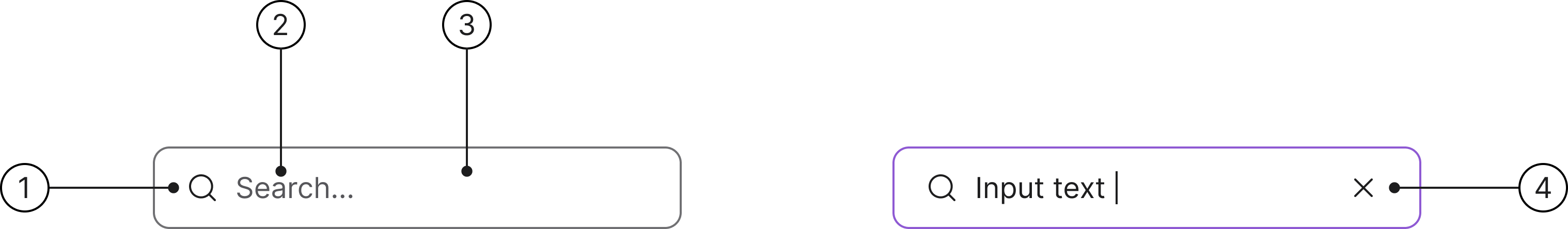
Anatomy
- Search icon
- Text (placeholder / input text)
- Container
- Close icon button
States
- Enabled
- Hover
- Focused
- Disabled
- Selected
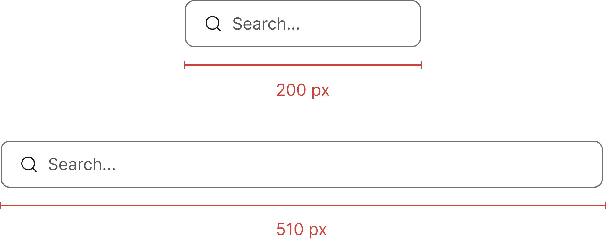
Width
Search fields can have a minimum width of 200 px and a maximum width of 510 px. The shipping SCSS applies a 510 px max-width on the wrapper so the field grows naturally inside its column up to that cap.
Clickable area
It is important that the entire search field is clickable to ensure usability and accessibility, making it easier and more efficient for all users to interact with.

Accessibility
Keyboard interaction
All components should be reachable via TAB and SHIFT+TAB keys.
Best practices

Match the size of your component to the elements next to it.

The size of the search field should match the size of any elements next to it.
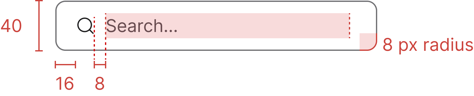
Specs
Developer reference
Implementation notes and patterns that complement the Figma-aligned guidance above. Use these snippets when wiring the component into your application.
Usage
Wrap a standard .form-control input in a .search-group div and append the leading .search-icon indicator. A sibling .clear-search element handles the clear affordance — the host app or the documentation preview script toggles the .typing class on the wrapper and the .show class on .clear-search when the input has a value.
Always include a label (visually hidden via .sr-only if no visible label is desired) so assistive tech can announce the field.
Primary variant
.search-group-primary green-outline variant has no counterpart in the redesigned Figma. Removed in 3.0 — use the default .search-group instead.Listed here for reference while the variant continues to ship.
Large size
.search-group-lg large-size variant has no counterpart in the redesigned Figma, which ships a single 40 px height. Removed in 3.0 — use the default .search-group instead.Submit button slot
.search-group-button variant (search field with an embedded submit button) has no counterpart in the redesigned Figma. Removed in 3.0 — pair a separate action button outside the field instead (for example a .btn.dropdown-toggle filter trigger, or any other plain .btn).