Updated: This page has been updated.
See DESY-158 for details.
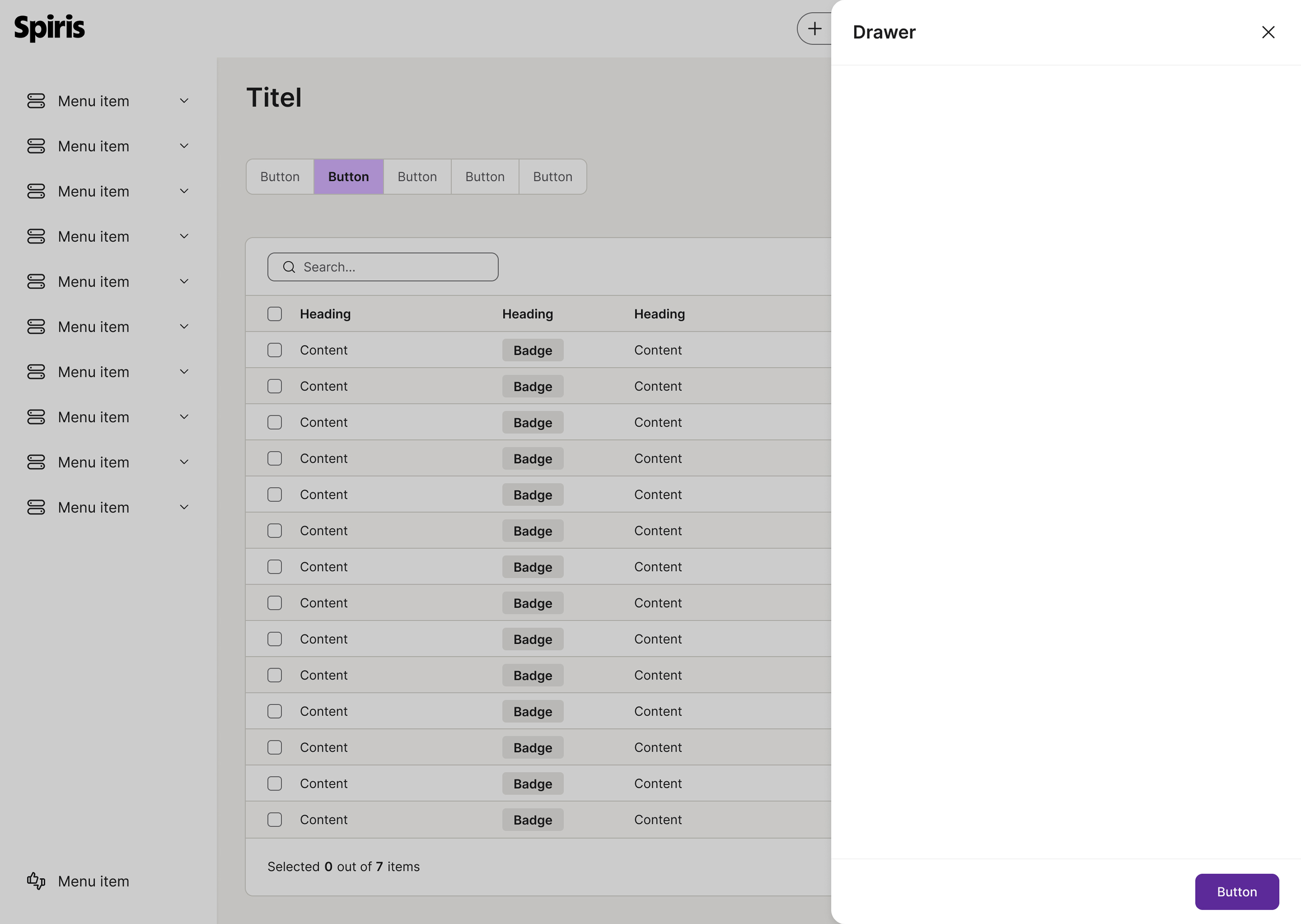
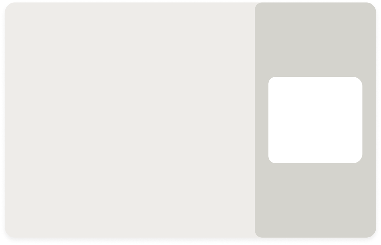
Drawer
A drawer slides in from the right side of the screen, appearing over the main content. It displays additional information while keeping the underlying page and its navigation visible and active.
The guideline content on this page is synced with Figma and can be used as a source of truth.
Open in Figma
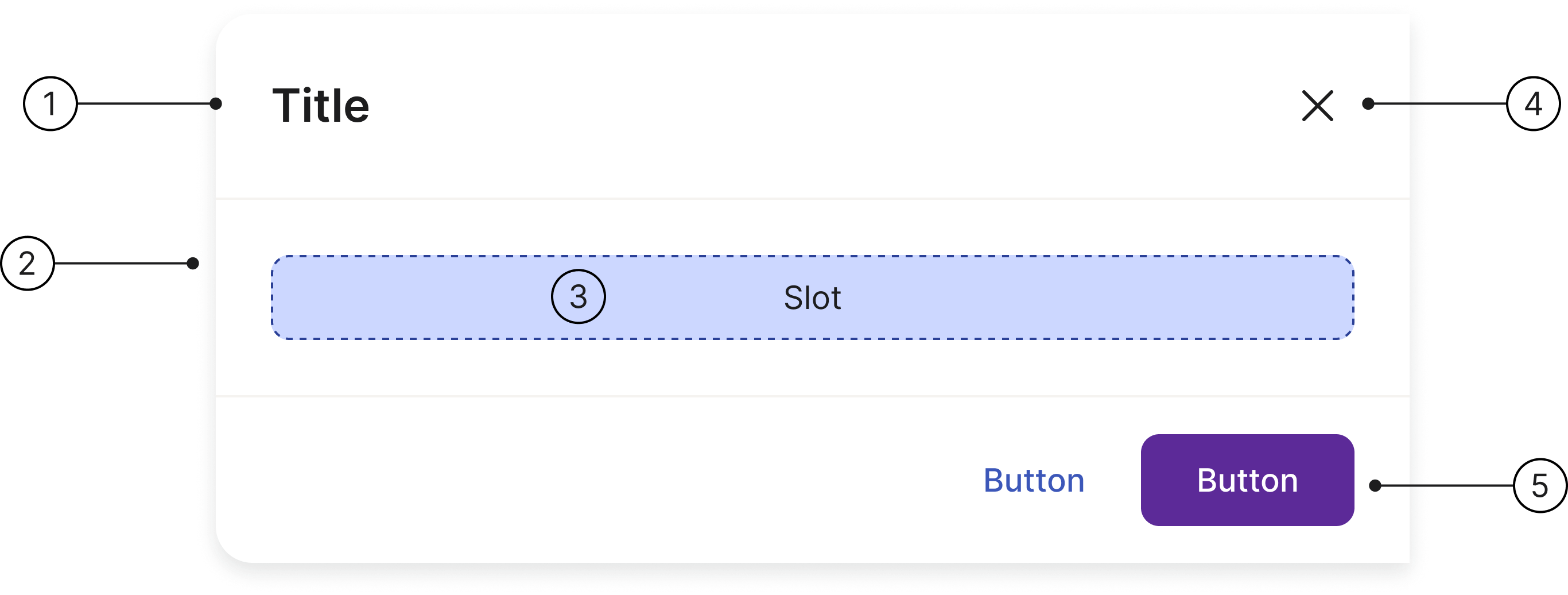
Anatomy
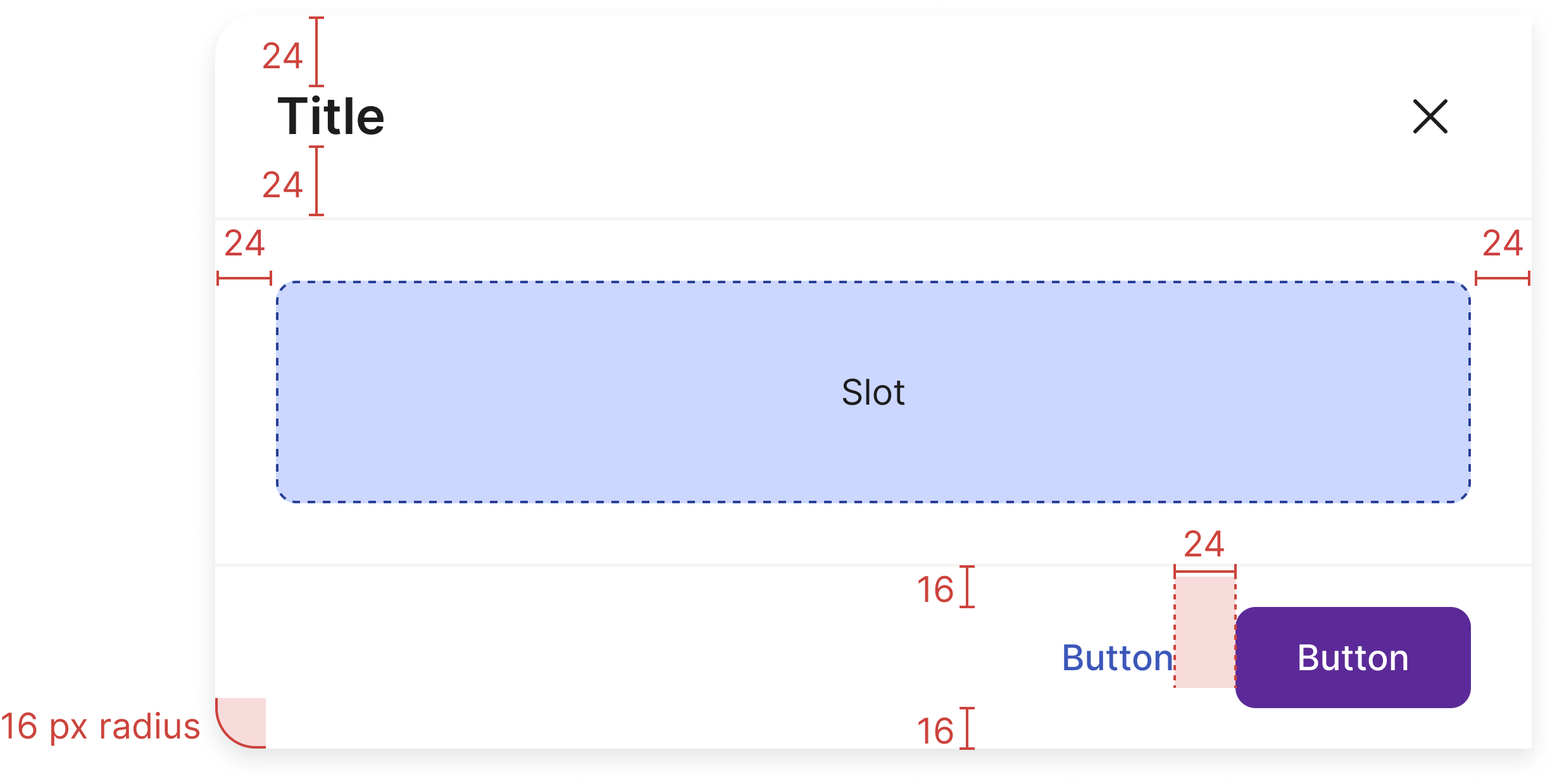
Title
Scrim
Container
Close button
Button section
Usage
You should use a drawer (also known as a side panel or sidebar) when you need to display additional information or controls without navigating away from the main view. Drawers are ideal for tasks that require context from the main page, providing a more efficient workflow for the user.
Container
The only required element for drawers is the container, as they can hold diverse content. A header, which includes a title and a close button, is provided as a standard element.
The easiest way to use this component is to use the slot functionality. Let us know if you have any questions about this.
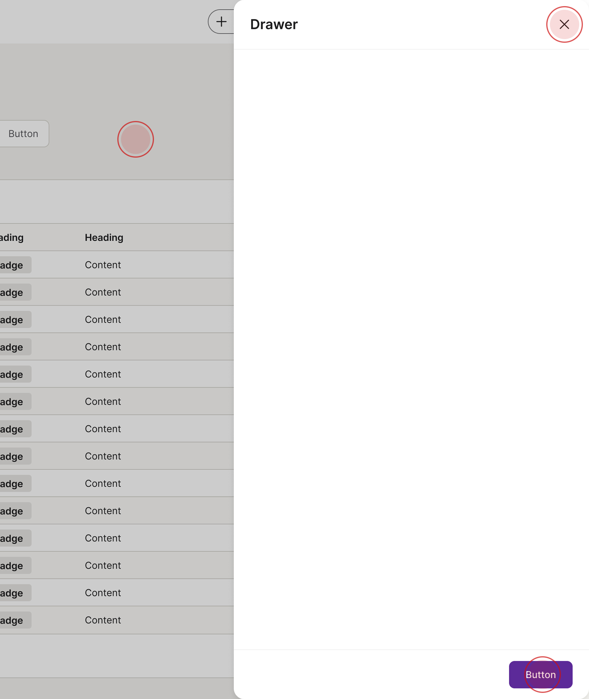
Dismissing
Drawers can be closed in different ways:
Click on the close button
Click on one of the buttons in the footer
Click on the scrim
Accessibility
Keyboard interaction
All components should be reachable via TAB and SHIFT+TAB keys.
<!-- Keyboard interaction example — the close button and the footer buttons are
reachable via TAB / SHIFT+TAB; any focusable content placed in the slot
joins the tab order too. (The slot placeholder here is decorative.) --><divclass="drawer show"role="dialog"aria-labelledby="drawerKeyboardTitle"><divclass="drawer-header"><h4id="drawerKeyboardTitle">Title</h4><buttontype="button"class="btn btn-icon"aria-label="Close"><spanaria-hidden="true"class="spirisicon spirisicon-close"></span></button></div><divclass="drawer-body"><divclass="d-flex align-items-center justify-content-center p-8 rounded-sm docs-slot-placeholder"><spanclass="font-size-sm">Slot</span></div></div><divclass="drawer-footer"><buttontype="button"class="btn btn-tertiary">Button</button><buttontype="button"class="btn btn-primary">Button</button></div></div>
Best practices
Only use one drawer per interaction.
Avoid stacking drawers.
Specs
Developer reference
The following sections describe supported functionality that is not part of the Figma design specification.
Drawer size
Drawers/sliders have 3 optional sizes:
75% of your viewport (.drawer-lg)
50% of your viewport (is the default size of the drawers or .drawer-md)
520px wide (.drawer-sm)
Add a .drawer-backdrop element to dim the page behind the drawer. Toggle the .show class on both the drawer and the backdrop to open them together.
For this component you need JavaScript! We recommend creating your own script to open and close the drawer/slider. If you need help just contact us.
Demo page! Here you can find a demo page where you can test a drawer/slider, together with a navigation and a text panel.
Lorem ipsum dolor sit amet, consectetur adipiscing elit. Fusce vehicula ex ex. Nullam lacinia nisl nisi, at tincidunt felis condimentum quis. Sed condimentum mi ut enim rutrum, quis tempus felis semper. Suspendisse posuere mi non mauris laoreet aliquet. Morbi diam orci, vulputate in posuere id, posuere in sem. Nam ornare urna magna. Class aptent taciti sociosqu ad litora torquent per conubia nostra, per inceptos himenaeos. Aenean gravida volutpat leo nec vestibulum. Mauris sit amet rutrum erat, nec bibendum orci. Aenean tincidunt massa metus, non egestas dolor vulputate vel. Etiam hendrerit eget sapien feugiat fringilla. Integer vitae elementum lectus.
Title of the small drawer
Lorem ipsum dolor sit amet, consectetur adipiscing elit. Fusce vehicula ex ex. Nullam lacinia nisl nisi, at tincidunt felis condimentum quis. Sed condimentum mi ut enim rutrum, quis tempus felis semper. Suspendisse posuere mi non mauris laoreet aliquet. Morbi diam orci, vulputate in posuere id, posuere in sem. Nam ornare urna magna. Class aptent taciti sociosqu ad litora torquent per conubia nostra, per inceptos himenaeos. Aenean gravida volutpat leo nec vestibulum. Mauris sit amet rutrum erat, nec bibendum orci. Aenean tincidunt massa metus, non egestas dolor vulputate vel. Etiam hendrerit eget sapien feugiat fringilla. Integer vitae elementum lectus.
Title of the large drawer
Lorem ipsum dolor sit amet, consectetur adipiscing elit. Fusce vehicula ex ex. Nullam lacinia nisl nisi, at tincidunt felis condimentum quis. Sed condimentum mi ut enim rutrum, quis tempus felis semper. Suspendisse posuere mi non mauris laoreet aliquet. Morbi diam orci, vulputate in posuere id, posuere in sem. Nam ornare urna magna. Class aptent taciti sociosqu ad litora torquent per conubia nostra, per inceptos himenaeos. Aenean gravida volutpat leo nec vestibulum. Mauris sit amet rutrum erat, nec bibendum orci. Aenean tincidunt massa metus, non egestas dolor vulputate vel. Etiam hendrerit eget sapien feugiat fringilla. Integer vitae elementum lectus.
<pclass="d-flex flex-wrap justify-content-center m-0 gap-8"><buttontype="button"class="btn btn-secondary"id="showDrawer">Show default (medium) drawer/slider</button><buttontype="button"class="btn btn-secondary"id="showDrawer-sm">Show small drawer/slider</button><buttontype="button"class="btn btn-secondary"id="showDrawer-lg">Show large drawer/slider</button></p><divclass="drawer-backdrop"id="drawerBackdrop"aria-hidden="true"></div><divclass="drawer"role="dialog"aria-hidden="true"aria-labelledby="drawerExampleTitle"id="drawerExample"><divclass="drawer-header"><h4id="drawerExampleTitle">Title of the default (medium) drawer</h4><buttontype="button"class="btn btn-icon btn-close"aria-label="Close"><spanaria-hidden="true"class="spirisicon spirisicon-close"></span></button></div><divclass="drawer-body"><p>Lorem ipsum dolor sit amet, consectetur adipiscing elit. Fusce vehicula ex ex. Nullam lacinia nisl nisi, at tincidunt felis condimentum quis. Sed condimentum mi ut enim rutrum, quis tempus felis semper. Suspendisse posuere mi non mauris laoreet aliquet. Morbi diam orci, vulputate in posuere id, posuere in sem. Nam ornare urna magna. Class aptent taciti sociosqu ad litora torquent per conubia nostra, per inceptos himenaeos. Aenean gravida volutpat leo nec vestibulum. Mauris sit amet rutrum erat, nec bibendum orci. Aenean tincidunt massa metus, non egestas dolor vulputate vel. Etiam hendrerit eget sapien feugiat fringilla. Integer vitae elementum lectus.</p></div><divclass="drawer-footer"><buttontype="button"class="btn btn-tertiary btn-close">Cancel</button><buttontype="button"class="btn btn-primary btn-close">Save</button></div></div><divclass="drawer drawer-sm"role="dialog"aria-hidden="true"aria-labelledby="drawerExampleTitle-sm"id="drawerExample-sm"><divclass="drawer-header"><h4id="drawerExampleTitle-sm">Title of the small drawer</h4><buttontype="button"class="btn btn-icon btn-close"aria-label="Close"><spanaria-hidden="true"class="spirisicon spirisicon-close"></span></button></div><divclass="drawer-body"><p>Lorem ipsum dolor sit amet, consectetur adipiscing elit. Fusce vehicula ex ex. Nullam lacinia nisl nisi, at tincidunt felis condimentum quis. Sed condimentum mi ut enim rutrum, quis tempus felis semper. Suspendisse posuere mi non mauris laoreet aliquet. Morbi diam orci, vulputate in posuere id, posuere in sem. Nam ornare urna magna. Class aptent taciti sociosqu ad litora torquent per conubia nostra, per inceptos himenaeos. Aenean gravida volutpat leo nec vestibulum. Mauris sit amet rutrum erat, nec bibendum orci. Aenean tincidunt massa metus, non egestas dolor vulputate vel. Etiam hendrerit eget sapien feugiat fringilla. Integer vitae elementum lectus.</p></div><divclass="drawer-footer"><buttontype="button"class="btn btn-tertiary btn-close">Cancel</button><buttontype="button"class="btn btn-primary btn-close">Save</button></div></div><divclass="drawer drawer-lg"role="dialog"aria-hidden="true"aria-labelledby="drawerExampleTitle-lg"id="drawerExample-lg"><divclass="drawer-header"><h4id="drawerExampleTitle-lg">Title of the large drawer</h4><buttontype="button"class="btn btn-icon btn-close"aria-label="Close"><spanaria-hidden="true"class="spirisicon spirisicon-close"></span></button></div><divclass="drawer-body"><p>Lorem ipsum dolor sit amet, consectetur adipiscing elit. Fusce vehicula ex ex. Nullam lacinia nisl nisi, at tincidunt felis condimentum quis. Sed condimentum mi ut enim rutrum, quis tempus felis semper. Suspendisse posuere mi non mauris laoreet aliquet. Morbi diam orci, vulputate in posuere id, posuere in sem. Nam ornare urna magna. Class aptent taciti sociosqu ad litora torquent per conubia nostra, per inceptos himenaeos. Aenean gravida volutpat leo nec vestibulum. Mauris sit amet rutrum erat, nec bibendum orci. Aenean tincidunt massa metus, non egestas dolor vulputate vel. Etiam hendrerit eget sapien feugiat fringilla. Integer vitae elementum lectus.</p></div><divclass="drawer-footer"><buttontype="button"class="btn btn-tertiary btn-close">Cancel</button><buttontype="button"class="btn btn-primary btn-close">Save</button></div></div>
 The guideline content on this page is synced with Figma and can be used as a source of truth.
Open in Figma
The guideline content on this page is synced with Figma and can be used as a source of truth.
Open in Figma