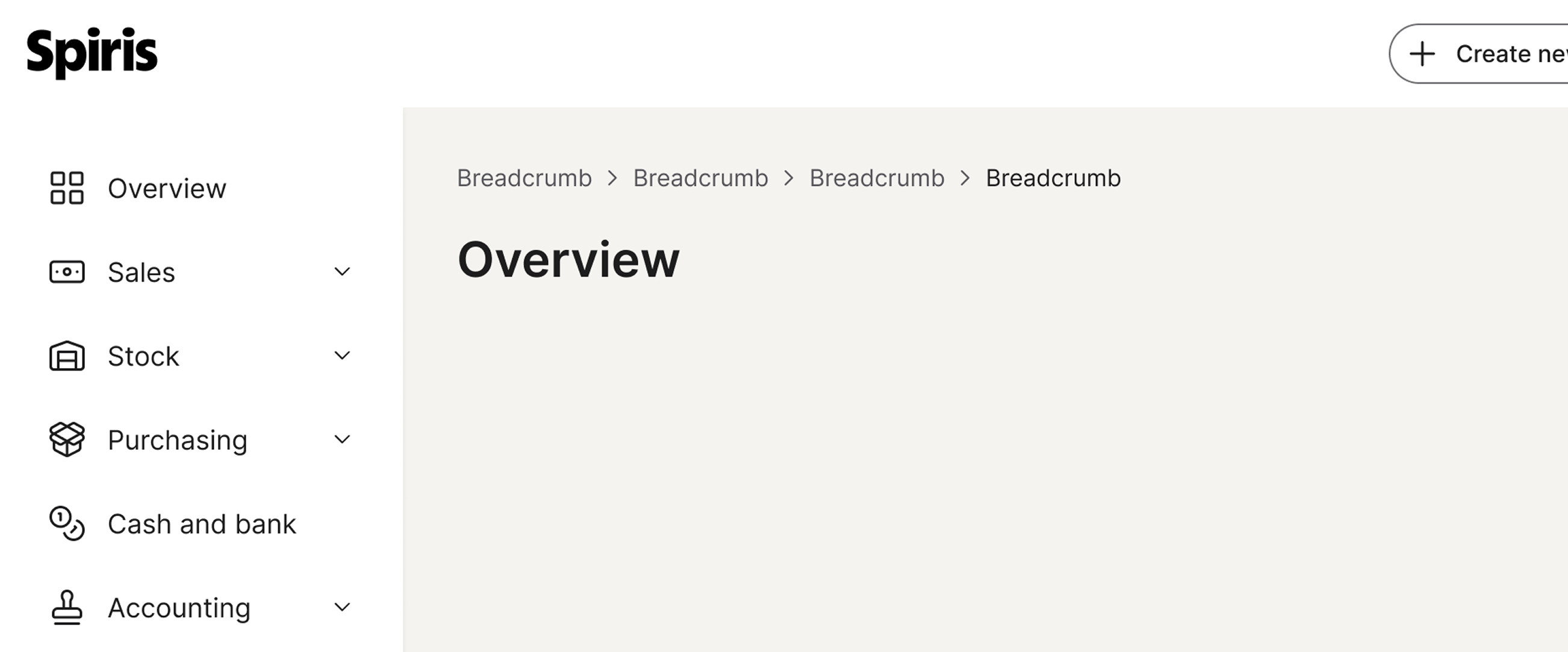
Breadcrumbs
 The guideline content on this page is synced with Figma and can be used as a source of truth.
Open in Figma
The guideline content on this page is synced with Figma and can be used as a source of truth.
Open in Figma
This component shows the navigational hierarchy of a page.
Anatomy
- Page link
- Separator
- Current page

States
A breadcrumb item can have various states, such as enabled, disabled, hover, focused, and selected, which visually communicate its current behaviour and interactivity to the user.
Default
By default, the first item is the root category page, and the last item is the current page. A chevron separates pages to show their hierarchical relationship.
Placement
Breadcrumbs are consistently positioned at the top of the page header across all pages.
This placement ensures a uniform, highly visible, and easily accessible navigational overview for users, maintaining a consistent experience throughout our product.
Last item
The last item in a breadcrumb shows the current page. This should be static and not be interactive.
Clickable area
It is important for the entire label in a breadcrumb to be clickable to ensure usability and consistency.
By making the entire text and its surrounding space a clickable target, you create a more efficient and predictable user experience.

Accessibility
Keyboard interaction
All interactive breadcrumb links must be reachable via Tab and Shift + Tab. Activate the focused link with Enter. The current page (last item) is non-interactive and is removed from the tab order with tabindex="-1", so keyboard users never land on it.
Best practices
Number of labels
Keep breadcrumb chains to a small number of items, typically up to five. Avoid long chains that span most of the viewport — they become harder to scan and dilute the value of the navigational summary.

Use a focused chain of five or fewer labels so the hierarchy reads at a glance.

Avoid pushing the chain past five labels — it begins to span the viewport and loses its summary value.
Specs

Developer reference
The following sections describe supported functionality that is not part of the Figma design specification.
Marking the current page
Apply .active on the last <li>; the inner anchor shifts to the selected colour and pointer-events: none is applied. Because the link remains in the DOM, add tabindex="-1" and aria-current="page" to it so keyboard users do not land on a non-interactive item.
Mid-chain disabled item
Apply .disabled on an <li> when a level in the hierarchy is not reachable from the current path. The link inside becomes non-interactive, the label shifts to the disabled colour, and the chevron after the disabled item picks up the same tint. Use sparingly — the canonical breadcrumb chain is fully interactive up to the current page.