Progress bar
 The guideline content on this page is synced with Figma and can be used as a source of truth.
Open in Figma
The guideline content on this page is synced with Figma and can be used as a source of truth.
Open in Figma
This component visually communicates the status of a task and it shows users how much work remains.
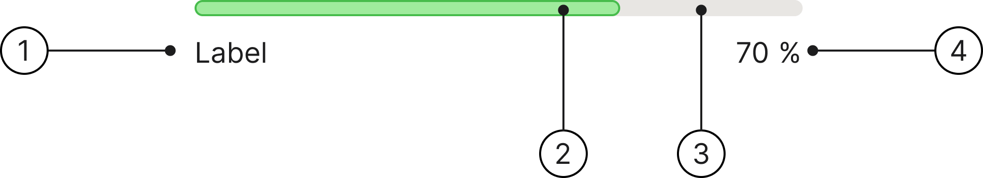
Anatomy
- Label
- Progress line
- Progress bar container
- Progress label
Usage
Progress bars are best when placed on the edge of a container.
Always use the same type of progress indicator for a given process across the platform. For instance, if refreshing uses a circular indicator in one view, it must use a circular indicator everywhere.
Progress label
The progress label is supposed to match the progress line and have the same number value. You will have to do that manually.
Variants
We have two distinct colours for the progress bar component to clearly communicate the status and user context of the ongoing process.
Green
Usage: it signifies a normal, positive, or successful state.
Purple
Usage: it signifies a specific, non-standard, or emphasised process.
Accessibility
Keyboard interaction
All components should be reachable via Tab and Shift + Tab keys. The focused progress bar shows a 2 px focus ring.
Best practices

Indicate to users the progress of a task, showing how much has been completed and what remains.
If there is a task with a short loading time, use the Spinner component instead.
Use the progress bar to show either a loading state or the status of a system process.

Don't use the progress bar for data visualisation; use a custom component for that purpose instead.
Specs
Developer reference
The following sections describe supported functionality that is not part of the Figma design specification.
Basic design
A standalone progress bar without a label row. Set the fill width with an inline style="width: …%" and keep the role="progressbar" ARIA attributes on the .progress element in sync. The .progress-bar fill is presentational.
Content Security Policy
Setting the fill width inline relies on the style attribute.
style-src 'unsafe-inline', then you won't be able to use inline style attributes to set progress bar widths as shown in our examples. Alternative methods that are compatible with strict CSPs include a little custom JavaScript (that sets element.style.width) or using custom CSS classes.
Deprecated patterns
The following classes are deprecated by the Figma redesign and will be removed in v3.0.
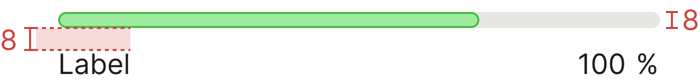
Deprecated in v2.7. The single 8 px bar is now the only size, so the size modifiers .progress-xs and .progress-sm no longer change the bar height. The absolutely-positioned .percentage element and the in-bar .progress-label are replaced by the .progress-content row (.progress-label + .progress-value). These will be removed in v3.0.