Split button
The split button allows users to trigger different actions via two interactive areas: a default action on the left and a menu with additional actions on the right.
 The guideline content on this page is synced with Figma and can be used as a source of truth.
Open in Figma
The guideline content on this page is synced with Figma and can be used as a source of truth.
Open in Figma
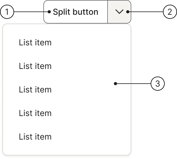
Anatomy
- Main action button
- Dropdown menu icon button
- Secondary action menu
Variants
Split buttons are available in two variants: secondary (default) and primary. Use the primary variant to emphasise the most important action on the page.
Disabled
Add .disabled to the wrapper (.btn-group.btn-split) or to each button individually to disable the split button.
Sizes
There are two sizes for split buttons: medium (default) and small. Choose the size that best suits the context and available space.
Small
Add .btn-group-sm to the wrapper and .btn-sm to each button for smaller split buttons.
Medium (default)
The default size. No additional classes are needed.
Large
Deprecated in v2.3
Large split buttons will be removed in v3.0. Use the default (medium) size instead.
Add .btn-group-lg to the wrapper (.btn-group.btn-split).
Drop-up
Add .dropup to the wrapper to open the dropdown menu above the button instead of below.
Usage
Used for this
To let users select multiple parallel actions. The split button groups a default action together with related alternative actions, reducing clutter whilst keeping them easily accessible.
Optimising user interaction
The small menu can be easily overlooked, so the split button works best when the main action is the most frequently used one. The dropdown provides quick access to less common alternatives without requiring extra screen space.
Clear default action
The most crucial requirement is that one action must be significantly more common than the others. If all actions are equally likely, consider using a standard dropdown or separate buttons instead.
Accessibility
Keyboard interaction
All buttons should be reachable via TAB and SHIFT+TAB keys. Ensure both the main action button and the dropdown toggle are independently focusable.
Best practices
Labels
Keep button labels brief and descriptive. Long labels reduce clarity and may cause layout issues.
Do
The label in the button needs to be brief.
Don't
Avoid using very long labels or changing the icon.
Grouping actions
Group related actions under the split button's dropdown menu. Actions available in the dropdown should always belong to the main action.
Do
Group related actions under the split button's dropdown menu. Actions in the dropdown should always belong to the main action.
Don't
Avoid using a split button to group actions that aren't directly related or similar.
Dropdown content
Use clear and concise labels for both the main and secondary actions. Do not repeat the main button action as an item within the dropdown menu.
Do
Use clear and concise labels for both the main and secondary actions.
Don't
Do not repeat the main button action as an item within the dropdown menu.