Toggle
A toggle lets you switch a setting between two states, such as on or off. It can also be used for dark / light mode.
 The guideline content on this page is synced with Figma and can be used as a source of truth.
Open in Figma
The guideline content on this page is synced with Figma and can be used as a source of truth.
Open in Figma
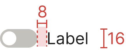
Anatomy
- Toggle
- Label text

Not active
There are two different states for a toggle — “Active” and “Not active”.
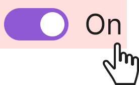
Active
There are two different states for a toggle — “Active” and “Not active”.
Usage
Use a toggle when you need a component with two distinct on / off states. It is ideal for showing that a specific filter option is currently active.
Clickable area
It is crucial for both the label and the toggle to be clickable to ensure usability and accessibility for all users. By making the label also clickable, you provide a much larger and more forgiving target, which reduces user frustration and the chance of accidental errors.
Accessibility
Keyboard interaction
All toggles should be reachable via TAB and SHIFT+TAB keys. Pressing SPACE on a focused toggle flips its state — handled natively by the underlying <input type="checkbox">.
Specs
Developer reference
The following sections describe supported functionality that is not part of the Figma design specification.
Basic example
A toggle uses the markup of a custom checkbox, but applies the .switch class to render a toggle pill. Toggles also support the disabled attribute.
Label position
To align the toggle to the right and place the label on the left, add the .switch-rtl class to the .switch wrapper.
Switch size
.switch (32 × 16 px) instead, which is the canonical Figma size.Adding the .switch-lg class to the .switch wrapper renders a larger 48 × 24 px toggle. This larger size is not part of the Figma design specification and is retained for legacy usages.
Switch with label
.switch with an external <label> instead, which is the canonical Figma pattern.The legacy .switch-label class rendered a wider pill with embedded ON / OFF text.
Light / Dark mode switch
The mode switcher is a toggle used to switch between Standard (light) mode and Dark mode. It should be easily accessible via the user profile dropdown in the top menu.
The .light-dark-toggle class renders the refreshed flat switch: a 48 × 24 px track with a white thumb carrying a sun glyph, matching the Figma Switch (light & dark) component.
Example in the top navigation
Legacy animated switch
The .light-dark-toggle-legacy class preserves the previous animated sky / sun / clouds / stars switch for consumers who need the old look. The inner markup is identical to .light-dark-toggle, so switching back is a single class change.