Buttons
A button is designed to grab the user’s attention.
Use the button classes on an <a>, <button>, or <input> element. Also you can use any of the available button classes to quickly create a styled button: .btn-secondary or .btn-primary or a medium-sized variant: .btn-md
 The guideline content on this page is synced with Figma and can be used as a source of truth.
Open in Figma
The guideline content on this page is synced with Figma and can be used as a source of truth.
Open in Figma
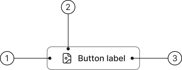
Anatomy
- Button container
- Icon (optional)
- Label
Primary
Primary buttons have a background fill in order to make them clearly distinguishable from input fields. The primary button has the following states.
Secondary
Secondary buttons are white in their normal state and can therefore not use purple for hover and focus state. The secondary button has the following states.
Previously called "Default" (.btn-default). The new canonical class is .btn-secondary. Both classes produce identical output.
Tertiary
The tertiary button has the following states.
Previously called "Link button" and required the compound class .btn-default.btn-tertiary. Now works standalone as .btn-tertiary.
Button with icon
Add an icon before the button label.
Summary
Links
Primary button — Used for the main action in a flow that changes data — for example sending, saving, or confirming. Represents the most important, often irreversible action in a view.
Secondary button — Used for supporting actions that change data, or — in rare cases — to give visual emphasis to an important action that initiates a process (e.g. opens a confirmation dialog).
Tertiary button — Used for non-committing actions that change the view or state, but do not change data or URL. Tertiary buttons are visually subtle and should never compete with Primary or Secondary buttons.
Link — Used for navigation to a new URL — either internal or external. Always use for navigation between pages or external resources. Clarify if it opens in a new tab/window.
Overview
This overview helps you select the right button or link.
| Button type | Changing data? | Typical measures | Recommendation |
|---|---|---|---|
| Primary | Yes | Submit form, Save changes, Publish, Confirm | Main action in flow. Only one per page/view. Positioned farthest right. |
| Secondary | Yes / No | Save as draft, Delete, Duplicate, Reset | Supplementary data change. Max 2–3 per view, not side by side. |
| Tertiary | No | Cancel, Back, Show more, Switch tab, Open panel | Navigates within page/view or changes visual state. Use sparingly. |
| Link | No (navigate) | Go to page, Open help/docs, Download file | Always use for page/external navigation. Clarify new tab/window. |
Primary
Usage
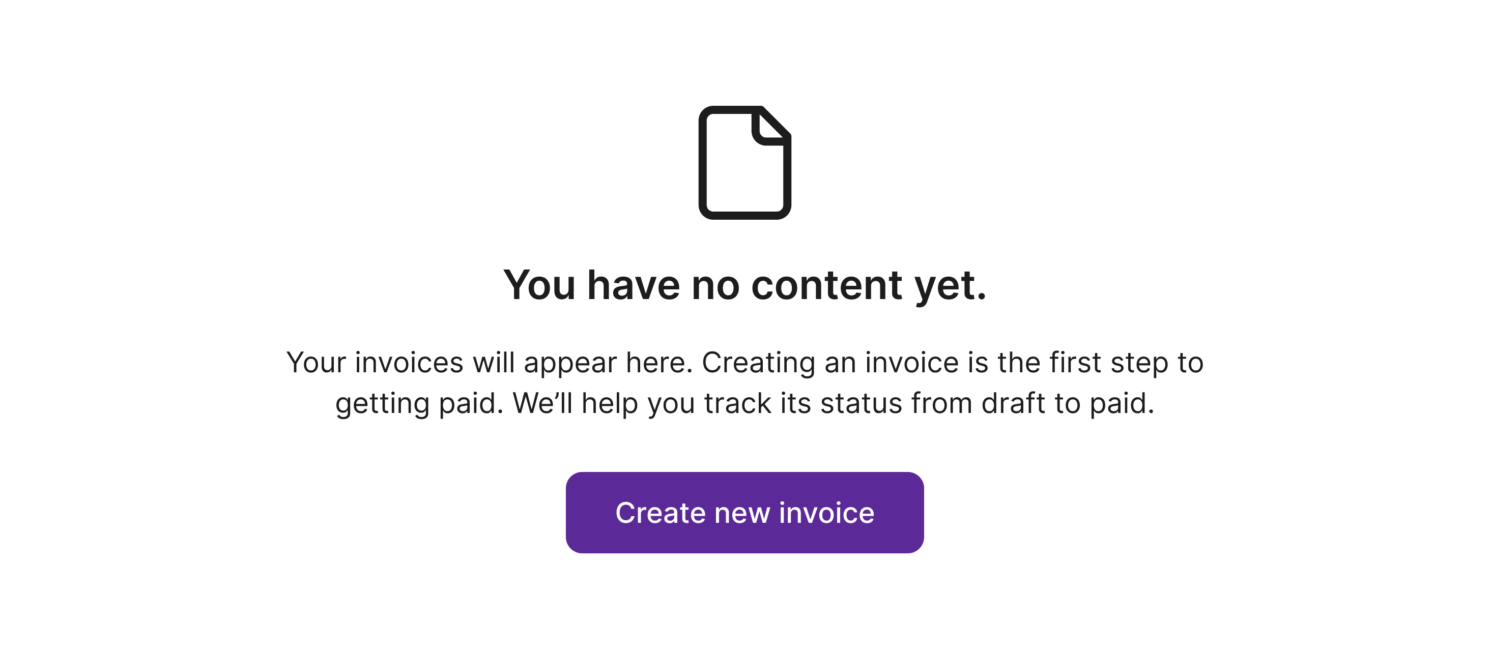
Used for the main action in a flow that changes data — for example sending, saving, or confirming.
Represents the most important, often irreversible action in a view. Primary buttons should only appear once per task, but not every screen needs a primary button.
Typical use:
"Submit application"
"Save and close"
"Publish"
"Confirm"
Placement: Use only one primary button per view or task. Typically placed on the right or in the main action area.
Best practices

- Use for committing or finalising actions.
- Do not use for navigation or cancel actions.
- Do not use multiple primary buttons in the same view.
Only use 1 primary button per screen. Use default, tertiary, or text buttons for other actions.
Avoid more than one primary button on the screen as it reduces the clarity of what should be done next.
Examples
If you are uncertain about when to use primary buttons, this table provides a clear reference for their intended use cases and placement.
| Action | Component | Comment |
|---|---|---|
| Send | Primary | Commits form data |
| Save | Primary | Finalises changes |
| Confirm | Primary | Confirms irreversible action |
Secondary
Usage
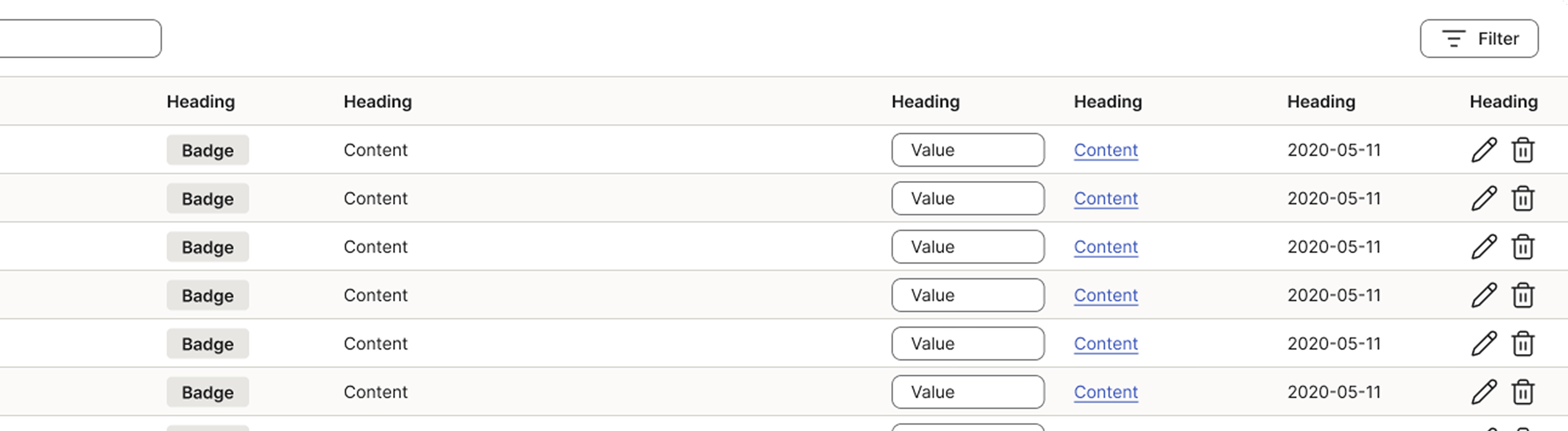
Used for supporting actions that change data, or — in rare cases — to give visual emphasis to an important action that initiates a process (e.g. opens a confirmation dialog).
Typical use:
- Save as draft
- Delete (open dialog)
- Duplicate
- Reset to default
Placement
- Positioned near the Primary button, but visually secondary.
- Can use multiple Secondary buttons per view (max ~3), but avoid side-by-side clutter.
Examples
If you are uncertain about when to use secondary buttons, this table provides a clear reference for their intended use cases and placement.
| Action | Component | Comment |
|---|---|---|
| Save as draft | Secondary | Saves data, but not the main action |
| Delete (opens dialog) | Secondary | Initiates process; deletion happens inside dialog |
| Duplicate | Secondary | Creates a copy of an item |
Exception rule
Visual weight without direct data change
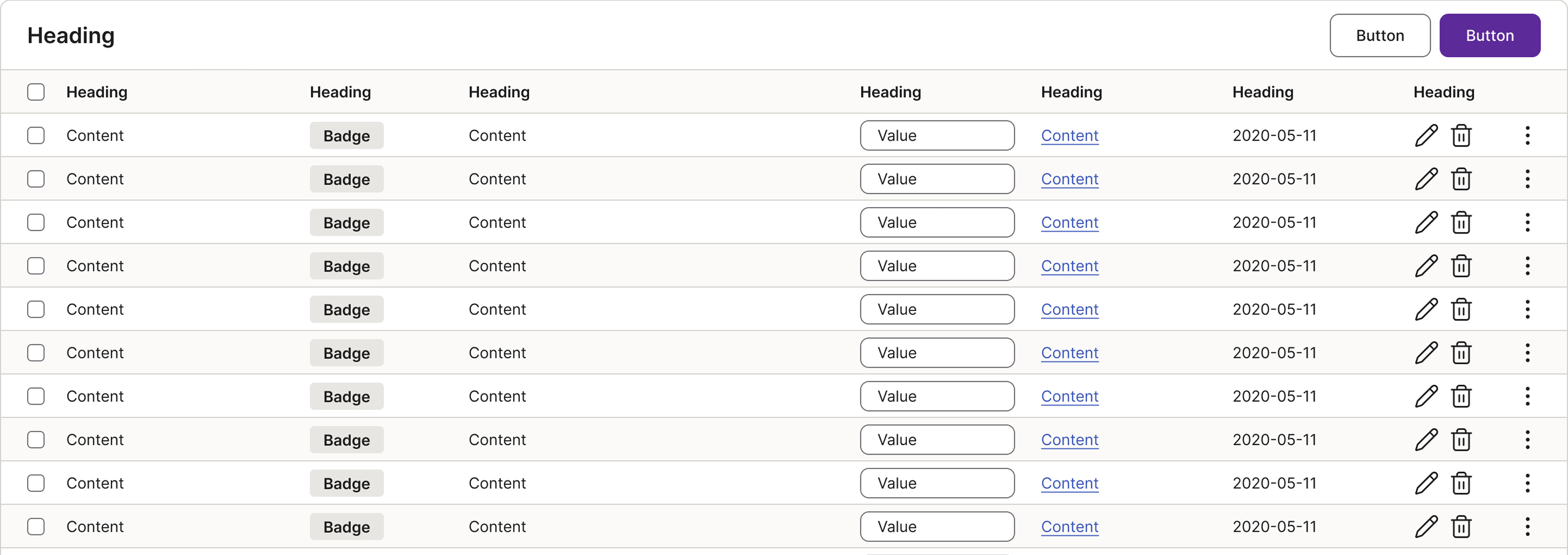
In some cases, the Secondary button is used instead of the Tertiary button even when data is not directly changed, but the action leads to something important. For example, it opens a dialog that requires a conscious choice.
This applies to, for instance:
- “Delete” in a list that opens a confirmation dialog.
- “Publish” which opens a review flow or publishing settings.
- “Submit for review” that leads to another view.
In these cases, Secondary is used to give visual weight to an initiating but important action, signalling that this is the next step in a decision-making process.
Best practices
- Use for meaningful actions that are less critical than primary.
- Use for initiating important flows that don’t immediately change data.
- Do not use for simple navigation or cancel actions.
- Do not use Secondary purely for visual styling.
Tertiary
Usage
Used for non-committing actions that change the view or state, but do not change data or URL. Tertiary buttons are visually subtle and should never compete with Primary or Secondary buttons.
Typical use:
- Cancel
- Back
- Show more
- Switch tabs
Placement
- Typically placed to the left of Primary and Secondary buttons.
- Can appear multiple times per view, but avoid overuse.
Best practices
- Use for navigation within the current view.
- Use for safe “escape” actions (e.g., “Cancel”).
- Keep visual emphasis low (text-only or outline style).
- Do not use to change data.
- Do not compete visually with Primary/Secondary buttons.
- Do not use for links that navigate to a new URL.
Examples
If you are uncertain about when to use tertiary buttons, this table provides a clear reference for their intended use cases and placement.
| Action | Component | Comment |
|---|---|---|
| Cancel | Tertiary | Cancels without saving. |
| Show more | Tertiary | Expands content in-place |
| Switch tab | Tertiary | Switches view state, no data change. |
| Delete (open dialog) | Secondary or Tertiary | Initiates an important process; actual deletion is Primary inside dialog. |
Hierarchy
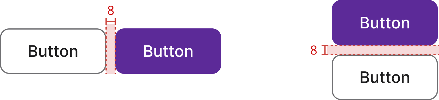
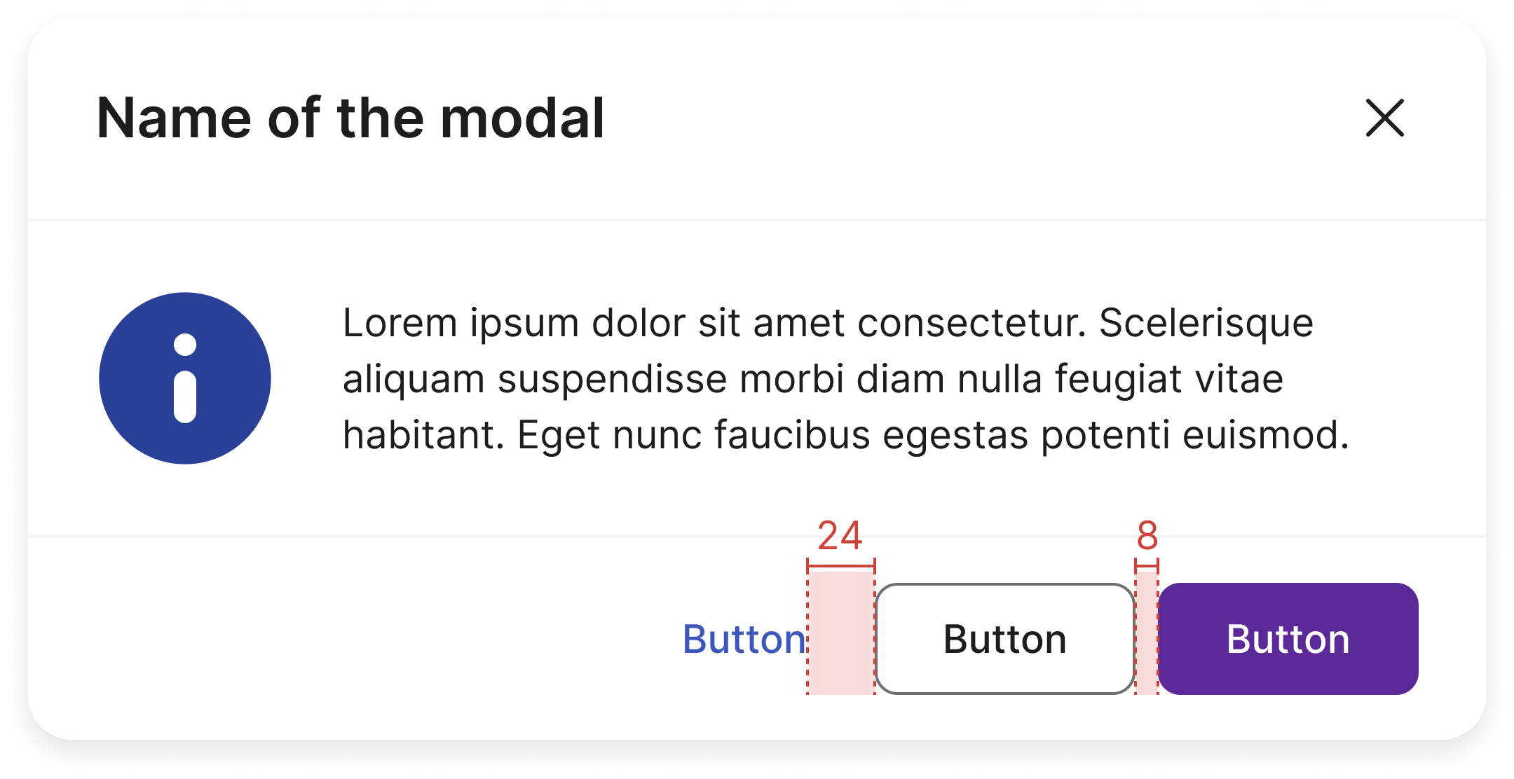
Buttons follow a visual hierarchy: Primary → Secondary → Tertiary. Use only one Primary button per view. Pair it with Secondary and/or Tertiary buttons as needed.
Horizontal stack
When stacking buttons horizontally, place the highest-emphasis button on the trailing edge (right in LTR layouts). Lower-emphasis buttons go to the left.
Vertical stack
Use a vertical stack when horizontal space is limited. Buttons are stacked top-to-bottom with 8 px gap. The highest emphasis button should be on top.
Use the .btn-group-block helper class on the parent container to make all direct child buttons span the full width, without adding .btn-block to each button individually.
Button label
The amount of text in a button is a critical element for both usability and visual consistency. The general rule is to prioritise clarity and conciseness above all else. A good button label tells the user exactly what will happen when they click it, without requiring them to read a lot of extra information.
Use verb
Button labels should typically start with a strong, action-oriented verb. This makes it a clear command. Examples include:
- "Save"
- "Download"
- "Add to cart"
- "Create account"
Maximum words
As a general guideline, button labels should be kept to a maximum of 2–3 words. This ensures the button is scannable and the text doesn't wrap to a second line, which can look messy and increase cognitive load. A single line of text is a key constraint for maintaining a clean and consistent layout, especially in mobile interfaces.
Behaviour
Minimum width
The minimum width for basic buttons is 2× the height of the button.
Maximum width
A button may grow with its label but should never exceed a maximum width of 240 px or the width of its container.
Touch area
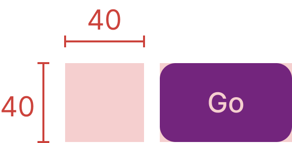
The minimum touch/click target for a button is 40 × 40 pixels, ensuring comfortable interaction on both pointer and touch devices.
Size
Two available sizes: medium (40 px, default) and small (32 px). Add .btn-sm for the small variant or .btn-md to be explicit. Choose based on the density of the surrounding UI.
.btn-lg class (48 px) is deprecated and will be removed in v3.0 — use .btn-md instead.
Accessibility
Keyboard interaction
Buttons must be reachable and operable via keyboard alone.
| Key | Action |
|---|---|
| Tab | Moves focus to the next focusable element |
| Shift + Tab | Moves focus to the previous focusable element |
| Enter / Space | Activates the focused button |
Disabled state
For disabled state (buttons are unclickable) add .disabled class on your button or add the disabled attribute to <button> or <input> buttons.
<a> tags don't support the disabled attribute, so you must add the .disabled class to make it visually appear disabled. For disabled links that include .disabled class, they should include the aria-disabled="true" attribute to indicate the state of the element to assistive technologies.
For active/selected state add .active class on the element and include the aria-selected="true" attribute.
Best practices
Labels
Use clear, concise verb-based labels. Avoid vague or generic wording.
Labels should use verbs and indicate what will happen when the button is pressed.
Don't use adjectives, nouns, or past tense labels.
Icons
Icons can reinforce meaning. Always pair icons with a visible text label unless the icon is universally understood.
Use icons when it helps clarify an action.
Avoid overusing icons in buttons for decorative purposes. This adds unnecessary noise to the UI.
Use a single icon in a button.
Don't use more than one icon in a button.
Design
Standard buttons
Primary, Secondary (formerly Default), Tertiary (formerly Link button), and Destructive buttons in their default appearance.
.btn-destructive) have no replacement and will be removed in 3.0.
| Type | Example | Class |
|---|---|---|
| Secondary | .btn or .btn.btn-secondary |
|
| Primary | .btn.btn-primary |
|
| Tertiary | .btn.btn-tertiary |
|
| Destructive | .btn.btn-destructive |
|
| Destructive (disabled) | .btn.btn-destructive.disabled |
|
| Primary destructive | .btn.btn-primary.btn-destructive |
|
| Primary destructive (disabled) | .btn.btn-primary.btn-destructive.disabled |
Directional buttons — size variants
Add .left or .right class together with .btn to indicate direction in a flow (e.g. wizard steps) or data movement.
Directional buttons in all three sizes (small, medium, large) for both secondary and primary themes.
.btn-lg class (48 px) is deprecated and will be removed in v3.0 — use .btn-md instead.
Squerkle buttons
Add .btn-squerkle together with .btn. Recommended sizes: 48 × 48, 32 × 32, and 24 × 24 px. Use background colour helper classes and spacing helpers to customise.
Default - .btn.btn-squerkle
.btn.btn-squerkle.bg-secondary
.btn.btn-squerkle.bg-primary
Link button
Use .btn-link for a button-styled link that retains button height without the full button surface treatment.
For icon-only buttons (.btn-icon), see the dedicated Icon button page.
Link button - .btn.btn-link
Transparent background buttons
Use .btn-link with .btn-secondary or .btn-destructive for a button-link with interaction styles of a secondary or destructive button.
Small button - .btn-sm
Medium size (default)
Login buttons
Different types of buttons used for login pages.
Default login button .btn-login
Block button
Create block-level buttons that span the full width of a parent by adding .btn-block.
Small
Medium (default)
Specs